
50 Shades of White
Trish Witkowski guides you through a blizzard of white paper choices.

This article appears in Issue 84 of InDesign Magazine.
White paper is like poetry without words. It’s a blank canvas that comes in many shades, each with its own personality. As someone who has studied thousands of creative printed materials over the past two decades, I can tell you that the beauty of white is in its subtleties. Often we don’t even realize these almost indistinguishable details until we set that white sheet next to, well, another white sheet. It’s then that we’re reminded that all whites aren’t created alike. Think about your favorite brochure or invitation printed on white paper. It’s probably printed off of a desktop laser printer on 28 lb. bright white laser paper, right? What? It’s not?? As a matter of fact, I’m going to bet that your favorite printed piece is on a medium-to-heavy weight sheet—possibly a gorgeous white dull or matte coated sheet, or a toothy uncoated sheet. As to which it is, well, that’s a matter of preference, and that’s the beauty of it. A gorgeous white sheet of paper engages the senses in many ways—through sight, touch, sound, even scent. The more senses we can engage, the greater the experience. Some of my personal favorites are enhanced with letterpress printing, or stamped with foil, blind embossed, or even digitally printed with an extended gamut color range.
Shades of White
So, with a world of whites at our fingertips, how do you choose? I think for anyone who has ever opted to paint a room “white,” and then gone home with paint swatches of Spare White, Toque White, Incredible White, Pure White, Alabaster White, and Dover White (among others), you start to realize that the choice can be a bit dizzying. The same goes for paper, when we pick up swatchbook after swatchbook of white sheets… stare at them for too long,
and you can start to lose sight of what you’re trying to achieve. So, the most logical first step is to determine what category of white you’re looking for. There are three general categories of white: Cream White (warm). Cream white shades are warmer in tone and generally have a yellowish tint. Blue White (cool). Blue whites are cooler, more blue, and are perceived as brighter to the eye. These days, blue whites are the most common white in the world of white papers, because people like the intense brightness that can be achieved in this category. True White (neutral). White shades in this category represent the color spectrum neutrally (neither warm nor cool).
Which White to Choose?
So, you’ve narrowed it down to one of the three categories, but now what? There are still lots and lots of choices. I know how I choose, but I wanted to reach out to my friend Sabine Lenz of Paperspecs to get her perspective on it. “It seems like as designers we spend so much time flipping through our Pantone books trying to nail down just the right colors for a project, and then just go with the first white sheet we’re presented with,” says Sabine. “Big mistake. There are more than 3,000 white sheets to choose from today… and the shade of white you choose can bring out the very best in your images, or mess them up completely. If your images include a lot of skin tones, for example, you want to go with a warmer white tone, as a blue white will make these vibrant people… look a bit space-alien gray.” Sabine has a point. The shade of white affects the appearance of what is printed on it, so just asking your printer for their house white sheet could be a mistake. Think hard about the print product itself, and about the images that will be on the pages. Personally, I love blue-whites for solids, textures, and graphics. Blue whites have a contemporary feel and are great for architecture, product photos, art, illustration, and anything that is not living. I know that sounds weird, but hear me out. I love warm and neutral whites for portraits and for other living things like trees, landscapes, and animals, and that’s because the paper’s warmth also adds a warmth and life to the images. Whites in the cream category can even seem to almost have a patina on them, and, with the right design approach, can be made to feel lived-in or aged. Warm and neutral whites are also great for text-heavy products like books, because softer whites are easier on the eyes.
Experience a World of Whites
If you’re like me and you love cool tools, here are a few suggestions and resources for you. Happy paper hunting! The Swatchbox from Parse & Parcel The Swatchbox (Figure 1) is a complete collection of mill swatchbooks neatly organized, beautifully packaged, and all in one place. The Swatchbox collection contains 60+ individual swatchbooks housed in five stunning swatch boxes—the perfect accessory to any designer’s studio.

Figure 1: The Swatchbox from Parse & Parcel with 60+ swatchbooks in total

Figure 2: The paper shade selector from the Paperspecs PRO Paper Database
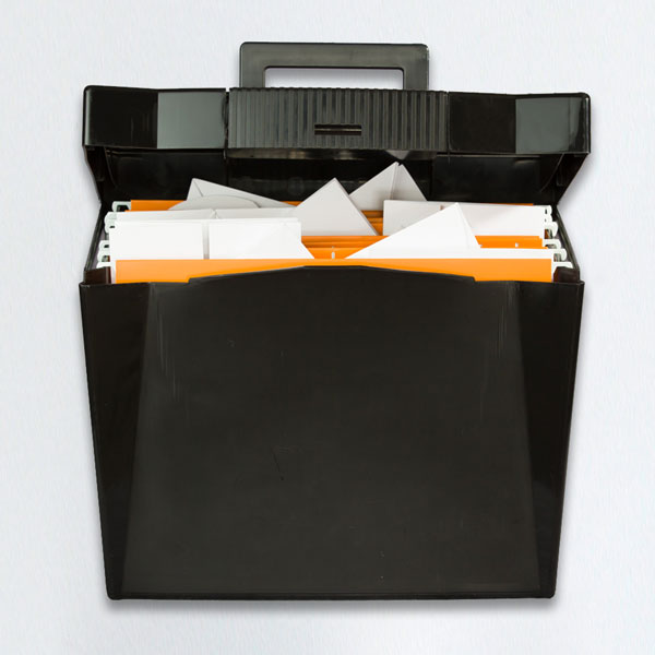
Figure 3: The Fold File carry case with 40 blank folded paper samples
The White Tool for the Job
Your “blank canvas” is an integral part of your design, and deserves some attention. It’s great that we have so many options to choose from, but then again, 3,000 white sheets is a bit overwhelming. Heck, 100 white sheets is overwhelming. If you’re feeling lost, you can always ask your paper merchant or mill rep for guidance. But trust your intuition as well. You know your audience, your product, your message—and now you can match the qualities of your paper to those of your content for the perfect fit.
Commenting is easier and faster when you're logged in!

Recommended for you

Accessibility Checklist for Designers
From guidelines to good design: accessibility made simple without the jargon

Scanning Around with Gene: Take A Vacation in Paradise
When I was in fourth grade, each student was assigned one of the 50 states. Duri...

Tip of the Week: Using Discretionary Line Breaks
How to use discretionary line breaks to avoid bad breaks when using en spaces an...