


If you’re working on a document that contains any kind of math in the text, even just dimensions like “8.5 × 11,” you should be using the correct math symbols. You wouldn’t use inch marks where quotation marks are needed, right? So don’t use a lowercase x when you need a multiplication sign, which looks much different in most fonts (especially serifs).
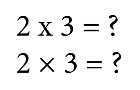
See the difference?
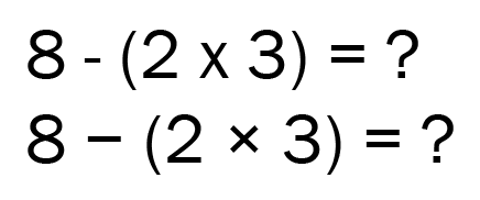
Ditto for minus signs, which are usually much wider than the hyphens that sometimes get used instead.
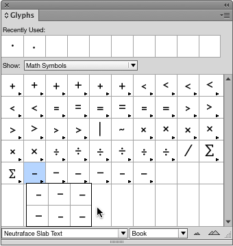
Likewise, multiplication dots are found in most commercial fonts, and are usually a lot smaller than a standard bullet character.

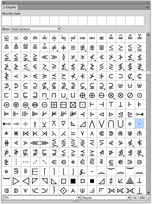
Use InDesign’s Glyphs panel and choose Show: Math Symbols to see all your options in the font you’re using. Some fonts include lots of math glyphs. For example, Neutraface gives you six versions of each of the basic math symbols.
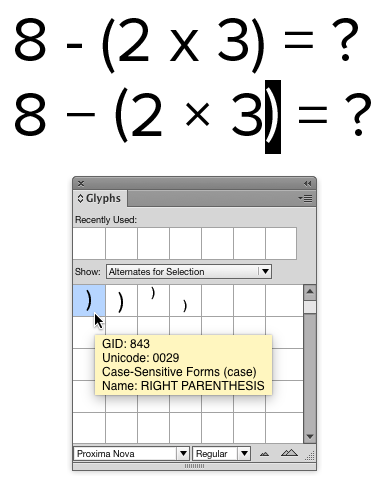
Case-sensitive glyphs like the parentheses in the bottom example below can also make for better looking math. In this case, standard parentheses are too low and not vertically centered on the numbers.
Need a math symbol that’s not in any of your current fonts? Check out STIX fonts (available for free download at their website or at Adobe Fonts), which contain thousands of math glyphs.
Commenting is easier and faster when you're logged in!

Recommended for you

Illustrator Downloadable: Cozy Plaid Pattern Set and Palette
Use this Illustrator downloadable to evoke cozy warm feelings in your vector art...
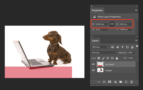
How to Find the Size of a Layer in Photoshop
Learn how to find the exact pixel dimensions of a layer in Photoshop!

Tip of the Week: Gridify Magic
This tip was sent to Tip of the Week email subscribers on November 19, 2015. Sig...