
The Art of Business: Logo Lessons

Before you blast an angry email my way, let me explain. I’m involved in a (very) non-profit teen suicide prevention organization called Five Alive. We have big dreams, many of which depend on the attention a successful logo can bring. But because our budget is so small, we knew we couldn’t afford the usual logo-design process. Instead, we posted our specs on Sitepoint.
Sitepoint allows clients to post requests for logos, identities, Flash animations, Web sites, or whatever is needed. Designers then compete for compensation by submitting designs based on the client specs. The designers who want to submit their ideas do quite a bit of work without any guarantee of pay. In fact, all but one will receive no compensation for their time and effort. If it weren’t for this struggling non-profit, I wouldn’t have worked this way. [Editor’s note — We understand that Eric’s controversial choice may generate strong reactions from readers of this column. We hope you share those by clicking on the voxbox icon to the left of the article. We’ll be monitoring the conversation closely.]
That being said, I learned a lot from the experience of assessing, providing feedback, and ultimately selecting a logo from the approximately one hundred submitted. This article is about those lessons, which can help any designer work more successfully with clients.
Five Things
But first, a little more about the project. When it comes to suicide prevention, most people are clueless. We have CPR classes, driving safety classes, water lifesaving classes, but nothing to teach kids how to help prevent the third leading cause of death among young adults 15 to 24 years old. Five Alive’s goal is to teach every teen in America (and beyond) the five things to do if they fear a friend is considering suicide:
Take it seriously
Know the warning signs
Make no promises of secrecy
Know where to turn
Act fast
You can learn more at our Web site.
The Brief
Five Alive envisions a multimedia teen awareness campaign with Web sites, t-shirts, concert booths, major celebrity endorsements, bumper stickers — you name it — all driven by the Five Alive logo. To achieve those ends, we posted the following summary on Sitepoint that we hoped would result in a winner of a logo.
Design Brief: LOGO — Five Alive Teen Suicide Prevention Awareness Campaign.
National non-profit campaign aims to teach ALL teens and college students the warning signs of suicide.
Summary: Need EDGY TEEN LOGO!!! Vector-based, to be used widely on Web sites, buttons, bumper stickers, t-shirts, wrist bands, etc.
Description: Every 100 minutes a teenager in America commits suicide. Our non-profit, privately funded campaign seeks to greatly reduce these numbers with a national teen awareness campaign. The program does one thing simply: teach kids how to help other kids considering suicide.
Logo needs to be bold, vibrant, compelling, and appeal to a young audience 14 to 24 years old. Logo should include both Five Alive name and the link to a Web address. Consult your edgy, radical inner teen.
This could develop into a continued relationship for Web site and collateral material. Plus it’s a really great cause.
Desired Style: Radical/Bold/Edgy
Winning design: $225
The Process
It was a lot of fun watching the designs roll in. We received submissions from designers from Indonesia to Israel, Oregon to Florida, and from pros and amateurs alike. Some concepts were great and some less so, but they all provided new ways of thinking about Five Alive and how the logo might look.
I conscripted Jim Nichols, my good friend and great illustrator, to help judge, review, and articulate suggestions for designers. And we conferred with an informal group of teenagers, some with art aspirations of their own. The entire contest spanned seven days, and during that week, we asked for several revisions from the designers of our most favorite entries. We tried to give every designer feedback, and we added information to our general summary as the contest went on to help clarify points.
Lesson #1
Although our design specs called for a radical, bold, and edgy design, several designers submitted logos that were the opposite. We don’t have the rights to post those images here, but you can view one of them at https://contests.sitepoint.com/contests/3176/entries/187287.medium.jpg.
Seeing submissions like this made me come up with the fundamental but often ignored lesson #1:
Follow the specs.
Lesson #2
One of the very first designs to pop up showed great potential: https://contests.sitepoint.com/contests/3176/entries/186963.jpg
We loved the arresting image; the clear and provocative, iconic nature of the logo; and the cool colors. However, Jim pointed out that the hand looked like a paw or cave art.
And so we asked the designer to modify the design with these instructions: “We love the concept, but most comments are about the hand print, mistaken for a paw print or cave art. Could you tweak the fingers to make it look more like a human hand (but still retaining the beautiful artistic rendering you’ve created)? Finally could you try a color other than copper? As we’re afraid of having trouble reproducing that color on uneven surfaces and different media.”
In response, we got this: https://contests.sitepoint.com/contests/3176/entries/189923.medium.jpg
We felt that adding palm prints didn’t address the issue of the hand, and the design was losing its distinction. However, the design remained a top candidate.
We also were intrigued with this initial design: https://contests.sitepoint.com/contests/3176/entries/187632.jpg
And so we wrote the designer back with this: “This has some very great possibilities, very iconic. It seems like the bottom of the V is in perspective but the top is not. Is it possible to put the top and the text in perspective as well.”
A few hours later the designer posted this: https://contests.sitepoint.com/contests/3176/entries/188192.jpg
Both the palm print and the V are examples of promising initial concepts that we felt (and, boy, is everything subjective) did not improve in the second iteration, which brings up lesson #2:
Make sure every iteration is an improvement over the previous.
Lesson #3
Then this design came in:
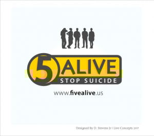
Our group of teens really liked it. One of the questions we asked the teens about every design was, “Would you wear this on a t-shirt?” This design was the first to get a unanimous “Yes.”
Still, it wasn’t quite as distinctive as we felt it could be. We asked for revisions, and the designer came back with this:
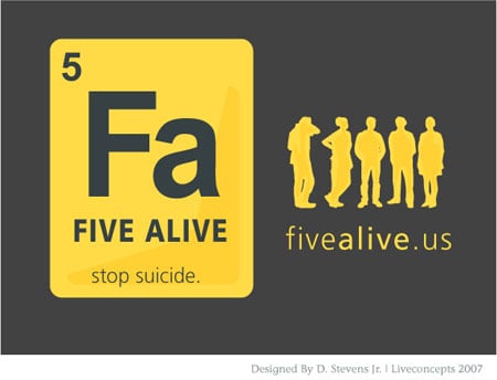
The teens really dug the revision. But we had one fear: It looked too much like the Periodic Table on which it was riffing, and we didn’t want Five Alive to feel like a science project. So we sent this instruction: “Is there something you can do to enliven the text or give the logo a bit more energy?”
Within hours the designer came back with these:

Nice iterations, but still not quite there.
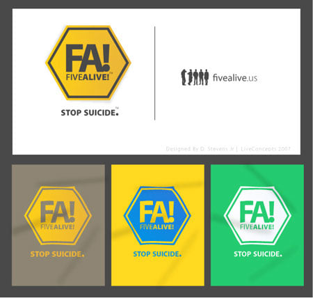
Then the designer did something special. He showed us a number of variations and applied them, so we could see them in action:

And finally, he posted this:

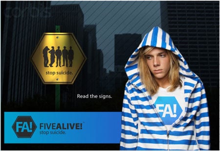
No logo lives in a vacuum. The designer, Darrell, a freshman at Florida State University, knew this and had articulated his concepts by incorporating them into a campaign because he knew that were we were ultimately headed in that direction. He anticipated our need and he imagined what we could do with the design, and in doing so, he acted as a consultant, not just a designer, which brings us to the all-important lesson #3:
Extend the design with visions of how it can be used.
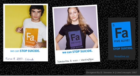
Not surprisingly, we awarded Darrell the prize money for his original design. We’re in the process of building the Five Alive Web site and campaign using elements from several of his submissions, and we truly hope to help reduce the rate of teen suicide. We also hope we can pay Darrell more money, which he richly deserves, as do all the designers who participated in our experiment.
To see the entire design contest, go to https://contests.sitepoint.com/contests/3176.
As for Sitepoint itself, it’s worth spending an hour or so tooling around the site to witness the sheer activity taking place, if nothing else. Here are some observations from this side of the client/designer relationship: Sitepoint attracts a wide range of designers — moonlighters looking for extra cash, late-night design-freak insomniacs, students hoping to break in, stay-at-home parents with talent, and overseas artists for whom $225 is a month’s wage. Designers were extremely responsive. The competition was intense but the atmosphere genial. And as for the number of designs submitted? As Stalin once said, “Quantity has a quality all its own.”
All of which drive home the point I made in a previous column: It’s the value-add of consultation and high quality that will differentiate you from what is becoming, regrettably, a mass market for design services.
This article was last modified on December 14, 2022
This article was first published on October 1, 2007
Commenting is easier and faster when you're logged in!

Recommended for you

Acrobat Tip: Make Last-Minute Corrections
An object you create in Acrobat, such as a link or a form field, can be selected...

Tip of the Week: Copying and Pasting Guides
Guides can be copied and pasted in InDesign, just like regular objects!

Creative Place and Story Linking
This blog-post gives an example of how InDesign CS5.5's new Linked Story feature...