




This article appears in Issue 59 of CreativePro Magazine.
Throughout this series, several themes have recurred: study graphic design history, obsess over typography, respect white space, use grids, understand color, learn by making things yourself, keep things as simple as the problem allows. These may seem like individual pieces of advice, each addressing a different aspect of graphic design, but actually they are all part of the rules.
Rules can make designers uneasy. We chose a creative profession because we enjoy solving problems in original ways, so the notion of rules can sound restrictive or even anti-creative. Yet every mature discipline accumulates knowledge over time. Architects understand structural principles that stop buildings from collapsing. Musicians study harmony before improvising. Chefs master classical techniques before inventing new dishes.
Graphic design is no different. Centuries of printers, typographers, engravers, illustrators, and designers have gradually discovered what helps people read, understand, and remember visual information. Those discoveries evolved into enduring principles that have guided generations of designers in creating clearer, more effective communication.
Borrowed Wisdom
It is important to understand what these rules are—and what they are not. They are not laws that must never be broken, nor are they arbitrary conventions handed down by design schools to cramp your style. They are observations that have survived because they tend to make solving problems easier.
Together they represent centuries of accumulated experience, and every generation of designers inherits that experience. We’re not starting out with a blank sheet, but rather beginning with thousands of years of experimentation behind us. Johannes Gutenberg transformed printing, Claude Garamond refined type design, Jan Tschichold codified modern typography, Josef Müller-Brockmann demonstrated the power of grids, and Massimo Vignelli showed how disciplined systems could solve remarkably complex communication problems. Their work, and that of countless others, forms part of the foundation upon which we build. Studying that history is not an exercise in nostalgia. It is an opportunity to borrow the wisdom of those who have already solved many of the problems we still face today.

Insurance, but No Guarantee
These rules are best understood as insurance rather than guarantees. Following them won’t automatically produce great work, but it will dramatically reduce the likelihood of producing bad work. A designer who establishes a clear hierarchy, uses consistent spacing, exercises restraint with typography, and pays attention to alignment may still create something uninspiring, but it is unlikely to be confusing or exhausting to read. Conversely, work filled with inconsistent spacing, weak contrast, random type choices and chaotic alignment occasionally succeeds, but usually despite those decisions rather than because of them. The rules simply improve your odds.
Break with Intention
We’ve all heard—or prescribed—the advice “learn the rules before you break them.” It’s repeated so often that it risks becoming meaningless, but its message is important. There’s a profound difference between breaking a rule intentionally and breaking it accidentally. A designer might deliberately abandon perfect alignment to create tension, overload a composition to communicate chaos, or interrupt a rigid grid to draw attention to a crucial message. These decisions are made with purpose and in full awareness of the convention being challenged.
Breaking rules without understanding them is something else entirely. Ignoring hierarchy because you have never studied hierarchy is not experimentation; it’s simply inexperience. The most successful examples of rule breaking are often surprisingly restrained because they leave everything else intact. The exception becomes meaningful precisely because the surrounding design is disciplined. If every rule is ignored, nothing feels intentional. The work does not appear bold or original—it merely appears confused.
Fewer Options, More Depth
Another lesson that many designers discover over time is that unlimited freedom can be surprisingly unhelpful. Faced with endless possibilities, it becomes easy to spend more time decorating than thinking. Constraints have the opposite effect. By limiting your options, you force yourself to concentrate on the quality of your decisions rather than the quantity of your choices. Try designing a poster using only one typeface, or one weight, or a single color, or only black and white. The removal of options compels you to think more deeply about hierarchy, composition, rhythm, and proportion.
Professional design offers countless examples of creativity flourishing within strict constraints. Book designers must create visual interest while working within fixed page sizes and margins. Newspaper designers balance clarity against relentless deadlines and rigid column structures. Packaging designers often have to accommodate mandatory legal information within tiny physical spaces. Election ballot designers work under extraordinary constraints because even subtle typographic decisions can influence how effectively people cast their votes. None of these designers enjoys unlimited freedom, yet many produce exceptional work precisely because the problem is so tightly defined.

Transit maps and signage provide some of design history’s most valuable lessons in working within constraints. The London Underground map created by Harry Beck demonstrates how a willingness to prioritize communication over convention transformed a complex transport network into an intuitive visual system. Similarly, Massimo Vignelli’s work on the New York subway signage system showed how disciplined typography and consistent structure could bring clarity to an overwhelming amount of information. These projects succeeded not because designers ignored constraints, but because they understood how to use them.
The Common Goal
If this series can be reduced to a single principle, it is this: Make every decision serve the communication. Every design decision should be justified by what it contributes to the audience’s understanding. Typography should support the message rather than compete with it. Color should reinforce meaning rather than simply provide decoration. Images should clarify ideas rather than fill empty space.
Consider an emergency evacuation notice. Large headings are not chosen because they look dramatic but because they can be identified instantly under pressure. Red is used because it signals urgency. Icons replace paragraphs because visual symbols are processed more quickly than lengthy instructions. Every decision supports a single objective: helping people understand what to do as quickly as possible.
Compare that with a brochure for a luxury watch brand, an entirely different communication problem. Generous white space suggests exclusivity. Restrained typography conveys confidence. Subtle photography encourages careful attention to craftsmanship. A loud color palette or cluttered composition would undermine the very qualities the product is attempting to communicate. Again, every design decision exists to serve the message rather than the designer’s personal preferences.
The same principle applies everywhere. A restaurant menu should help diners make choices without frustration. A museum exhibition should guide visitors naturally through a sequence of information. An annual report should make complex financial data comprehensible. A charity website should make donating effortless. Even the simple decision to left-align body text is not an aesthetic preference but a recognition that readers generally find continuous text easier to follow when each line begins from a consistent position. Good design is less about making things look impressive, and more about making them work so well that the audience scarcely notices the effort behind them.
Always the Contrarians
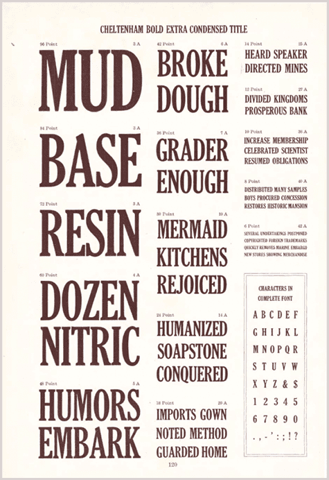
No discussion of principles would be complete without highlighting some examples that contradict those principles. While we might like to believe that good design is essential to success, reality is less flattering. History provides numerous examples of products, brands, and organizations that have prospered despite design decisions that many professionals would criticize. Trader Joe’s continues to enjoy remarkable commercial success despite branding that often appears visually inconsistent. The London 2012 Olympics became a memorable and hugely successful event despite years of controversy surrounding its logo. United States banknotes remain visually cluttered, historically layered, and inconsistent in comparison with many modern currencies, yet they continue to function perfectly well. Craigslist has looked outdated for much of its existence, yet became one of the internet’s most successful marketplaces. Many discount supermarket own-brand products deliberately employ crowded packaging and unsophisticated typography because appearing inexpensive forms part of the marketing strategy.
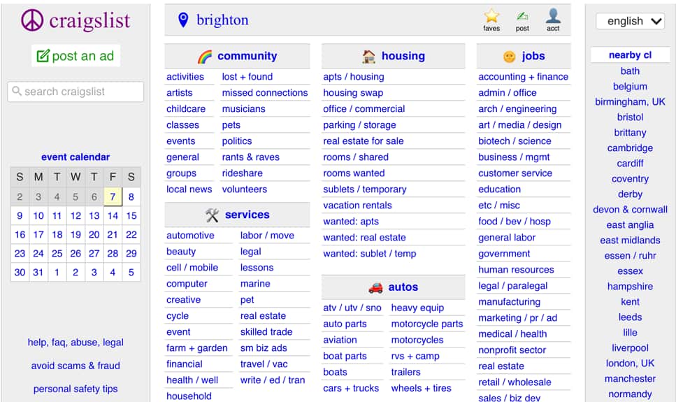
These examples are not arguments against good design. Rather, they are reminders that design exists within a much larger system. Price, convenience, habit, distribution, product quality, and brand recognition all influence success. Good design cannot compensate for a poor product, nor does poor design necessarily prevent an excellent product from succeeding. What good design does is improve the probability that communication will be effective, friction will be reduced, and trust will be strengthened.
This also explains why design principles should never become dogma. There is no universally perfect grid, no ideal typeface, and no correct amount of white space. Every principle exists in relation to a particular problem. Swiss Modernism solved certain communication challenges brilliantly. Victorian advertising posters solved entirely different ones through exuberance, density, and ornament. Editorial magazines, theater posters, children’s books, and museum exhibitions all demand different responses. Judgement lies in recognizing which principles deserve priority in each situation.
The Rules Are Tools
Good design, then, is not about following rules blindly. It is about understanding which rules matter, when they matter, and why they matter. The rules are tools, not chains. They exist to help us make better decisions, not to prevent us from making original ones. A designer with sound judgement understands when clarity should take precedence over expression, when restraint should yield to spectacle, and when breaking a convention genuinely strengthens the communication rather than simply drawing attention to itself.
Perhaps the greatest misconception about creativity is that originality requires inventing everything from scratch. But we advance by building upon what came before. Standing on the shoulders of giants does not diminish originality; it makes originality possible. No musician becomes less creative by studying Bach, no architect weakens their imagination by understanding classical proportion, and no designer becomes less innovative by learning typography from the masters. Knowledge expands the range of choices available. The more deeply we understand the principles developed by those who came before us, the more confidently we can decide when to embrace them, adapt them, or deliberately depart from them. Originality does not emerge from ignoring history but from contributing something new to an ongoing conversation.
As this series concludes, that idea seems more important than any individual tip or technique. Software will continue to evolve. Artificial intelligence will transform parts of our profession. Trends will appear, flourish, and disappear. Yet the central challenge of graphic design remains remarkably constant: arranging words, images, color, and space so that other human beings understand something more clearly than they did before.
The rules matter because they embody generations of accumulated wisdom. Learn them thoroughly enough that they become instinctive. Study the designers who developed them, understand the problems they were trying to solve, and recognize why their solutions have endured. Then, when you choose to ignore a rule, do so deliberately, confidently, and always in service of the communication rather than simply for the sake of being different.
There Is No End
Ultimately, becoming a better graphic designer is not about memorizing principles or collecting techniques. It is about developing judgement—judgement shaped through study, practice, observation, and reflection. Every project offers another opportunity to ask “Does this communicate more clearly?” There is no point at which you finally arrive as a designer. The journey is one of continually refining your judgement, one project, one decision, and one lesson at a time.
Commenting is easier and faster when you're logged in!

Recommended for you

From Type to Table: Different Medium, Same Design Eye
Our longtime typography expert explores how the core principles of design transl...

Lightroom CC for Designers
If you’re a designer, you’d be forgiven if you responded to Adobe’s announcement...

Designing with Grids
Maya P. Lim shows how working with a grid opens up all kinds of creative design...