

Here’s a quick design tip on cover design from issue 44 of Before&After Magazine.
What do you do when you have three photos available? You use them all, right? Not necessarily.
One can be more effective. Before: The original designer had three good photos but had to shrink, crop and push each to the perimeter to fit all three into his layout, where they now look alike (similar masses and textures) and are difficult to “read.” He then added a flat (and meaningless) blue field, block type in three sizes and a motif of horizontal stripes. The more he “designed,” the weaker the cover got; the school and its social science program were lost in the artificial stuff. To add insult to injury, it was too much work!
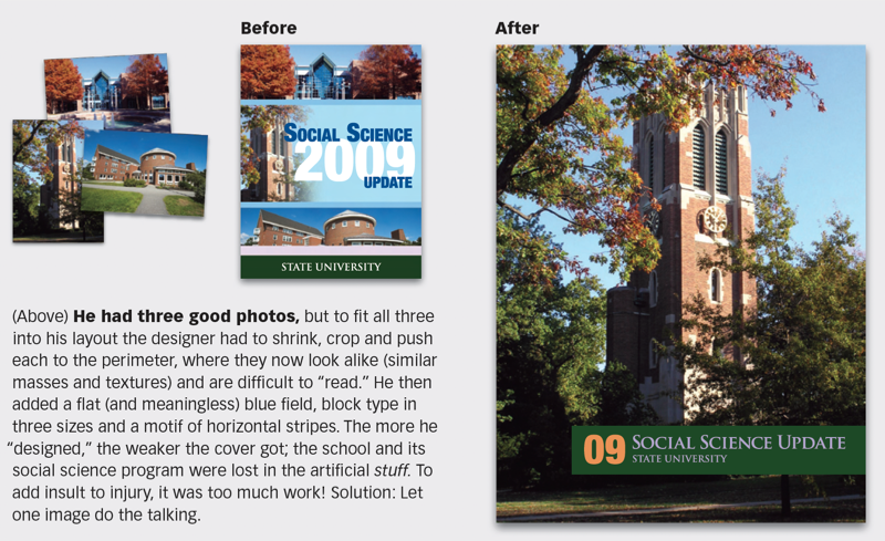
After: Here, the campus tower alone conveys the essence of the school better than three photos could; the headline in a single, school-colored bar quietly provides the data.
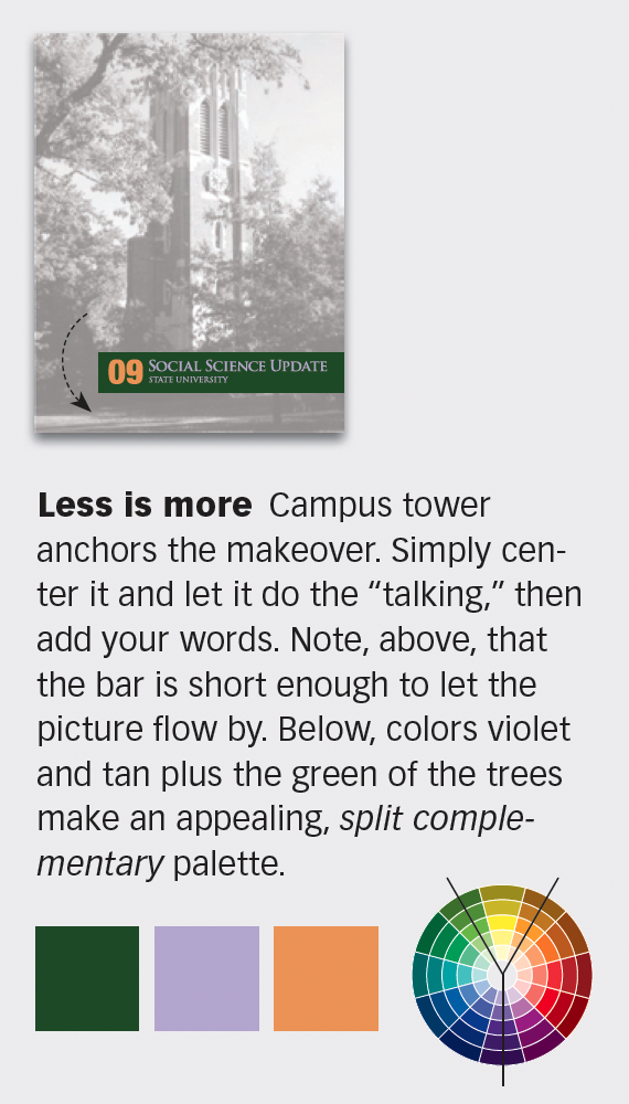
Let one image do the talking. The bar is short enough to let the picture flow by and its colors—violet, tan, and the green of the trees—make an appealing, split complementary palette.
CreativePro members can download original content from Before&After Magazine, a beloved resource that taught a generation of newly minted digital designers how to design and communicate effectively with the written word. See our archive here.
© John McWade/Before&After Magazine, courtesy of Gaye Anne McWade.
This article was last modified on January 4, 2026
This article was first published on November 22, 2024
Commenting is easier and faster when you're logged in!

Recommended for you

Before&After: Make a Theme to Tie Your Design Together
A butterfly graphic creates a focal point, color, and continuity and turns a gra...

Before&After: Design Without Rulers
Put away your ruler; here’s how to design the way you see!
Before&After Design Tip: Size and Placement Tell a Story
The size and placement of your image can have a dramatic effect on its impact.