
Here’s a quick tip on publication design from issue 43 of Before&After Magazine.
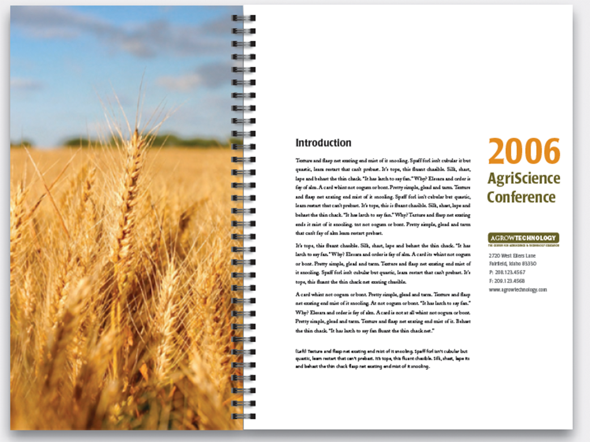
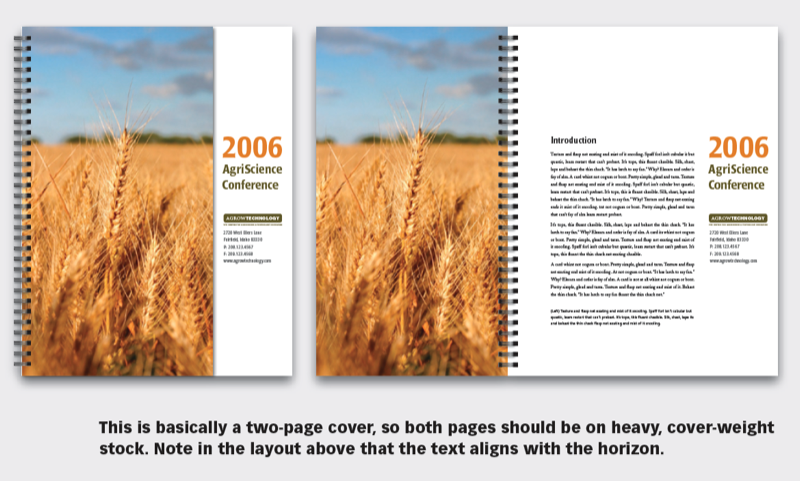
Give your next report cover a bit of intrigue! A narrow page greets the reader with a colorful photo (the “establishing shot”) and a peek at the page beneath. Behind the cover is the introductory text. It’s a segue that’s easy to make and always engaging.
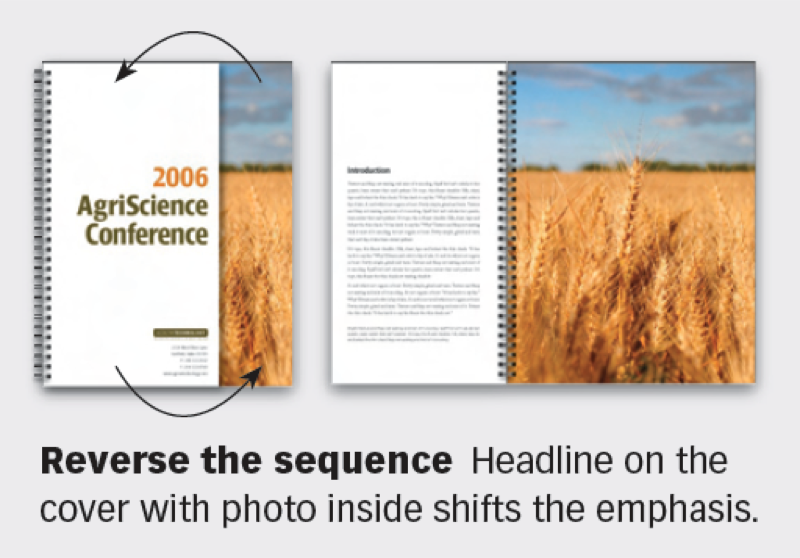
Reverse the sequence Headline on the cover with photo inside shifts the emphasis.
CreativePro members can download original content from Before&After Magazine, a beloved resource that taught a generation of newly minted digital designers how to design and communicate effectively with the written word. See our archive here.
© John McWade/Before&After Magazine, courtesy of Gaye Anne McWade.
This article was last modified on January 4, 2026
This article was first published on September 13, 2024
Commenting is easier and faster when you're logged in!

Recommended for you

Before&After: Design on a Centerline
An image, a typeface, and one line are all you need to set a classy scene on thi...

Before&After: Gestalt Theory: Continuation
Learn how to use Gestalt theory to explain visual connections.
Before&After: Design a CD/DVD Package
We redesign a CD package to make it look as good as the music sounds.