
Here’s a quick design tip for creating a consistent look on letterheads, envelopes, and business cards from issue 41 of Before&After Magazine.
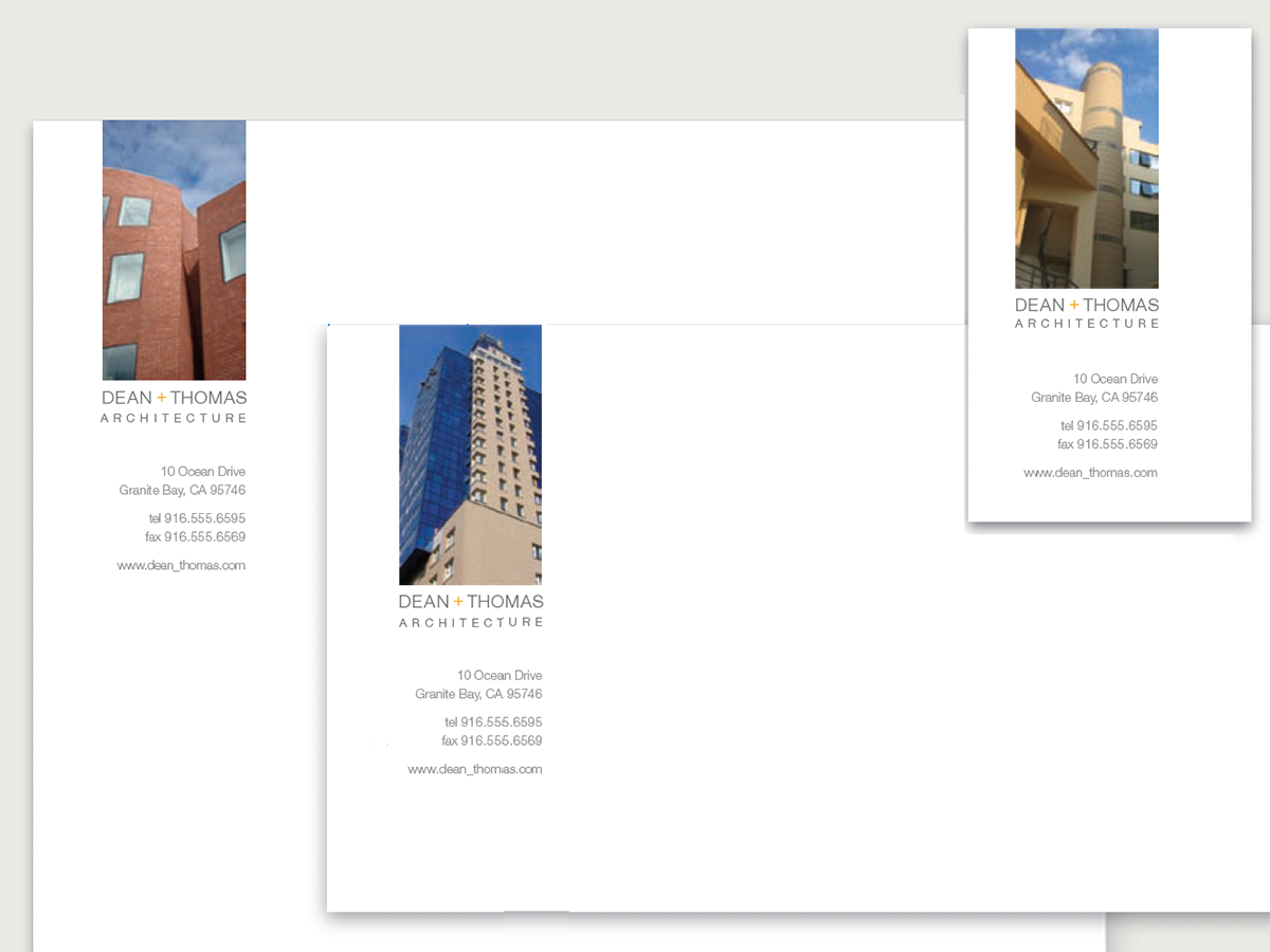
Instead of designing a conventional logo, this firm chose three projects to adorn its stationery, effectively creating a photographic logo that’s nearly as good as a brochure.
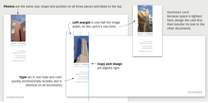
The visual key is consistency of type, size, placement, alignment and color from letterhead to envelope to business card.
CreativePro members can download original content from Before&After Magazine, a beloved resource that taught a generation of newly minted digital designers how to design and communicate effectively with the written word. See our archive here.
© John McWade/Before&After Magazine, courtesy of Gaye Anne McWade.
This article was last modified on January 3, 2026
This article was first published on March 21, 2025
Commenting is easier and faster when you're logged in!

Recommended for you

Before&After: Convey the Energy of the Moment
A still photo is real life on pause, so to speak. Here's how to add energy to yo...

Before&After: Use Photos in Skinny Spaces
Skinny spaces are everywhere—web banners, newsletter nameplates, single-column a...
Before&After: How to Find the Perfect Color
Hidden in your photo is the color palette you need. Here’s how to get it out.