
Five Super Slide Makeover Techniques
Team up with the “Fantastic Five” to become a presentation design superhero.

This article appears in Issue 51 of CreativePro Magazine.
In this article, I’ll share five quick exercises to reshape boring, text-heavy slides with visualized, story-first thinking. They’re all easy to execute and designed to make a lasting impact. Master these techniques, and you’ll feel like you’ve gained amazing new slide design superpowers.
1. Find the Idea Beneath the Bullets
Your content is solid. But, is it in the most presentation-friendly format? This isn’t about fixing a bad slide; it’s about surfacing the core message so your audience quickly understands what matters. Clarifying that message sets the stage for a more focused, effective story.
Identify one slide for your makeover
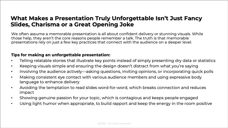
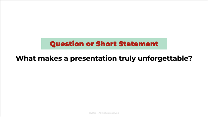
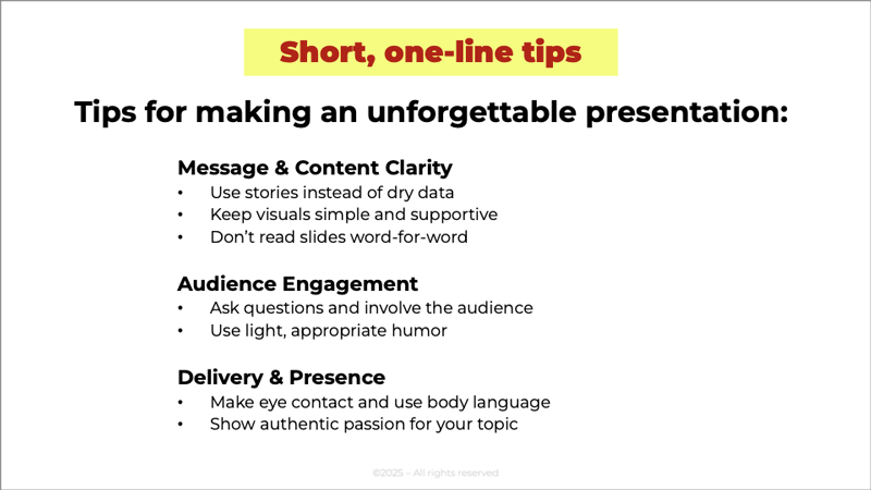
Choose one bulleted slide from your deck—ideally one that feels crowded, text-heavy, or a bit unclear. Look for a slide packed with bullet points or dense content that tries to do too much at once. That’s a perfect candidate for a quick, story-focused refresh (Figure 1).
Clarify the main idea
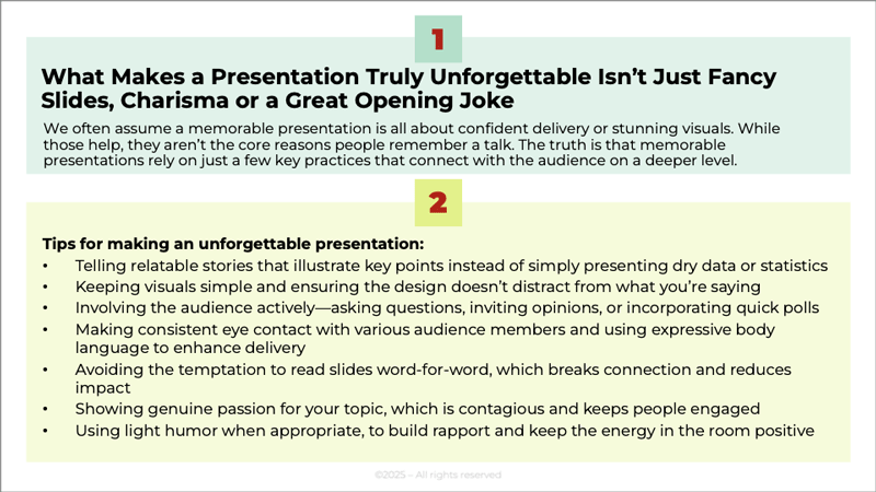
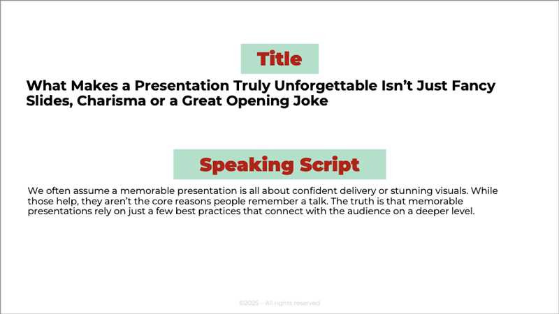
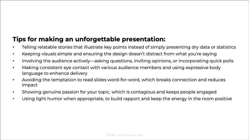
Read through your bullet points and highlight the key ideas and most important information. Ask yourself: What’s the one big idea I want my audience to remember from this slide? That’s your core message. If the slide contains multiple messages, start with the highest-level idea—the one that ties everything together. Move any extra details into the speaker notes for now. You can always bring it back later if needed. In Figure 2 I’ve divided mine into two sections.
 alt=”” class=”wp-image-14425840″/>
In this next example, the slide title conveys the core idea, though it’s a bit too long. The subtitle or short paragraph beneath it works as a built-in speaking prompt (Figure 3).
Turn your title into a clear statement or compelling question
Avoid generic labels like Overview or Results. Instead, write a full-sentence title or pose a thought-provoking question. This helps your audience instantly grasp your point and frames the content in a way that encourages interest. If you ask a question in your title, be sure to answer it during your presentation. It’s a powerful way to close the loop (Figure 4).
Tip: Framing your title as a question encourages your audience to think actively about the topic and process it through their own experiences.
By simplifying your slide and clarifying the core message, you’ve created something that can stand on its own—as a title slide, a section divider, or the foundation for your story. Every slide should have a purpose, and clarity makes that purpose easy for your audience to understand.
2. Create Clear Categories and Hierarchy to Organize your Slide Content
Let’s focus on shaping that content into a clean, audience-friendly structure. This means grouping related points, deciding what stays on the slide, and giving yourself permission to make more slides—not fewer. One idea per slide helps your message land, and any long explanations can live comfortably in your speaker notes.
Group related ideas
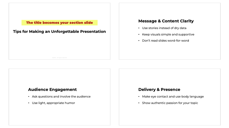
Figure 5 shows our starting slide.
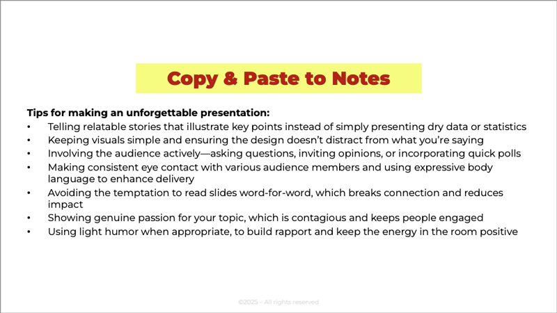
Before editing the copy, copy and paste the original into the notes section (Figure 6).
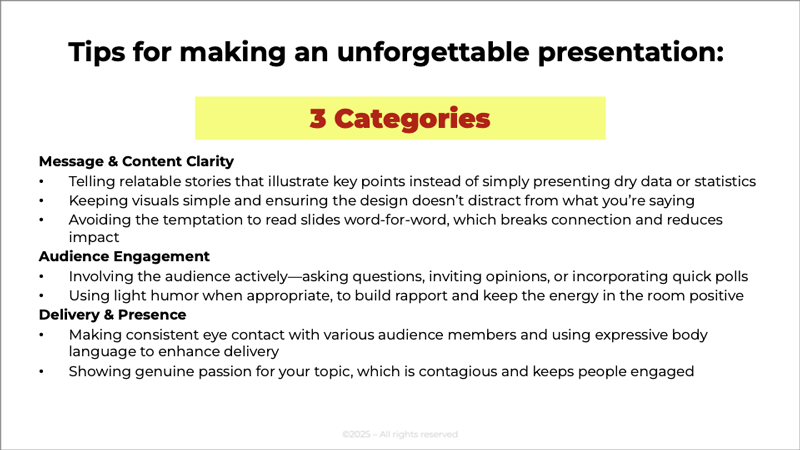
Look at your bullet points, and sort them into categories or themes. Items that naturally belong together should support the same part of your story. This helps you see what flows where—and what doesn’t. Aim for three categories when possible; people more easily remember things grouped in threes (Figure 7).
Tip: Use AI to categorize your bulleted information. Ask it to group your bullet points into three categories, each with a short title.
Condense the copy
Shorten each point to a clean phrase or brief statement. Move any detailed explanations or examples into the notes section. Your audience sees the essence; you keep the depth. Each point should fit on one line with a legible font size. Take a look at the example (Figure 8).
Tip: Use AI to condense your bullet points into short, simplified points for your slide.
Always check for accuracy and make sure nothing important was lost.
By organizing your slide into clear categories and a simple hierarchy, you make your message easier for your audience to absorb and remember. Clean structure reduces cognitive load, gives each idea room to breathe, and sets you up for stronger storytelling later in the deck. When your content is grouped, condensed, and intentionally arranged, your slide stops overwhelming and starts communicating.
3. Breaking Up and Spacing Out
Sometimes a single slide tries to do way too much. Breaking it up gives each idea the space it needs and makes your message easier to follow right away.
Give each idea its own slide
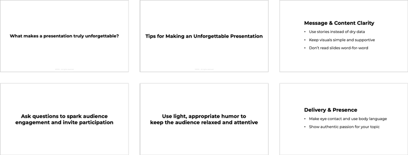
Choose one idea per slide, and don’t hesitate to create more slides as you go. Clarity always beats density. Your audience never knows (and doesn’t care) how many slides you have; they see only the one you’re showing. When each idea has its own space, your message becomes easier to follow, less overwhelming, and far more effective. In Figure 9, I’ve given each category its own slide.
Take it to the next level
You can also make each individual bullet point its own slide. Presenting one idea at a time gives your audience the clarity they need to stay focused and engaged. In Figure 10, I’ve broken the Audience Engagement slide into separate slides, turning each point into a short sentence.

Why it works
By breaking a dense slide into multiple, focused moments, you’re not just reorganizing—you’re turning your content into a story. Each slide becomes a small scene, and when you present them one after another, they move quickly and naturally, almost like frames in a film. This pacing keeps your audience engaged, makes your message easier to absorb, and transforms even the simplest ideas into something that feels intentional, dynamic, and memorable.
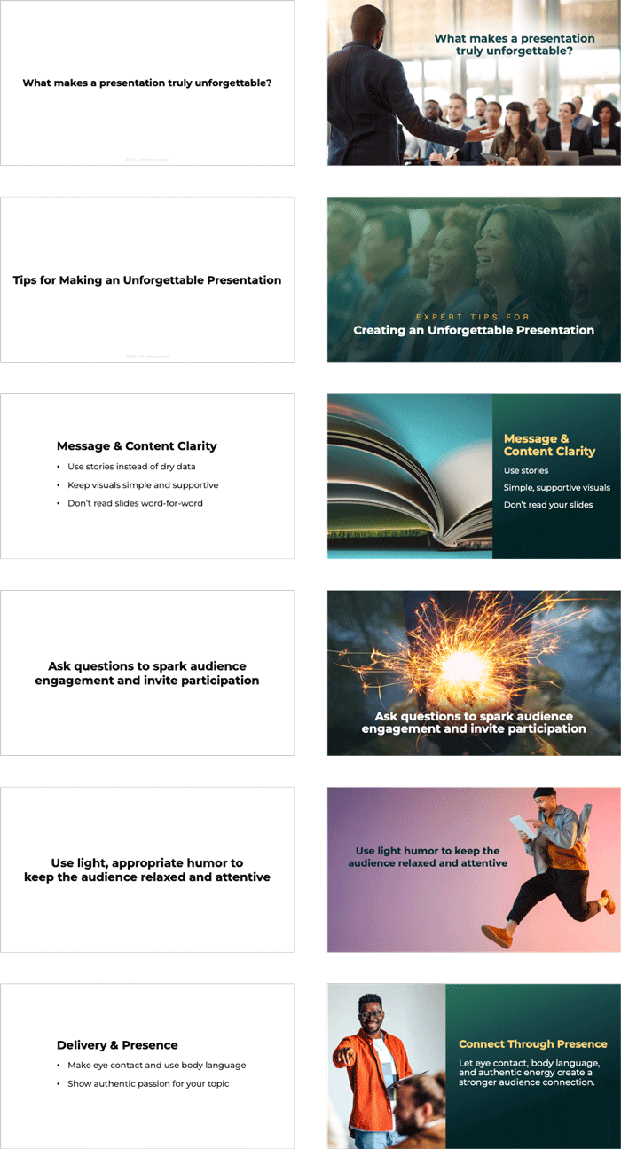
4. Use Visuals to Bring Ideas to Life
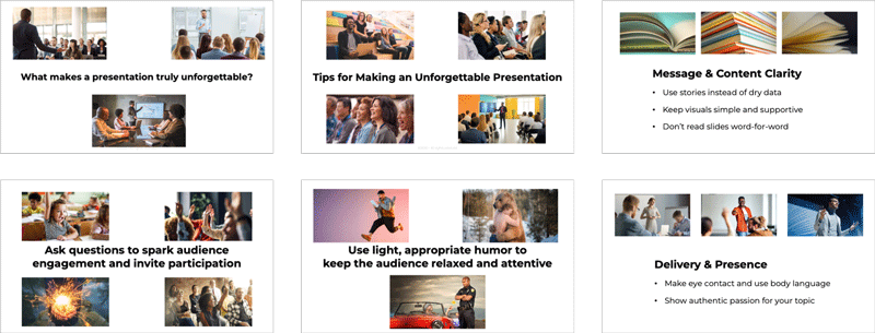
Visualizing your story is often the most enjoyable part of the process—but it can also take the most time. The goal isn’t to design perfect slides; it’s to break your message into visual moments your audience can instantly understand. When each idea has a visual anchor, your story becomes easier to follow, more engaging, and far more impactful. Take a look at the slides we need to visualize (Figure 11).
Find visuals that support each slide
For each chunk, select a visual that reinforces the idea. In this exercise, we’ll use realistic photos. People relate to realistic images because they can see themselves in your story.
Image Match: Choose images that reflect the emotion or meaning behind each slide. Look for visuals that support the feeling you want to convey—curiosity, tension, simplicity, excitement—so the audience senses your message before you speak.
Keyword Search: Use keywords pulled directly from your content to guide your image search. Try nouns, verbs, emotions, or metaphors from your script or slide text to quickly find visuals that reinforce your idea.
Visual Fit: Pick visuals that communicate the idea as clearly as possible—whether metaphorical or literal. Choose whatever helps your audience understand the message fastest and with the least effort.
This is all about finding images that help your audience feel or see what you’re saying. I like using images with people in real environments. Figure 12 shows the slides with some images I found on stock photo sites.
Tip: If you use AI to generate images, keep authenticity in mind. People can sense when something feels “off.” Don’t pass an AI image off as real if it isn’t. Use it honestly and intentionally.
Visualizing your ideas is often the most time-consuming part of the slide design process—but also one of the most important. The right images can make your message clearer, more relatable, and far more memorable. Whether you use free or paid stock sites, choose visuals that communicate your idea effectively. The effort you put into strong visuals pays off every time.
5. Go Full Screen: Design Immersive Slides with One Clear Visual per Idea
When it comes to slide design, simplicity wins. A full-screen image is one of the easiest and most effective ways to create a clean, professional-looking slide. It removes visual clutter, keeps the focus on a single idea, and pulls your audience into the moment—as if they’re standing inside the story. One image per slide ensures nothing competes for attention, making the design process faster and more intuitive.
Choose one image per slide
Select a single strong image that represents your idea, emotion, or story moment. Avoid placing multiple visuals on one slide; competing images dilute meaning. One image, used well, communicates more powerfully than a collage ever could.
Fill the entire frame
Let the image take up the full screen on each slide. Full-bleed visuals feel cinematic and immersive, and they instantly elevate even the simplest presentation. This approach also minimizes layout decisions—no boxes, borders, or white space to manage.
If you choose to use bullet points, use an image that bleeds off the sides and set the background to one of your brand colors. Space the points so you can remove the bullets while keeping the text easy to read at a glance.
Use only the words that truly matter
Because you’re transforming a text-heavy slide, reduce the copy to the essential idea. A short headline or key phrase can anchor the meaning, while the full-screen image delivers the impact. It’s perfectly fine to have a slide with only an image or only minimal text.
Figure 13 shows the original slide, followed by the makeover. While designing your slides, it’s a great time to fine-tune your copy for clearer understanding and quick, at-a-glance readability.
Full-screen design turns your slides into moments—clean, focused, and impossible to ignore. By using one strong visual per slide, you simplify your design process, reduce clutter, and create a more immersive experience for your audience. When your slides feel like scenes instead of layouts, your entire presentation becomes more engaging, more memorable, and far easier to deliver.
The Fantastic Five to the Rescue
With these techniques, you can rescue even the most hopelessly dull, text-heavy slides, and transform them into engaging, story-focused visual experiences. Instead of overwhelming the audience, your design will captivate them, ensuring the message is not just seen, but remembered.
Commenting is easier and faster when you're logged in!

Recommended for you

Storytelling in PowerPoint
Learn how to build a compelling story for a successful presentation.

What PowerPoint for the Mac Can Do (That the PC Can’t)
The top 5 advantages that the Mac version of PowerPoint has over its Windows cou...

How to Quickly Duplicate Items and Slides in PowerPoint
Learn how to quickly duplicate individual items and slides in PowerPoint to quic...