
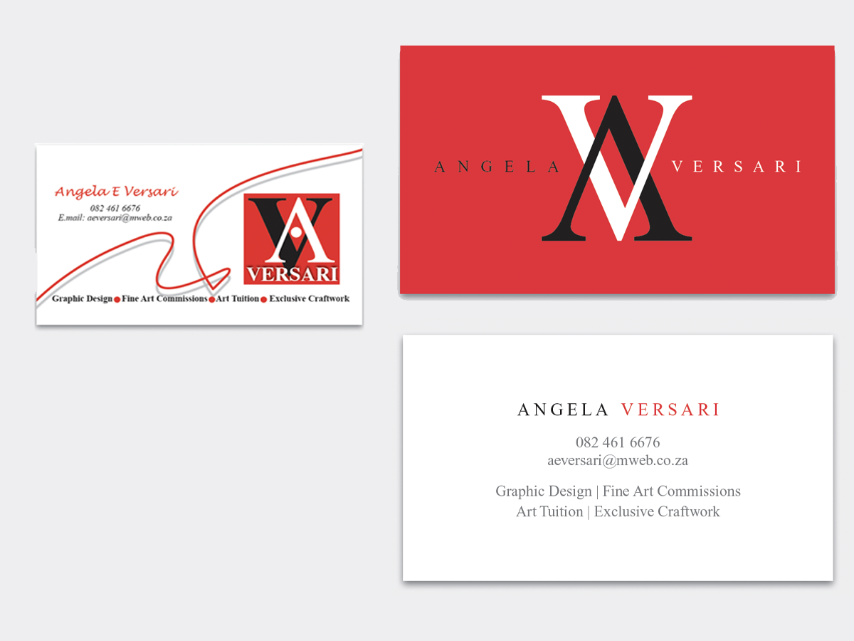
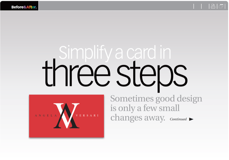
This business card uses a fine typeface, powerful colors, and a fortuitous pair of virtually mirror-image letters. But the design has too much going on. Let’s see how less stuff can make a better look. This 11-page article from issue 50 of Before&After Magazine illustrates how sometimes good design is only a few small changes away.
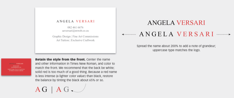
The original design of the card treats four elements — logo, name, text and squiggly line—as graphical equivalents, and arranges them without hierarchy. Problem is, they’re not equal but different. Make the logo the focal point and everything else secondary.
© John McWade/Before&After Magazine, courtesy of Gaye Anne McWade.
Commenting is easier and faster when you're logged in!

Recommended for you
Before&After: Gestalt Theory: Equilibrium
Equilibrium gives your design elements rest, stability, and permanence.

Get Many Images From One Original Photo
Did you realize that big photos have small photos hidden in the details—a collar...

Before&After: Design a Peekaboo Brochure
This brochure with a narrow front panel gives a peek at the inside, which opens...