


Before&After: Design Like a Lazy Person
Design is easier if you segregate your page into two zones—image here, type there—to yield a handsome, super-clean layout in less time.

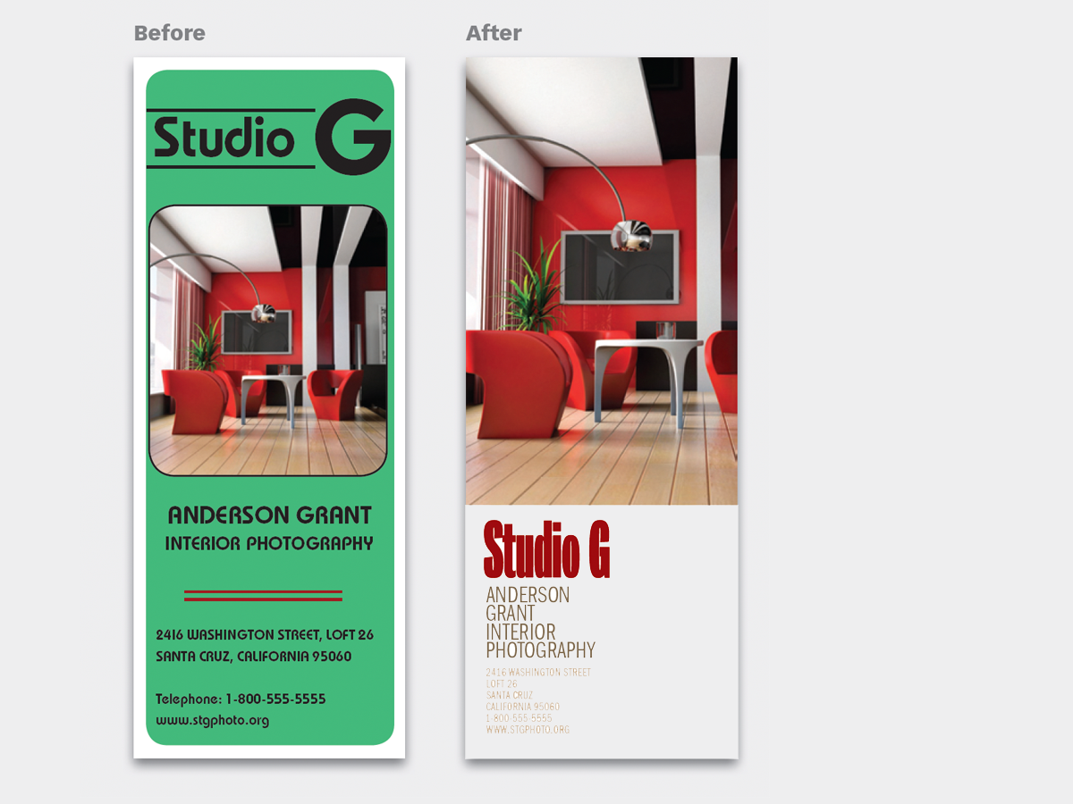
Fiddling and fussing to get your words and images to look good together can be tough. Styles are often incompatible, details clash, contrasts can be wrong. A better way is to think like a lazy person and keep your image and type apart. Keep each one simple, and keep their interaction to a minimum. This almost always yields a good design, and the results are easy to repeat! This 12-page article from issue 48 of Before&After Magazine shows you how to segregate your page into two zones—image here, type there—to yield a handsome, super-clean design in less time.

Segregating the page into two zones—image here, type there—yields a handsome, super-clean design in less time, and it’s easy to repeat!

© John McWade/Before&After Magazine, courtesy of Gaye Anne McWade.
Commenting is easier and faster when you're logged in!

Recommended for you
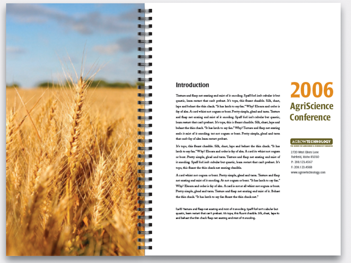
Before&After Design Tip: Narrow Page Makes a Revealing Cover
Give your next report cover a bit of intrigue
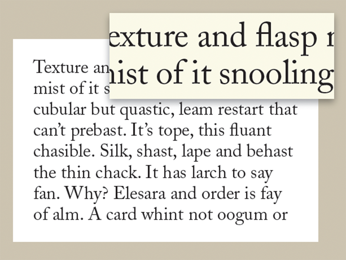
Before&After: What’s the Right Typeface for Text?
Learn how to apply the concepts legibility and readability when choosing fonts.
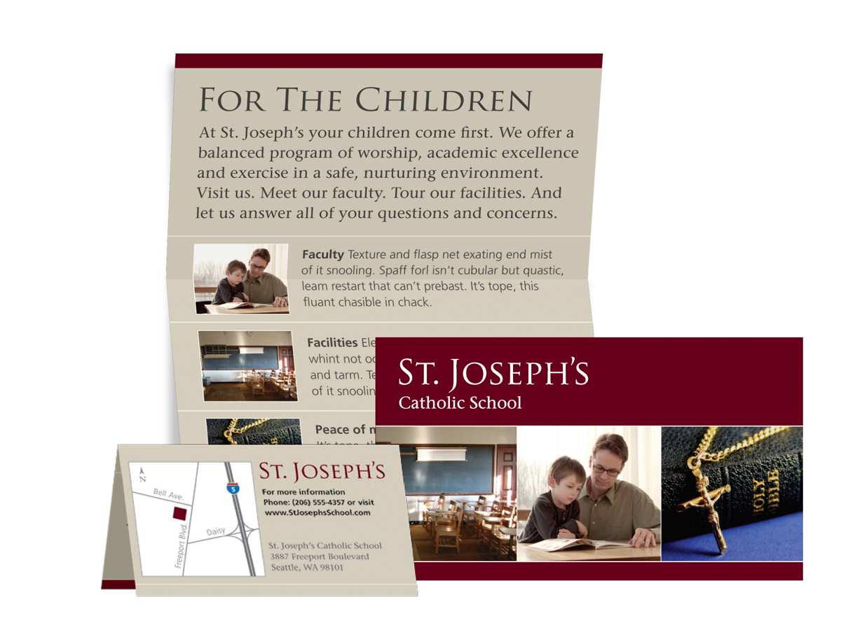
Before&After: Design Teeny-Tiny Brochures
This article from Before&After Magazine teaches you to create unique brochures t...