
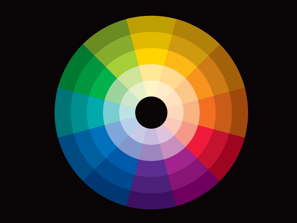
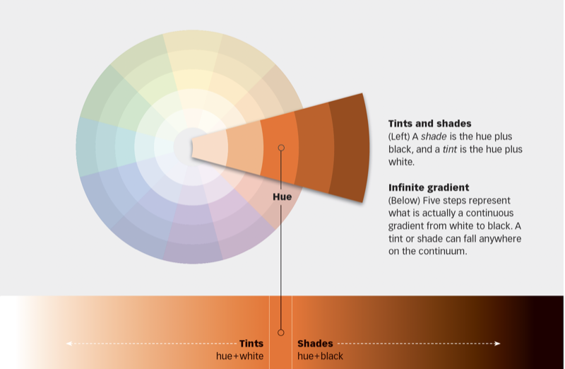
While we think of colors as independent—this blue, that red—a color is never seen alone but always in the context of other colors. Like a musical note, no one color is “good” or “bad.” Rather, it’s one part of a composition that as a whole is pleasing or not. The color wheel is our tool for understanding how colors relate to one another. This 19-page article from issue 45 of Before&After Magazine teaches you how to use the color wheel—our tool for understanding which colors go with what.

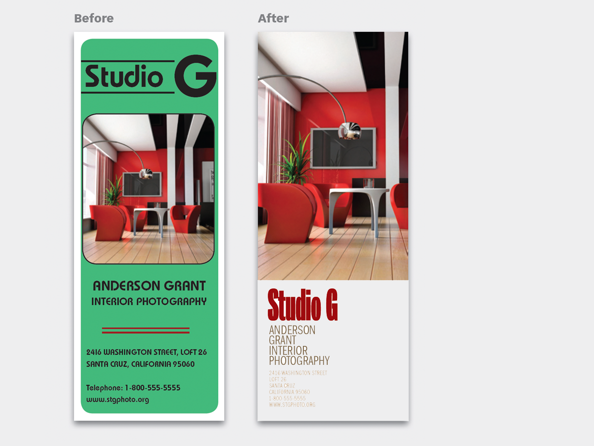
The amount of color matters. Palettes can be made warmer/ cooler, darker/lighter, stronger/ quieter and so on by using more or less of some colors.
© John McWade/Before&After Magazine, courtesy of Gaye Anne McWade.
Commenting is easier and faster when you're logged in!

Recommended for you

Before&After Design Tip: Don’t Trap the Space
Empty space surrounded by text and images can weaken your design.
Before&After: Design Like a Lazy Person
Design is easier if you segregate your page into two zones—image here, type ther...

Before&After: Design a Letterhead, Envelope, and Business Card
How to turn letterhead, envelope, and business card into a single visual presenc...