

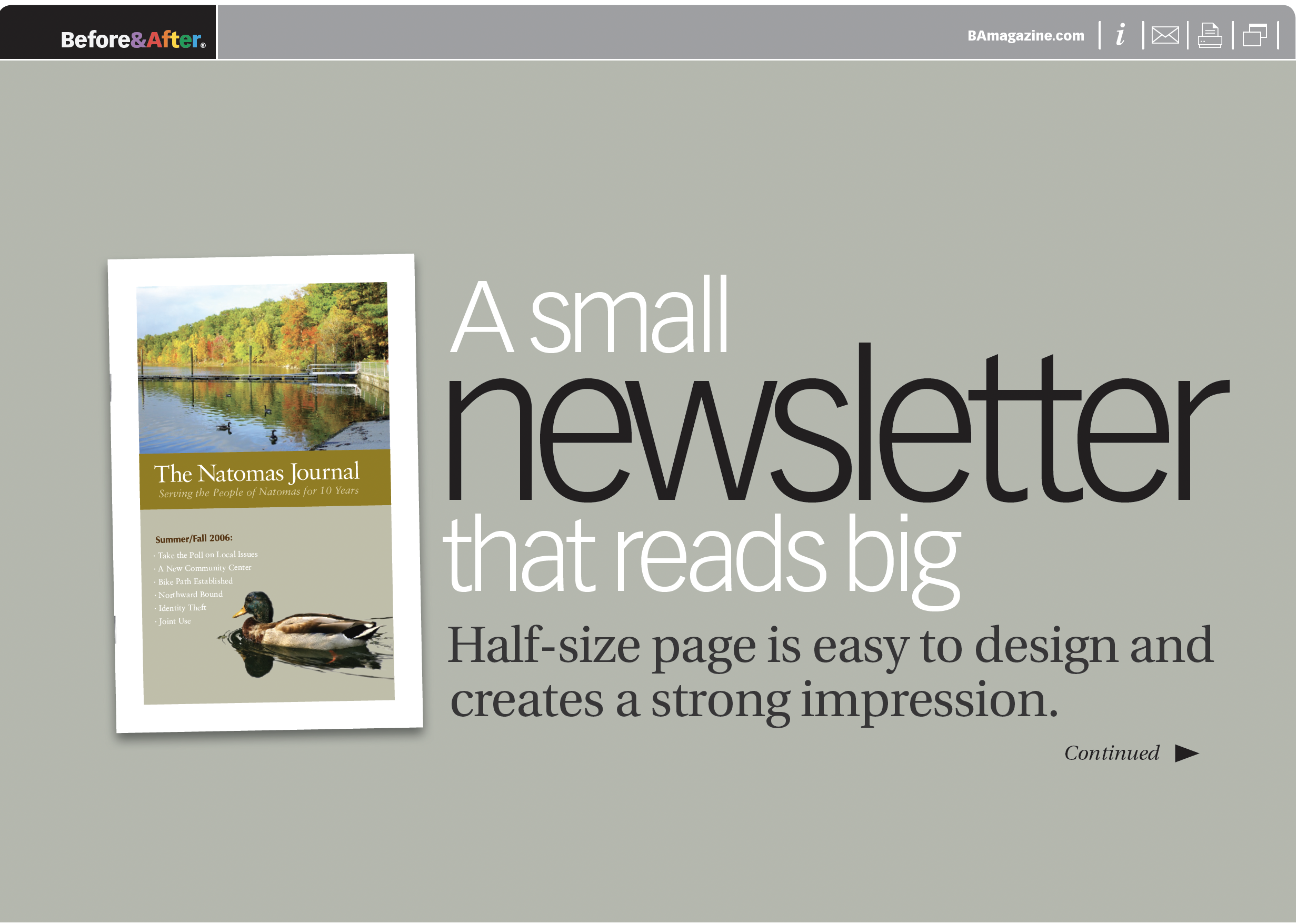
For hard-working editors who want their news to be taken seriously, here’s an excellent small format. Turn a letter-size sheet sideways, and lay out its contents like a small book in two distinct fields repeated every spread. The result is a newsletter with the look of permanence and credibility! This 22-page article from issue 42 of Before&After Magazine demonstrates how using a half-size page for your newsletter is not only easy to design, it also creates a strong impression.
Divide the spread into two fields: Each spread is made of two fields—a bold inner and a light outer—each with its own information. The main narrative occupies the inner; supporting articles go outside.
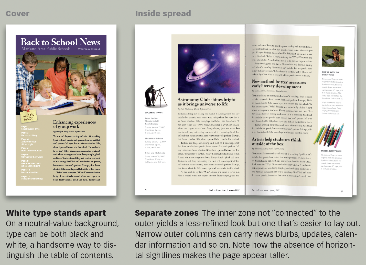
© John McWade/Before&After Magazine, courtesy of Gaye Anne McWade.
Commenting is easier and faster when you're logged in!

Recommended for you

Before&After Design Tip: Crop to Change a Meaning
Don’t throw a problematic image away. Crop boldly to make it work!
Before&After Design Tip: To Fit a Space, Crop to an Extreme
Need to fit your design in an extremely shallow space? Cut an extreme slice!