This article appears in
Issue 44 of InDesign Magazine.
For almost everything we design and print, we want the finished piece to be noticed. The best way to get that attention depends on several variables, but eye-catching folds are one good option.
Designers tend to be in one of two camps when it comes to folding: Either they feel like their hands are tied by a tight budget and they can’t do much beyond the safe and economical tri-fold, or they have the budget and opportunity to do something creative, but they’re uncertain of their folding options.
So this will be a two-part article: Part one for the cheapos, and part two for the high rollers.
Part One: Creative Folding for Cheapskates
I know what you’re thinking—all the good stuff will be in Part Two because you can’t do much on a budget. And to that I say, “No way!” These tricks and techniques will get you the high impact you want on even the smallest budget.
Simple guillotine trims
Paper that has been cut into an unusual shape with a metal die is certainly an attention getter, but it’s also beyond most small budgets. To achieve the effect without the cost, try a simple guillotine trim, which just slices off an edge of the page (Figure 1). It could be anything from a straight short trim on a cover or fold-in panel, to an angled trim along the top of an accordion fold, which gives a waterfall effect.
Second shows a four-panel brochure with folds in alternating directions. Third shows horizontal brochure with four folds in the same direction, wrapping around the perimeter of the piece.” width=”505″ height=”600″ /> Figure 1. Examples of guillotine trims
Make “cutting corners” a good thing!
Figure 2 shows a four-panel accordion with the upper right and lower left corners cut at angles. It makes an interesting shape when flat and folded.
Figure 2. Accordion fold with cut corners by Design Ranch, Kansas City, MO
Directional and format changes
The least expensive way to give your project a fresh look is also the simplest: Change the orientation of your art and panels (Figure 3). If you don’t believe me, take the usual 4 in. × 9 in. tri-fold brochure, make it 9 in. × 4 in., and see what that does to your layout (and your mind).
Figure 3. An easy way to bring the unusual to a printed piece is to change its format from the expected.
Now, take some other basic folds and make them longer, shorter, wider. Rotate them 90 degrees. In most cases, it’s the same fold to your printer—it’s just your art and panel orientation that changes (Figure 4).
Figure 4. A brochure as tall and skinny as this one will get a second look just because it’s out of the norm.
The most critical issue to keep in mind when changing formats is to understand the end use of your product. Sometimes a brochure is specified in a certain size and format for usability issues, or to fit into a literature rack, or for mailing purposes. Maybe it has to fit into a custom envelope, folder, or binder. Do your research and get the green light before changing formats.
One critical production note: Sometimes when you make a dramatic format change, it affects things from a production standpoint.
For example, your project might need to run differently on press—maybe against the grain instead of with the grain—which means you may have to score the piece, when previously that wasn’t a requirement. There are also minimum and maximum tolerances on print finishing equipment, so be kind to your printer, communicate carefully and early in the process, and don’t make a quick left turn without warning.
Cheapskate Folds in Motion
As part of my website, FoldFactory, I post a lot of videos showcasing cool folds. Most of the videos focus on high roller folds, since those are more technically tricky, but I show many less- expensive folds, too:
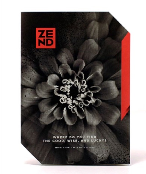
Asymmetry gets attention because it’s unexpected. Figure 5 is a sample of a double-parallel fold folded in such a way that it creates a stepped effect along one side. The manner in which it was folded (two parallel folds) doesn’t change, just the size of the sheet and placement of the folds. What is most excit- ing about a stepped double parallel fold is that truly “stepped” folding styles, such as stepped accordion folds with tapering panels, can be complex specialty folds, but this folding trick achieves the look of a stepped folding style without the price tag.
Figure 5. Stepped double parallel. Design and illustration by Kelsey Grafton, Lewiston, Idaho.
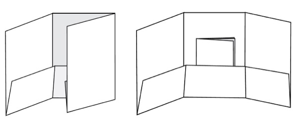
Asymmetry also works with gatefolds. On a standard gate, push the break between the panels to off center (Figure 6). Interesting!
Figure 6. Above, two examples of asymmetrical gatefolds that don’t cost much but can make a real impact. For example, the asymmetrical gatefold pictured below is bound to cause a stir.
On a closed gate, make the two leftmost panels shorter, and the rightmost panels longer to create a short cover and a step on the right edge.
Broadside folds and short folds
A folding style can take on a totally different personality when it’s in a broadside format; that is, printed on one side only. The broadside format doubles the total area for a spacious, poster-style interior, yet it folds down neatly into a tailored package. Take it a step further using one of my favorite tricks: Trim one corner at an angle for a peek at what’s below. It looks like a die cut, but it’s actually just an angled trim (Figure 7)!
Figure 7. An inexpensive trim can look like a pricey die cut.
Short folds are broadside folds that don’t meet at a flush edge (Figure 8). They’re shortened by whatever length you want, and you get a banner effect along the bottom of the piece (on the inside or outside). Usually, short folds are designed to lift up, but a fun trick is to design the short fold to pull down instead—it’s called an inverted short fold.
Figure 8. Short folds, whether regular (left) or inverted, are your friends (right).
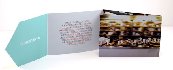
If that’s not enough, turn the inverted short fold into a pocket to hold a sell sheet or smaller brochure. The pocket technique creates a nice little package without the extra cost of a die or glue (Figure 9).
Figure 9. This example of an inverted short fold creates a pocket to hold materials. No gluing required!
Visual tricks
Landscape designers know that gardens are more interesting when you can’t see everything in the space at once. You can accomplish that slow reveal with folding, too.
For instance, an old Verizon piece in my collection has one short-trimmed panel and on that short panel is a phone on a cradle (Figure 10). The designer placed an image of the front of the phone on the underside of the short panel. The resulting trompe-l’oiel effect is that when you lift the panel, the phone is off the cradle and in your hand, and the image revealed by the panel is an empty cradle. So, utilizing a basic short trim and interesting imagery, you can also amuse and captivate the recipient.
Figure 10. A canny use of a simple fold adds a fun reveal to your piece.
Die cuts
You’re probably wondering why die cuts are in the cheap tricks category. Although in many cases die cuts can be an expensive process, the simpler forms of die-cutting can often be done inline on a folding machine, which cuts costs.
Die cuts don’t have to be elaborate, either (Figure 11). Sometimes just a simple slit to tuck the cover panel can make a standard roll or tri-fold more exciting. Remember that every printer’s capabilities are different, so it pays to ask the question. You may be avoiding something that is totally within your budget.
Figure 11. Roll fold with simple die-cut cover by Neenah Paper
The other frugal die-cutting secret involves materials and labor. Much of the expense in the more complex forms of die-cutting comes down to the labor and materials required to create a die in a custom shape. Printers save their dies, so ask your printers about their die inventory—you may be able to save money by utilizing a die made for someone else.
Extended panels
The first cheap trick focused on trimming panels, and the last cheap trick is about extending them. This trick is for certain types of folds that have open trailing edges, like double parallels and accordions. (Rolls, tri-folds, and gates don’t qualify because their panels tuck.) The concept is simple—in the case of an accordion, make the final trailing panel longer so that it extends past the others. For a double parallel, extend either one of the panels on the open edge. The effect is a sidebar of sorts, a place for a shot of color, a fun graphic teaser, a tab for information or branding. It’s an unexpected technique that adds no cost from a production perspective (Figure 12).
Figure 12. Extend one panel to give yourself a sidebar, a graphic teaser, or a tab.
Do you see what I mean? There are so many great effects you can accomplish on the cheap, so start folding!
Part 2: Creative Folding for High Rollers
You lucky dog. You’ve landed a great project—the kind every designer wants. Good client, good content, and the budget to make it happen. While it’s going to be fun, the pressure’s on. With great projects come great expectations. Your client wants not only a beautiful piece, but a piece that gets the desired response, whether that’s great attendance at an event, a boost in sales, etc.
No need to panic. I’ll not only open your eyes to creatively complex folds, but I’ll also point out places where unprepared designers falter and give you a plan for testing the success of your design before you go to print.
The process
Designers often collect inspiring print samples. While one of these samples may work for your own high-end project, try not to force it into a certain format just for the wow factor. The type of content and the audience should dictate the format.
Let’s say you’re in love with a snake fold or an iron cross. Both are well suited to smaller, standalone nuggets of content. But if your project has continuous text that should be read in a certain order, these folds won’t give the recipient a positive experience. The content’s pacing will be wrong.
Before you get too far in the design process, you should also check into things like mailing costs. I see a lot of specialty folds finishing to square formats—some because they have to, some just because. But if it’s going in the United States mail, that square format adds an extra 20 cents per piece in non-machinable surcharges. High-budget project or not, that’s a lot of money to waste if you don’t have to. Many specialty folds can be modified into mail-friendly formats, so do your client a favor and explore those opportunities before going square.
My most important word of advice is also the most obvious: Don’t spring a specialty fold on your printer at the last second. Get your printer involved early; if possible, before you sell the concept to your client. Most specialty folds involve tricky fold placement, critical dielines, or other issues that greatly benefit from a discussion with an experienced print professional.
Iron crosses
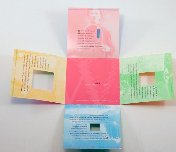
The standard Iron Cross folds out into a plus or cross shape (Figure 13). But go beyond this standard, and you’ll find a lot of flexibility. You can add panels in any direction to roll inward toward the center.
Figure 13. This example shows the standard Iron Cross fold with the addition of carefully placed die cut windows.
Add panels to the left and right of the top and bottom panels and it’s called a reveal folder. Iron “crosses” can also take on different forms, such as L-shapes (Figure 14), the L-Cross or T-shapes. I even have a hexagon-shaped iron cross in my collection.
Figure 14. This L-shaped piece is a variant on the Iron Cross.
Iron crosses are most commonly built into a square format, but they can easily convert to rectangular formats that are direct mail-friendly.
Plan for: Die, score, and hand folding in most instances; however, some printers and specialty binderies can fold by machine. Ask your printer if they can.
Twist folds
Twist folds offer a spectacular show (Figure 15). Perpendicular folds and scores work together to allow the piece to twist down into a compact size. They’re memorable because they’re fun to play with and quite rare. Twists are great carrier pieces, as a natural cavity that can hold materials is created when the piece is folded down. All variations of twist folds must finish into a square format.
Figure 15. Twist folds combine perpendicular folds and scores to allow the piece to twist down into a small size that’s fun to play with.
Plan for: The folding style requires scoring and hand folding in most cases; however, I know of one specialty bindery in Canada that can fold the standard twist by machine.
High Roller Folds in Motion
While still images are good, moving images are best for grasping the complexities of some folds. I’ve demonstrated examples of all of the high roller folds I talk about in this article, plus a few more. Each video runs only 60 seconds or less, and since they can help you grasp tricky techniques, they’re well worth the time:
Snake folds are always a hit. The standard snake fold rolls around itself counterclockwise from the center panel (Figure 16). There’s a great discovery experience with this folding style. You can also create what’s called a Traveling Snake Fold, and the traveling snake wanders anywhere you want it to go, rather than in a predictable path.
Figure 16. A piece that uses a snake fold slowly reveals the content on its panels.
Plan for: The dieline for a snake fold is extremely difficult, so work closely with a printer at the earliest stages. Snake folds are always hand-folded.
Modified accordion folds
The accordion family of folding styles is large and varied, and within this family there are several exciting specialty variations. Stepped accordion folds incorporate tapering panels to create steps on one or both sides of the piece (Figure 17).
Figure 17. Two views of a stepped accordion fold
There are several stepped accordion formats, and some are more difficult than others; for example, a stepped accordion that has steps on both edges (no flush edge) is more difficult than when the edge opposite the stepped effect is flush. This principle is a little tough to explain without getting technical, so it’s best to ask your printer if you want to go down this road. Another exam- ple is the meandering accordion (Figure 18), which uses accordion folding and a simple die to create a fabulous fold that changes direction 180 degrees.
Figure 18. The meandering accordion includes a simple die cut that lets the piece change direction 180 degrees.
Plan for: Early production planning with your printer. Depending greatly on which accordion format you choose, there may be hand-folding, scoring, and die-cutting.
There are many, many other exciting high budget options—too many to mention in one article, but these should get you started. For more ideas, visit foldfactory.com. You may also want to check out our Fold Picker publication at the foldfactory store.
Getting results
Before your special folded piece goes to print, you should test it. Every specialty fold offers a unique experience to the recipient, and you need to be sure that the visuals and distribution of content make sense and provoke the desired action.
To test it, mock up your piece and pass it to a few people who aren’t associated with the project. Watch them experience the piece and then ask them what message they took away (visit a website, respond, buy, etc.). If they can’t tell you, then you have a problem.
Watch facial expressions, too. Do they seem to be straining to read it? Do they look unsure of where they’re going next? Do they look pleased, confused, intrigued, annoyed? All of these expressions will give you clues regarding whether you’re on the right track or on a path to wasting a lot of money.
Enjoy this exciting opportunity. Think it through, choose something that works with your concept, test it, and go for it. And if your next project doesn’t have this kind of budget, don’t worry! Remember, there are amazing things that can be done on low to moderate budgets, as well.
Recently Adobe released a new mobile application for iOS (iPhone), Adobe Post. L...
×By signing in, you agree to our Terms of Use and acknowledge our Privacy Notice.
Manage your privacy
This site uses cookies, but not the kind you eat. We use cookies to remember log in details, provide secure log in, improve site functionality, and deliver personalized content. By continuing to browse the site, you accept cookies.
Functional
Always active
The technical storage or access is strictly necessary for the legitimate purpose of enabling the use of a specific service explicitly requested by the subscriber or user, or for the sole purpose of carrying out the transmission of a communication over an electronic communications network.
Preferences
The technical storage or access is necessary for the legitimate purpose of storing preferences that are not requested by the subscriber or user.
Statistics
The technical storage or access that is used exclusively for statistical purposes.The technical storage or access that is used exclusively for anonymous statistical purposes. Without a subpoena, voluntary compliance on the part of your Internet Service Provider, or additional records from a third party, information stored or retrieved for this purpose alone cannot usually be used to identify you.
Marketing
The technical storage or access is required to create user profiles to send advertising, or to track the user on a website or across several websites for similar marketing purposes.
We use technologies like cookies to store and/or access device information. We do this to improve browsing experience and to show (non-) personalized ads. Consenting to these technologies will allow us to process data such as browsing behavior or unique IDs on this site. Not consenting or withdrawing consent, may adversely affect certain features and functions.
Functional
Always active
The technical storage or access is strictly necessary for the legitimate purpose of enabling the use of a specific service explicitly requested by the subscriber or user, or for the sole purpose of carrying out the transmission of a communication over an electronic communications network.
Preferences
The technical storage or access is necessary for the legitimate purpose of storing preferences that are not requested by the subscriber or user.
Statistics
The technical storage or access that is used exclusively for statistical purposes.The technical storage or access that is used exclusively for anonymous statistical purposes. Without a subpoena, voluntary compliance on the part of your Internet Service Provider, or additional records from a third party, information stored or retrieved for this purpose alone cannot usually be used to identify you.
Marketing
The technical storage or access is required to create user profiles to send advertising, or to track the user on a website or across several websites for similar marketing purposes.
Best Online Casinos 2026
Your trusted source for expert-reviewed online casinos, exclusive bonuses, and verified real-money payouts. Updated daily. toprank2u


 Asymmetry also works with gatefolds. On a standard gate, push the break between the panels to off center (Figure 6). Interesting!