
Your Tables in InDesign Don’t Have to Be Boring!
All it takes is a little effort and a willingness to think outside the box(es) to make your tables beautiful.


This article appears in Issue 78 of InDesign Magazine.
Every time I ask my friend Andrea Späth, a graphic designer from Germany, for samples of great tables in the publications she works on, she sends me pictures of actual tables—coffee tables, dining room tables, end tables. Once we solve the translation problem, she reminds me that her publications involve more furniture than data. Fortunately, other designers I work with have more boring projects that do require tables. And that’s how we all tend to think of tables, right? Boring. As you’ll see here, sometimes the data itself may seem boring, but the design doesn’t need to be. With a combination of tried-and-true graphics principles, coupled with the excitement of you-can-break-the-rules-if-you-know-them techniques, you can design clear, inviting, memorable tables. In this article we’ll be looking at a few before-and-after examples and talk about a couple of principles; along the way, you’ll see some cool table designs that will inspire you.
Alternating Colors, and Other Easy Additions
Sometimes the best solution to the challenge of a mild-mannered, basic table is, quite simply, to make it into a nicer table. In our first example, admittedly dry data in a Word table is transformed into a sophisticated, easy-to-read chart for a stock-photo company (Figure 1). According to Matt Bargell, a design and marketing firm president, “On tables where I have two rows or more, I almost always stagger each row’s background color from white to a screen of a light color to provide a visual guide for the viewer.”
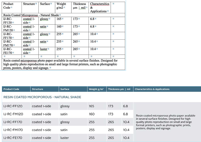
Figure 1: Alternating soft background colors, a spiffier font, and some color and texture in the heading area make this list of types of photo paper a more pleasant and
legible read.
Appeal to Different Senses
Building a better table isn’t always the perfect design solution. Tim Giesen, principal and creative director of Claro Creative Group, transformed a typical top-10 list into what he calls a “charticle” with a loose table format. This three-column, 10-row table (Figure 2) breaks the grid to engage the readers and bring a potentially dry subject to life.
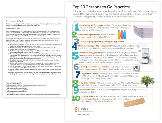
Figure 2: Giesen broke up the data, added graphics, and played with the type to turn a plain text list into an engaging reading experience.
Please Don’t Run Away—Read Me!
For a medical newsletter, Giesen took detailed information that was provided in paragraph form, organized the details into a table, and highlighted the information with different type colors (Figure 3).
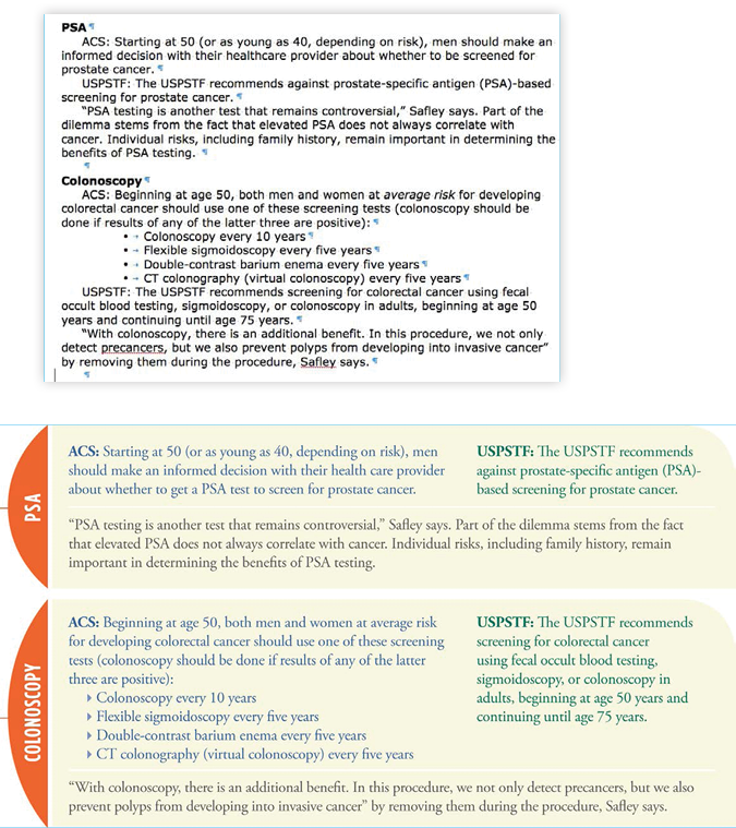
Figure 3: What a difference a font makes: Difficult information is more approachable with good visual presentation (but we’ve been telling you that for years).
Set a Strong Visual Base for Differentiation
The more sections of data your table needs to show, the more you have to make things easy to find and distinguish—which happens to be something that InDesign tables can really help with. In a brochure for a company that provides color proofs, Matt Bargell imported an Excel file and formatted it with InDesign table and cell styles (Figure 4).
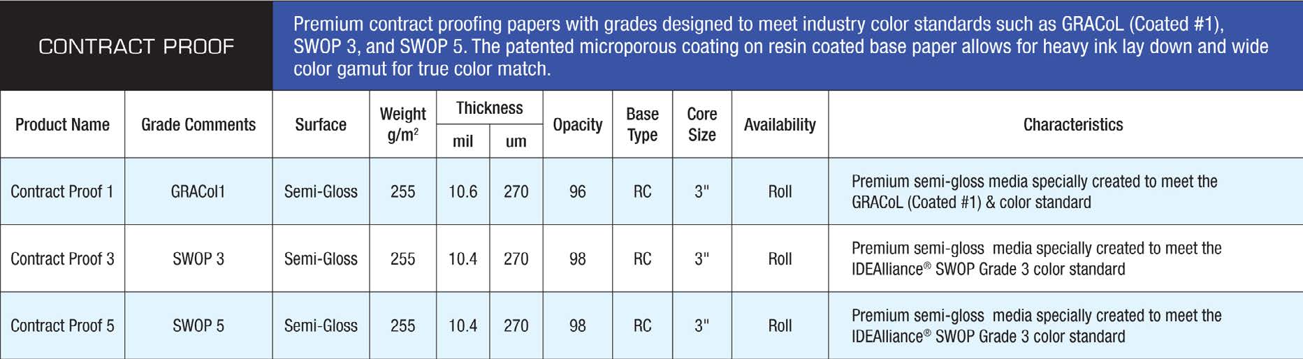
Figure 4: Especially with repetitive or very-similar content items, visual formatting distinctions are extremely welcome—and so easy to apply.
Rules Are Made to Be Broken
Now we start to break the rules a little more. Tom Visocchi, the art director of the short-lived Denver Magazine, added interest to typical tables with interesting header rows. In the chart in Figure 5, he staggered the height of the headers to match the text.
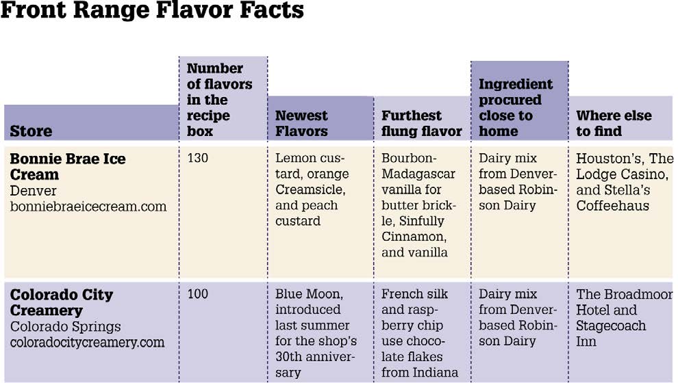
Figure 5: Break out of the box by expanding header rows into the space above the table.
Figure 6: Pull out all the stops with rounded corners, a mixture of stroke styles, and an image that spans cells.
Calendars
Tables are ideal for calendar pages. And as we’ve already seen, InDesign really gives you a lot of room for fun and creativity. In Figure 7, Giesen enlivened the table with both an image and text balloon to really highlight an event on Aug. 1.
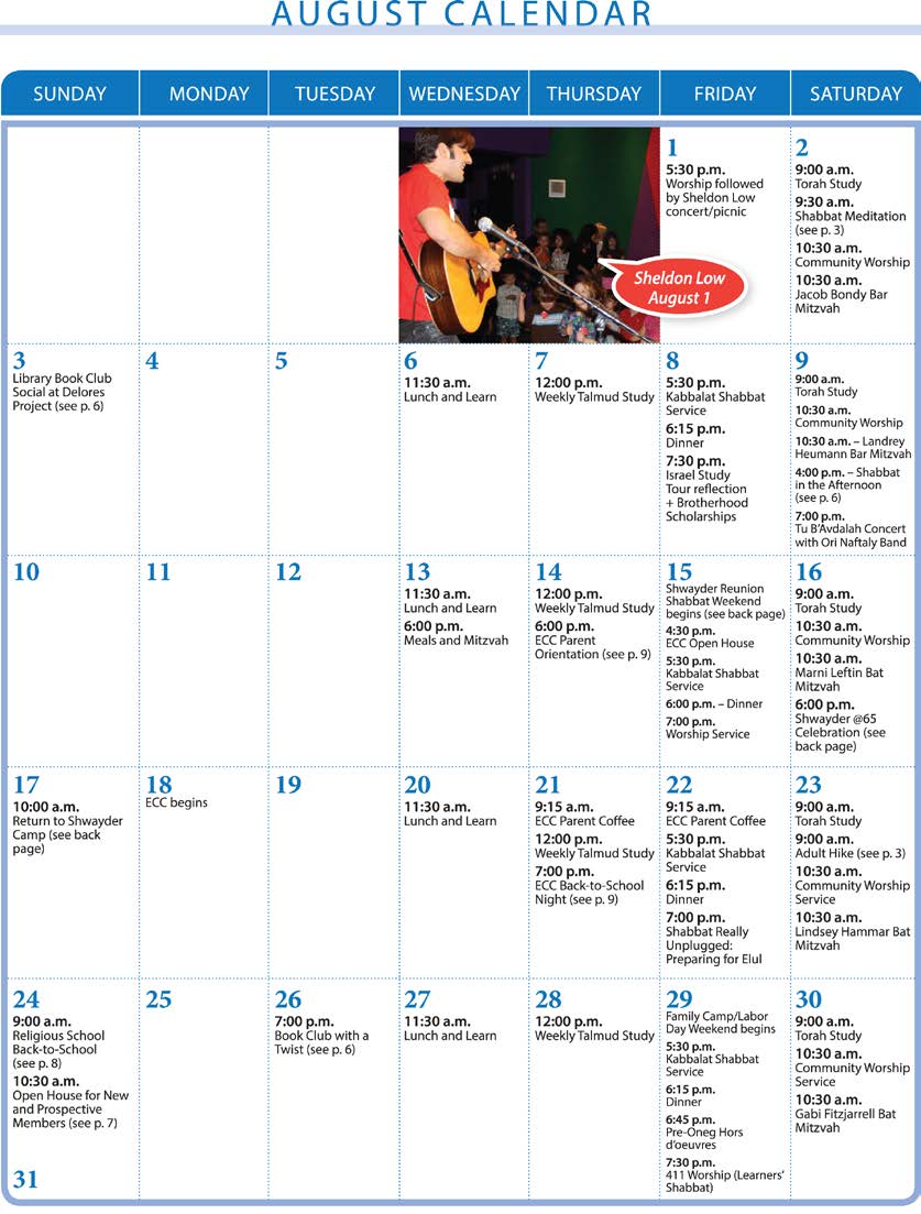
Figure 7: A photo and speech bubble can grab the eye of a reader who might otherwise breeze past the all-too-familiar form of a calendar.
Commenting is easier and faster when you're logged in!

Recommended for you

InDesign How-To: Six Small Things, Six Big Results
You can use these six simple tips to maximize your efficiency any time you...

CreativePro Week 2026 Preview: 5 Game-Changing Motion and Video Sessions
Here are five great sessions that will "motivate" you to join us in Nashville

Filling Text with Multiple Colors in InDesign
Sandee Cohen shows you how to fill your text with color.