Choosing Color Combinations for Accessibility
These tools will help you select colors that maximize the number of people who can read your message.


This article appears in Issue 38 of CreativePro Magazine.
Color contrast is an essential component of ensuring accessibility and inclusive design. Even though it is critical, it is often overlooked.
But not anymore, not for you, because you are reading this article and committed to making a difference. Not only do you care about adhering to accessibility guidelines and improving the experience for folks with visual disabilities, but you also care about legibility. You understand that being able to read text efficiently and reducing the visual strain benefits your users.
By now, you know the value of having the right tools in your toolbox. Here are some of my favorites and how to use them to ensure color contrast. Let’s dive in.

The Essential Tools
If you’re looking for only one tool, let me suggest TPGi’s Colour Contrast Analyser (CCA). The app is available for Windows and macOS, allowing you to access it no matter which program you’re using or your Wi-Fi situation.
I am delighted with its Colour Slider feature (Figure 1), which lets you adjust your colors and see how those changes affect the contrast ratio in real time. Its Colour Blindness Simulation (Figure 2) displays examples of how each color deficiency will see the color combination.
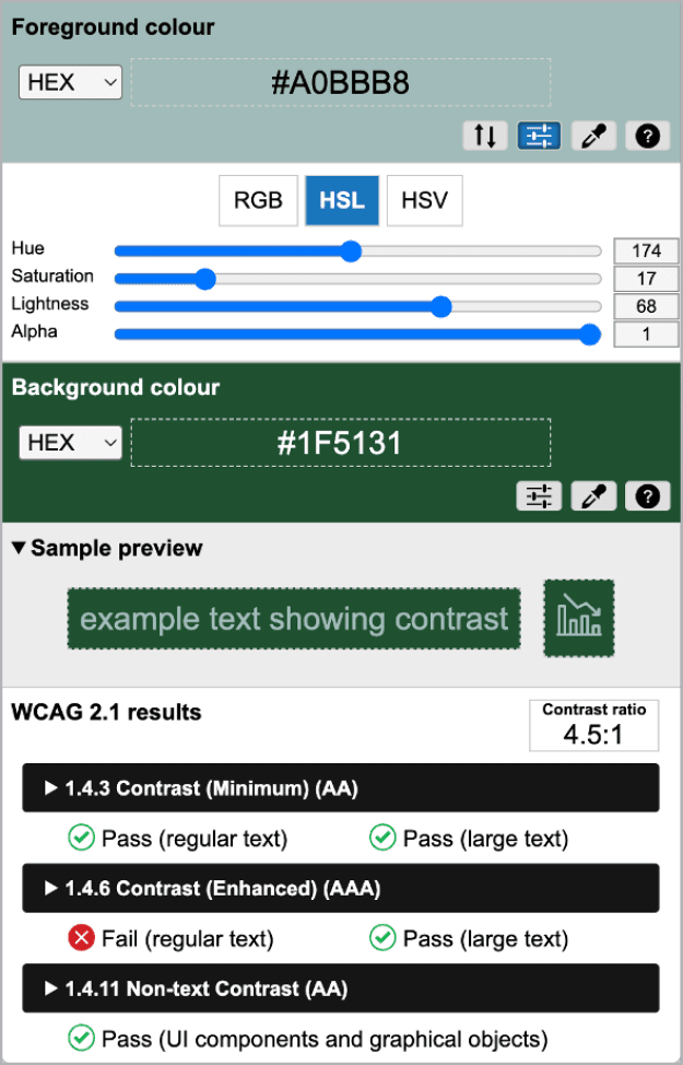
Figure 1. TPGi Colour Contrast Analyzer

Figure 2. TPGi Colour Blindness Simulation
For the Adobe loyalist, there’s no need to look elsewhere. The Adobe Color Contrast Checker, right in the Accessibility Tools tab, is simple and easy to use, but its true beauty is that you can save the results directly to a Library.
I also really enjoy that Adobe Color offers recommendations, including the Set a Contrast Ratio (Figure 3) option, which can come in handy when you’re trying to find the right balance of contrast between colors for a pie chart or maybe searching for the perfect shade of orange for your icons. It offers suggestions for foreground and background colors to give you more options to achieve the proper color contrast.

Figure 3. The Adobe Color Set a Contrast Ratio tool
Adobe also offers a Color Blind Safe tool, which you can find in the Tools menu. You can enter up to five colors, and the tool will flag any potential color conflicts.
These conflict guides help you understand and locate problematic color pairings on the color wheel (Figure 4). When the tool identifies an issue, you can move the selection directly on the color wheel or adjust the color sliders until the conflict is resolved.

Figure 4. The Adobe Color Color Blind Safe tool
Color blindness simulators can help you see how your designs will appear to those whose color perception is more limited. Several web-based choices are available. Toptal’s Colorblind Web Page Filter enables you to enter a URL, while Coblinder’s Coblis color blindness simulator lets you upload a photo. My favorite, however, is WhoCanUse, which offers insights not only into color blindness but also glaucoma and situational events such as direct sunlight (Figure 5).

Figure 5. WhoCanUse results
If you’re looking for the simplest of color contrast checker websites, I recommend Accessible Web’s WCAG Color Contrast Checker. It displays results in a clean layout, it’s easy to comprehend, and the preview box includes iconography (Figure 6). It’s also offered as a Chrome browser extension—a great option that lets you keep a color contrast checker handy all the time while you browse the web.

Figure 6. Accessible Web’s WCAG Color Contrast Checker
Tools for Inspiration
Are you trying to create a color palette for your project? These tools will let you see your options and build a collection of colors that will work together accessibly.
Colors A11y Stats
Although Colors A11y Stats is not a tool but just a simple web page, it helps when you need to figure out where to start. This single page shows 90 accessible color combinations of color text on color backgrounds. It can help you see how some combinations, such as fuchsia text on a lime background (Figure 7), might meet color contrast requirements but still could be challenging to read. I always recommend testing with users.

Figure 7. Color A11y Stats example
Color Safe
Sometimes, you have an idea of what your background color will be. You may be adding content to an existing page, or you already know that you’ll be playing around with a light-and-dark theme. You also know that font selections can affect legibility. This is when you turn to Color Safe. To test a combination, enter a background color; specify your font family, size, and weight; and then specify the standard you are trying to meet.
Let’s say I’m looking for an accessible warning color, I know the background will be #ECECEC (a very light gray), and I know I want to select a red. Color Safe will generate a series of colors for me to choose from and narrow it down by hue (Figure 8). As the site uses only web-safe colors, the choices for me will be limited. However, I still like Color Safe as a good starting point.
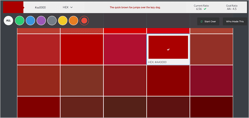
Figure 8. Color Safe results
RandomA11y
If you’re looking for a more chaotic form of inspiration, check out RandomA11y, which lets you plug in an initial color and generate one other color that will provide sufficient contrast—and do so again and again and again. Sit back and enjoy as you see your color matched with these accessible colors (Figure 9). You can choose the color format, algorithm (we’re sticking to the WCAG 2.1 algorithm here), and color contrast threshold.

Figure 9. RandomA11y results
Don’t fret if you want to return to a previous pairing; all randomly generated colors appear at the top of the screen during your session. Simply refresh the screen if you want to start over. Have fun, and scroll through the page to see various examples of the color pairing and a full breakdown of the colors by the numbers.
Venngage Accessible Color Palette Generator
Let’s say I have my primary logo color and I’m ready to build a color palette. That’s when I turn to Venngage Accessible Color Palette Generator for inspiration.
When you specify a hex color, you will automatically generate different color palette combinations. By default, it will present a vibrant palette, a monochromatic palette, and two contrasting palettes.
The beauty of these pairings is that each color within the palette is guaranteed to be accessible with white or black text (Figure 10). For example, the first color in my vibrant palette is #8B8D06, which yields a color contrast ratio of 5.91:1 with black. Now I know I can always pair this color with black as the text or background color.
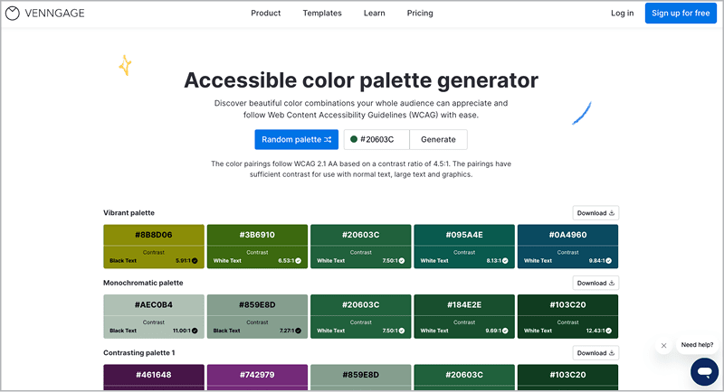
Figure 10. Vennagage Accessible Color Palette Generator
Tools for Adjustments
Sometimes, the contrast between colors isn’t far off, and you just need to tweak the foreground or background color to ensure accessibility. Here are my favorite tools for this job.
Tanaguru Contrast Finder
With Tanaguru Contrast Finder, all you have to do is enter the foreground and background colors, either as RGB or hexadecimal, then set the minimum ratio you’re after—then it does the work for you.
You can decide which color to alter and how close to the original color it should remain (Figure 11). I am typically looking for something close to the initial color, but I like to see what color ranges emerge, as you never know when one will inspire.
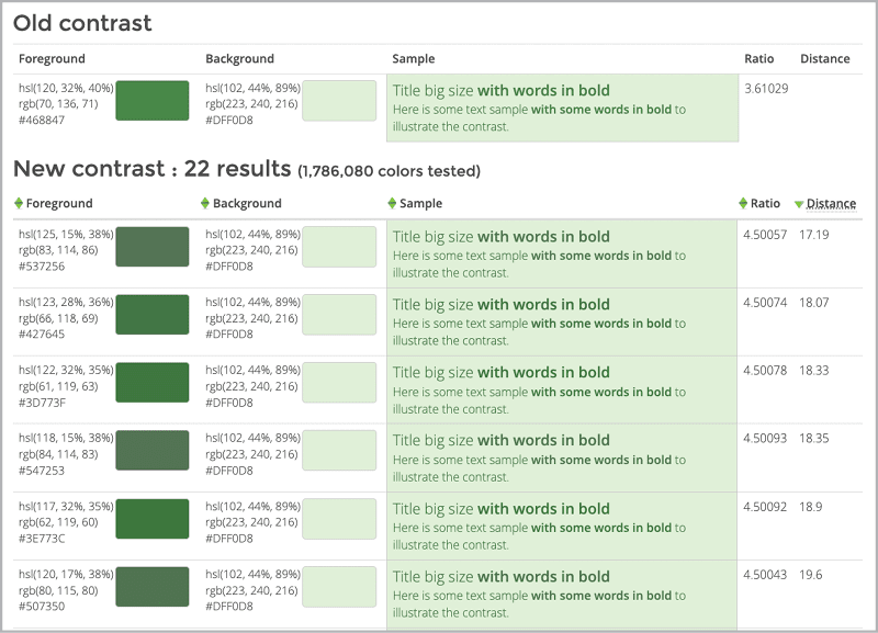
Figure 11. Tanaguru Contrast Finder results
Colour Contrast Checker
If you like having more control over the color variations, then I recommend Colour Contrast Checker. You enter your foreground and background colors, then you can use sliders to play with color combinations and see how the adjustments affect the contrast ratio in real time (Figure 12).
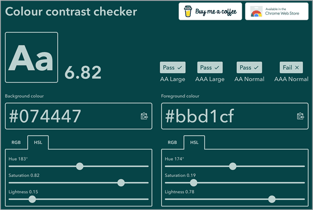
Figure 12. Colour Contrast Checker results
Color Review
Not all these sites are themselves accessible! But I do like that they help me better understand the relationship between colors.
For visual learners, I recommend Color Review. As with the other web apps, you’ll enter colors, but Color Review displays your selected colors on a color spectrum with visual guides of the areas of color that match the ranges that you can choose to satisfy 3:1, 4.5:1, and 7:1 color contrast requirements, respectively (Figure 13).
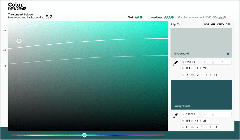
Figure 13. Color Review
When you click and drag the selected color on the map, you can directly see how saturation and brightness affect the contrast of the pairing. For more fun and chaos, drag the hue slider to see how the contrast guides change with the color field.
Advanced Tools
Whether you’re evaluating an existing color palette or building a new one, it’s essential that you identify accessible color combinations. Here are some tools that will let you do just that.
Accessible Color Palette Builder
The Accessible Color Palette Builder allows you to enter up to six colors, generating a matrix that visualizes all accessible color combinations (Figure 14). I prefer this tool, because I follow the best practice that all text should have a minimum 4.5:1 color contrast ratio.

Figure 14. Accessible Color Palette Builder
Contrast Grid
Contrast Grid allows you to add many more colors, but it’s a lot clunkier. (Don’t say I didn’t warn you!)
Leonardo’s Color Scales
Another critical consideration we still need to discuss is determining the proper color contrast for infographics. Leonardo’s Color Scales tool is incredibly robust and built specifically for data visualizations.
Whether creating a sequential or diverging color scheme, this tool enables you to check the color contrast by going to the Accessibility tab below the Color Scale.
Alternatively, you can input all color variations for your qualitative color scheme and click the Cycle Safe Color Options button (Figure 15) to have the tool generate a scheme for you.
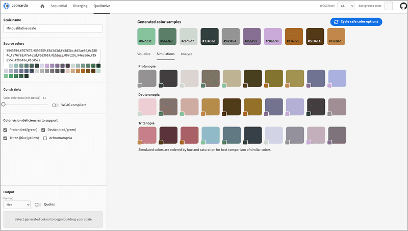
Figure 15. Leonardo’s Color Scales
APCA Accessible Colour Contrast Checker
We have a new algorithm for testing color contrast: the Accessible Perceptual Contrast Algorithm (APCA). It has yet to be adopted as a standard, but it’s gained some support. The idea behind this method is that font size and weight can impact text’s legibility beyond color. This algorithm factors these elements in to determine the most accessible combinations.
Utilizing the APCA Accessible Colour Contrast Checker, I can determine that the color pairing needs to increase in font weight or size to be legible (Figure 16).
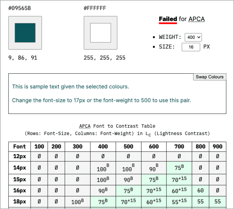
Figure 16. APCA Accessible Colour Contrast Checker
Stark
I highly recommend Stark to all my UX designers and prototypers. Available as plug-ins for both Figma and Sketch, Stark will automatically check the contrast of the selected layer and can use the APCA algorithm if you wish (Figure 17). The plug-in provides accessible color suggestions and allows you to directly apply it to the selected item.
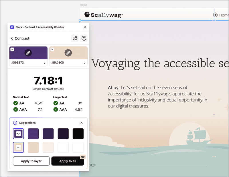
Figure 17. Stark Contrast Checker
Tip: Stark is much more than just a color contrast tool. It provides a suite of integrated accessibility tools for web development workflows. It’s definitely worth exploring.
Choosing Color for All Readers
We all know the power of colors and their capacity to engage, inspire, and bring connection. By considering accessibility when we choose colors and by using these tools, we can include all users we are meant to engage with.
I sincerely hope these resources help you on your accessibility journey or, at the very least, bring you some creative joy.
Commenting is easier and faster when you're logged in!

Recommended for you

How to Remove a Background From an Image in Photoshop
Learn how to quickly and easily remove the background from an image in Photoshop...

Neue Haas Unica: The Lost Sequel to Univers and Helvetica
Pardon me for waxing enthusiastic. Some things are just too cool to stay calm ab...
The Digital Dish: Kill the Widows and Orphans!
As the R.M.S. Titanic began to sink in the icy waters off Newfoundland on April...