
Designing with Rules, Borders, and Shading
Creative ways to highlight text content in InDesign


This article appears in Issue 144 of InDesign Magazine.
Any fan of film noir can tell you that, sometimes, the best way to bring attention to a subject is to cast it into shadow (Figure 1).
We are quite accustomed to making some important word or phrase bold or perhaps changing its color to apply emphasis. But we should also consider surrounding notable text with color or shadow. Over the years, InDesign has possessed features that let us do this in a number of ways. Let’s see what’s at our disposal.

Figure 1. The brilliant chiaroscuro cinematography of Gregg Toland and Orson Welles in Citizen Kane (1941)
Rules Rule
Consider the classic “reversed out” header paragraph shown in Figure 2.

Figure 2. Basic white text on a colored background and the paragraph rule settings used to create it
To create this effect, I made a paragraph style with a paragraph rule. By default, such a rule has only a 1 pt Weight and is the color of the text itself. I obviously changed those settings for the paragraph. The Rule Above and Rule Below features are intended to appear just over or under the paragraph. However, by default, both lie along the first baseline of the paragraph to which they’re applied.
So, to bring about a more desirable result, we usually have to increase the Weight and adjust the position with Offset. Greater offset values move the rule farther in its direction: Rules below get lower, and rules above go higher. In this case, I used Rule Above and needed to move it down, so I ended up with a small negative value for Offset. I also changed the color to a swatch I’d made for the purpose, then changed the Character Color (a different paragraph style option, not shown here) to Paper (known outside the realm of InDesign as “white”).
The Width and Indents features can be tricky at first, but very powerful. If you set Width to Text, the rule will be as wide as the text itself, usually requiring you to decrease the Indents (using negative numbers) to “outdent” the rule’s edges away from the text a bit (Figure 3).

Figure 3. Negative Indent values are used to extend the length of rules.
With large enough “outdents,” the rule can extend even beyond the text frame’s edges. If that is not desirable, the Keep In Frame option will slice the rule at the frame-edge.
I’ve used paragraph rules like this extensively. Sometimes, I choose stroke types other than Solid (or create a new stroke style) or even combine both Rule Above and Rule Below (Figure 4).
Figure 4. You can create complex effects by combining Rule Above and Rule Below settings.
You can get even more fun effects with stroke types that contain gaps, because that gap can be filled in with a color… or left blank. In Figure 5, I used tints of the same swatch. Be aware that InDesign places Rules Below on top of Rules Above if they overlap.

Figure 5. Stroke Type of Thin-Thin with 21 pt Weight for Rule Below (top); Thick-Thick at 15 pt and a Gap Color for Rule Above (bottom)
The meaty masterpiece shown in Figure 6 also uses both Rule Above and Rule Below. To achieve the round ends, I created a custom stroke style (which is then found in the Stroke Type menus throughout InDesign).

Figure 6. Call me a hot dog, but I like showing off with effects like this.
To create your own stroke style/type, use the Stroke panel menu to choose Stroke Styles. Click the New button to configure it. For my “hot dog” stroke, I chose a Dash Type and a round Cap then set the Length and Pattern Length to the same value (it doesn’t matter what value, just be sure they’re the same so there are no gaps). Leave some gap if you want linked sausages instead; adjust the Length/Pattern Length values to get there.
After creating my custom stroke style, I selected it as the Type for both Paragraph Rules (above and below), but with different Weights, Indents, and Colors to achieve the hot-dog-on-a-bun effect. A yellow script-font applied to the word mustard finishes it.
Shading Small Bits of Text
Sometimes you want to apply these kinds of round-ended strokes to individual words or phrases within a paragraph. Of course, you can’t use paragraph rules. (Well, there is a clever workaround, but it requires you putting the text inside an anchored or inline object, so it’s a bit clunky.) Instead, I usually use what I call bloated underlines. In Figure 7, you can see the effect and the character style that creates it.

Figure 7. Creating a highlight effect with an underline
The little bits you see fore and aft of the phrase (with Show Hidden Characters enabled) are non-breaking spaces. They add a touch more breadth around the text and are housed inside those rounded hot dog caps. To type a non-breaking space, use Command+Option+X (macOS)/Ctrl+Alt+X (Windows). As I did with the paragraph rules, I made the Weight substantial and nudged the Offset to better balance the underline’s vertical position. The character style is also responsible for the font, size, and color of the shaded text.
Bonus tip: To ensure that any text surrounded by non-breaking spaces gets this treatment, use a GREP style in the paragraph style governing the text (Figure 8).
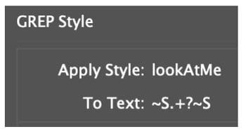
Figure 8. This GREP style will apply a character style to any string of text surrounded by non-breaking spaces.
~S is Greppish for a non-breaking space and .+ means the one or more characters between two of them. The ? ensures that only the shortest match of that pattern gets styled—which is needed in case there’s more than one set of these constructions in a paragraph.
But how do we shade multiple lines of text?
Paragraph Shading and Borders
Newer to InDesign is Paragraph Shading and its cousin, Paragraph Border. Whereas underlines and rules are in a sense one-dimensional (they’re just lines), shading and borders have both height and width—and they need to be able to stretch depending on the size of a paragraph. So, their controls look a bit more complicated. With default settings, paragraph borders look like what you see in Figure 9.

Figure 9.
One setting nestled in this dialog box may be rather confusing: Display Border if Paragraph Splits Across Frames/Columns. Borders are displayed across frames or columns whether or not this is enabled, but this option determines whether InDesign should draw a top or bottom stroke (Figure 10).

Figure 10. Left: with the Display Border if Paragraph Splits Across Frames/Columns option off (unchecked); Right: with that option selected
Once you get comfortable with making custom borders and shading, you can take it to the next level with custom stroke types/styles. For example, you can see in Figure 11 that I’ve constructed corner ornaments rather than simple lines. The trick is to do the opposite of the “hot dog” dash style. In that earlier style, we ensured the Pattern Length and Length settings were exactly the same. To get corner dashes only, we make the Pattern Length far greater than the dash Length. This ensures that any one segment of a path (or side of a box) gets exactly one dash.

Figure 11. A large Pattern Length value is the key to creating effects with corner dashes. With huge indents, and a few adjustments to the Paragraph Border settings, we can have this love-struck paragraph (below) decorated appropriately.
In my examples, I changed only the Cap setting when creating the custom Stroke Style.
“But wait,” you say, “this is an article about shading!” Ah, well, yes, but as you’ll see, these features can all work together. In Figure 12, I applied shading to a paragraph, with a few tweaks to its default settings.

Figure 12.
Note that we can make all kinds of tweaks to the shading, including massively shifting the left and right offsets (Figure 13).

Figure 13. With a little creative thinking, we can put this rather odd ability to good use.
Notice how the shading needn’t even be in the frame at all! Also, a corner’s size will never exceed half the shading’s height or width, no matter how large a value we use. This turns out to be useful: Knowing these limits, we can use the shading to point at a paragraph (Figure 14).

Figure 14. A pointer effect created by using huge Offset and Corner Size values
Note that the upper- and lower-right corners are set to 800 pt (the maximum allowed). So as long as the paragraph is less than 1600 pt tall (a bit over 22 inches!), the shading will continue to point at it. I also changed the shapes: rounded on the left, beveled on the right.
Why point at a paragraph? To draw a reader’s attention to it, of course. But sometimes we might wish to draw the eye of an editor or collaborator to it—without actually wanting the shading to appear in our output. That is, for our “arrow” to be visible only within InDesign.
That’s why there’s a checkbox labeled Do not Print or Export. Sadly, using that option also makes our pretty arrow disappear in Preview mode. Because some folks like to work in Preview mode, this little checkbox trick is of limited use.
So… I’ve got a workaround! (And, for those of you who are a bit naughty, pay attention: This can also be the start of an April Fools’ prank.)
A Spot of Trouble
To get shading that will be visible in Preview mode but not output, we need two spot color swatches. The first is the color of our shading. Either edit an existing swatch or create a new one for the purpose, setting its Color Type to Spot (Figure 15).
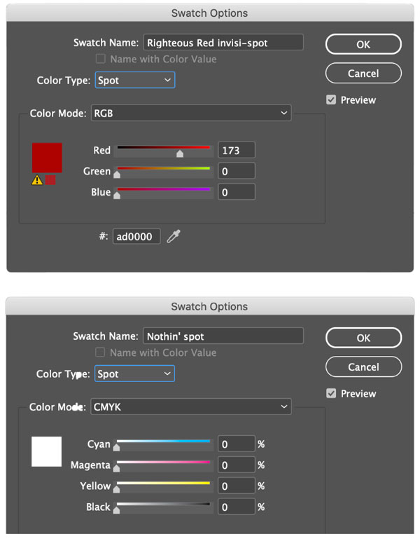
Figure 15. The ingredients are two spot color swatches: the color and a solid white.
The second spot color swatch should be set to what is essentially white: zero percent of CMYK. The trick is to tell your InDesign document that anything set to our shading color will be actually use the other swatch when output. This is called Ink Aliasing, which swaps one ink color for another. And if you alias your colored spot color to the white spot color, then no color is put on paper or seen in a PDF.
The way to do this is to open the Swatches panel menu and choose Ink Manager. Select the shading spot color, then, in the Ink Alias menu near the bottom of the dialog, choose the “white” spot color swatch.
To make sure there isn’t a stray spot color plate in an exported PDF, click the spot icon to the left of the white spot ink to set it to process upon output. You’ll see its icon change to CMYK (Figure 16).

Figure 16. Set the “white” spot to output as process. Then, no spot plate will be present when printed or exported.
Now you and your collaborators will see the shading color in InDesign, but no one else will. Figure 17 shows the result.

Figure 17.
I understand that might sound like a lot of work, but in reality it’s quick and painless: just two swatches, a couple clicks in Ink Manager settings, and the Shading options themselves. It only takes a minute or two to set up.
Regarding the pranking possibility: Ink aliasing is powerful, but with power comes responsibility. If you’re irresponsible, you might alias one spot color to a random process ink—like aliasing the corporate Pantone color to bright yellow! But this is very, very naughty, and you should never, ever do that to someone. Or at least, don’t blame me if you do!
In any case, now that you know the kinds of things that can be achieved, don’t be afraid to push the boundaries—that’s where the fun is. Enjoy your creative adventures with borders and shading!
Commenting is easier and faster when you're logged in!

Recommended for you
Four Great Ways to Emphasize Text
A step-by-step guide for directing the reader’s eye with with highlighting, pull...


Taming Wild Assets with Adobe Bridge
Not a Bridge user? Alan Gilbertson shows you what you’ve been missing.