
InQuestion: TOC Leader Dots and Pull Quotes
Learn some creative solutions for designing tables of contents and pull quotes in InDesign.


This article appears in Issue 140 of InDesign Magazine.
Our online communities on Facebook and LinkedIn bring together people who are passionate about using InDesign. When someone has an issue with the program, the community is ready to jump in and offer solutions.
In this Q&A column, we’ll look at a few ways to solve problems our community members have brought up. Note that the questions and discussions may have been edited for brevity and clarity.
Follow the Leader Dots
Steven Greenwell asks:
Q: “I think this is a really cool dot pattern for a table of contents (Figure 1). Does anyone know how to do it with InDesign?”
Figure 1. The old-timey leader dots to replicate
A: I had never really thought about offsetting leader dots in a TOC like that, but I became intrigued by how quaint it looked… and also wondered how to achieve it. As with so many questions posed in our online communities, people jumped right in with solutions.
Let’s first take a step back and think about what you need in place before creating a TOC. You need source paragraph styles, which are applied to text throughout the file and which you want to appear in the TOC. In the TOC dialog box, you’ll choose those styles and apply a corresponding TOC entry paragraph style to that text as it appears in the generated TOC. Lastly, you need to set up a specific character style to apply to the generated page numbers and also to any characters between the entry and the page number.
Create an alternating pattern
One suggestion offered online was to use a set of alternating paragraph styles. This
approach involves applying one source paragraph style to Chapter 1 for instance, then the alternate style to Chapter 2, and so on. In the table of contents, you have to set up multiple styles to look for and to style. Don’t even ask what happens if you need to wedge in a chapter after you’ve created your TOC! It quickly became apparent that this method wasn’t going to save any time—one of the main reasons there is a TOC feature in InDesign.
One reminder when looking for a solution for any problem is that automation is not an all-or-nothing prospect. You can use automation as far as you can push it, and help it along where needed. If the overall result is that you’ve saved time or eased repetition or ensured consistency, then using a “semi-automatic” approach is a great option.
So, back to the question of making those offset leaders in the TOC. Let’s keep just one source style—use the chapter heads—and create two TOC entry styles. In the Paragraph Styles panel, set up TOC Entry Style 1. Next, create and name a second TOC entry style based on TOC Entry Style 1, so that an update to the first one will be reflected in the second one.
You need to set up each TOC entry style to have those alternating leader dots. Right-click the first entry style in the Paragraph Styles panel and choose Edit. Choose Tabs from the left side of the dialog box. Drag a right-justified tab down into position on the ruler. If you are going to be using a right-indent tab, make sure the tab stop is set to the right of the right-indent marker (Figure 2).

Figure 2. Setting leaders for a Right Indent Tab
With the tab stop selected, put the leader dot sequence in the Leader field—that’s right, you aren’t limited to just one character! For this first one, put a dot (period) followed by six spaces. Click OK. Now go into the second entry style and change the leader value to three spaces followed by a dot followed by three spaces. That—along with tweaking the leading—should give us a nice, almost checkerboard pattern.
Now let’s create the TOC, by choosing Layout > Table of Contents. For this example, you’ll focus on just a few options in the dialog box (Figure 3).

Figure 3. The Table of Contents dialog box
First, select which paragraph styles to search for by selecting the chapter heads style on the right and clicking Add to send it to the left. In the next section, choose the TOC Entry Style 1. Choose After Entry for the Page Number setting and a right-indent tab for Between Entry and Number, assigning any desired character styles, then click OK. Place your TOC text on the page.
Head back to the Paragraph Styles panel, right-click TOC Entry Style 1, and choose Edit. In the Next Style menu, choose TOC Entry Style 2. Next, edit Style 2 so that its Next Style is Style 1. Congratulations! You just created a loop with alternating styles.
This is a good place to note that this technique will work on simple TOCs where each line is a chapter title with page number followed by the same. If you have a more complex TOC, you may or may not be able to use this method.
For the final step, select all the lines of entries in the TOC text frame, right-click TOC Entry Style 1 in the Paragraph Styles panel, choose Apply [Entry Style 1], Then Next Style, and the alternate pattern is complete (Figure 4).

Figure 4. The results of applying the alternating styles
Forget the leader
If you’re going with just straightforward dots—and not using the alternating pattern we’ve been discussing—you can forget about entering a leader dot all together. You can instead set up a character style that gets applied automatically to the space between the entry and the page number.
For this, set up a new character style for the leader. The only thing you need to define is an underline style: Go to the Underline Options section and select the Underline On checkbox. Choose a weight for the line and select the dotted line style. You can customize the line by changing the offset value and the color.
Back in the TOC dialog box, when choosing a tab between the entry and the page number, choose the underline character style. The plus side to this method is that—as it’s a character style and not a paragraph style—you can change the attributes of just the dots in the line.
Who says leaders have to be dots?
There are no rules that leader characters even need to be dots. Why not choose something entirely different? In the Tabs panel (Type > Tabs) select a tab you need a leader for, then head to the Leader field. Type in any sequence of characters, such as a lowercase x, a bullet, or even x’s and o’s. Play with the sizing and baseline shift to make it interesting. Change the font up, add a color, and make a character style with it. Use a symbol or dingbat font to create a line of arrows (Figure 5) or checkmarks. You can then use the style in a table of contents as above—or any place you need a leader sequence between tabs.
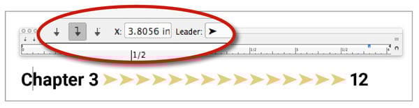
Figure 5. Tabs using arrows as a leader character
Pull Out That Quote
Jody Skinner writes:
Q: “I’m formatting a book where the client has requested text boxes/callouts, but they are part of the flow of the text, and some are a full page long or more. I’m able to fit some onto a single page, but obviously some need to flow from one page onto a second one.”
A: Callouts—or pull quotes—not only let you highlight text outside of the normal flow, but also visually break up large blocks of text. There are several different ways to accomplish these and most of them can flow across pages or individual columns.
Paragraph shading
Using a different color on the highlighted paragraph has been one option in my bag of tricks for a while. Up until version CC 2015 of InDesign you had to create a one-cell table for the paragraph, just to get the different colored fill—though unfortunately these cells cannot break across two columns or pages. However, now that functionality is built in, with the aptly named Paragraph Shading—found in the Control panel, paragraph styles, or Paragraph panel. As you build these different callout paragraphs, keep in mind that each should be made into a style for easy updating and consistency across your document.
To apply shading, simply put your cursor in the paragraph you want to highlight, and select the Shading checkbox at the bottom of the Paragraph panel. Most likely nothing happens, because the default shading color is set to None. You can choose a color from the menu, or Option/Alt-click the little swatch icon just to the left of the menu to bring up the Shading section of the Borders and Shading dialog box. Here, you can choose a color and a tint to start. You can also set any corner options, which are the same as corner options found in the Object menu that you can apply to any frame.
The offset values are where the shading really shines (if shade could shine). Unlike the Offset setting in a standalone text frame, where the text moves in by that amount, with paragraph shading the text stays in place relative to the frame and the shading moves out from the text. You can set each side separately or lock the values together with the Link icon. Be aware that the top and bottom values will run underneath any text in neighboring paragraphs. Use Space Before and Space After to account for this (Figure 6).
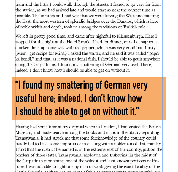
Figure 6. Pull quote using paragraph shading
Change the margins
Most of the time pull quotes appear in a different font and usually a different size. If the difference isn’t drastic enough, try changing up the margins to call attention to the text you want to highlight (Figure 7).

Figure 7. A narrower margin brings the pull quote in from the edges
If you want a smaller width for the quote you could easily just center the text and force a return where you want the text to break. The better option, however, is to set the left and right margins tighter than the surrounding paragraphs. The margin boundaries become more obvious if you use right-justified text. To set the margins, go to either the Control or Properties panel under Paragraph Settings and select the icon with a right-pointing arrow, a vertical line, and a series of horizontal lines. Use the arrows to move the left margin in and out. I find that it helps to have already entered text when I do this, so I can get a feel of how much indent feels right. Do the same for the right margin. Remember to create a style for your callouts or update a modified one to include the new margin settings.
I prefer using just the opposite of a narrow margin: a wider margin. The issue is, the text can’t run outside the text frame, so you have to work in reverse a bit. Create a style for the surrounding paragraphs—or modify the current one being used for the text—where its margins are set in from the frame edges. Apply it to all the body text, and set your callout style to fill the width of the text frame (Figure 8).
Figure 8. Using a wider margin for the pull quote text
Set some rules
Use paragraph rules to set the pull quote apart from the body text. Like with the other examples, you can use color in text and elements to really make the quote stand out. Creating styles and styles based on those styles makes it easy to switch out those elements—for instance having a different paragraph rule color for each chapter.
Let’s create a light-hearted callout by using wave-like blue lines on both top and bottom of the text (Figure 9). Start by putting the cursor in the callout paragraph, go to the Paragraph panel menu, and choose Paragraph Rules. Select either Rule Above or Rule Below (we’ll be doing both) and select the box to turn the rule on.
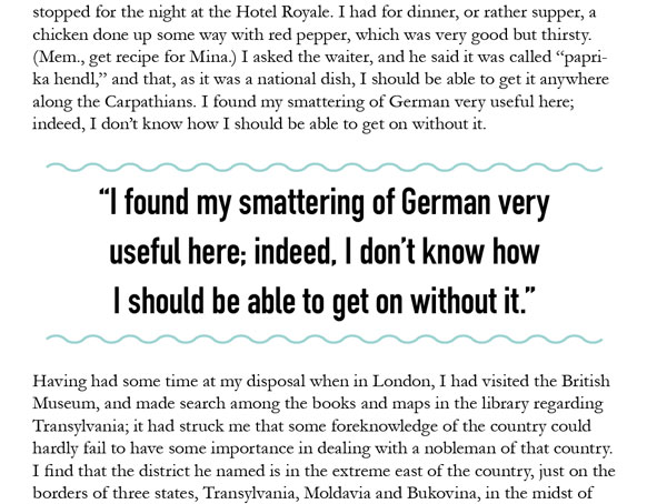
Figure 9. A pull quote using paragraph rules
Select the weight and the stroke type—perhaps 6 pt with the Wavy line style. Choose a blue or any color from your swatches, or leave it as Text Color to have it change with any text color changes. Set the line to fill the width of the whole column or just the amount of space the text occupies and set indents from there, then indicate any offset value. Do the same for the other rule, and click OK.
Anchored objects
Using an anchored or inline object gives you some flexibility, but also limits your options slightly. When Jody asked the question, she indicated she’d like the text to flow across pages and anchored objects can’t do that. They’re one object and need to remain that way. On the bonus side, you have more than just text and text-based elements to work with. You can anchor all sorts of elements, and you can even anchor groups of elements. We’ll only look at a few anchored object options, and you can explore them more on your own.
Create a standalone text frame and style as needed. Go wild, adding rounded corners, a deep inset, and a gradient background. My example is more subdued with just a plain color and rounded corners (Figure 10).

Figure 10. Using an inline graphic for the pull quote
I generally build my soon-to-be-anchored items in about the position they will be anchored. The first option is going to be anchored inline, meaning it lives inside the boundaries of the text frame and occupies a paragraph in the text. There are exceptions in that the frame can stick out on the sides and an “above the line” anchored object is attached to the paragraph below it.
Select the object you created, and Shift-drag the little blue square in the upper-right corner of the frame into a blank paragraph in the text frame. The object will take its cue for alignment based on the settings of the paragraph it occupies. To set other settings, Option/Alt-click the anchor icon badge that now shows on the frame. You can switch from an inline to above-the-line anchor and further change the alignment of the object here. Add any space before and after the object, and don’t allow any manual positioning of the object. Click OK. Some of the styling done in this example could have been more easily accomplished using paragraph shading. Where an inline graphic comes in handy is being able to use gradients and even other shapes as the background. Also, if you need to adjust slightly, you can also allow manual positioning and make tiny tweaks.
An anchored object—one that lives outside the frame but is still connected—is created in almost the same manner. In this example (Figure 11), I created an object by grouping two objects: a text frame and the circle behind it. I can easily anchor the group as one item. This time, though, I’m just going to drag the blue square to the beginning of a line of text without the Shift key. This is the text I want the object to be associated with and travel with. The object remains where it was even after I drag the square. You can manually move it around or choose values in the Anchored Object dialog box.
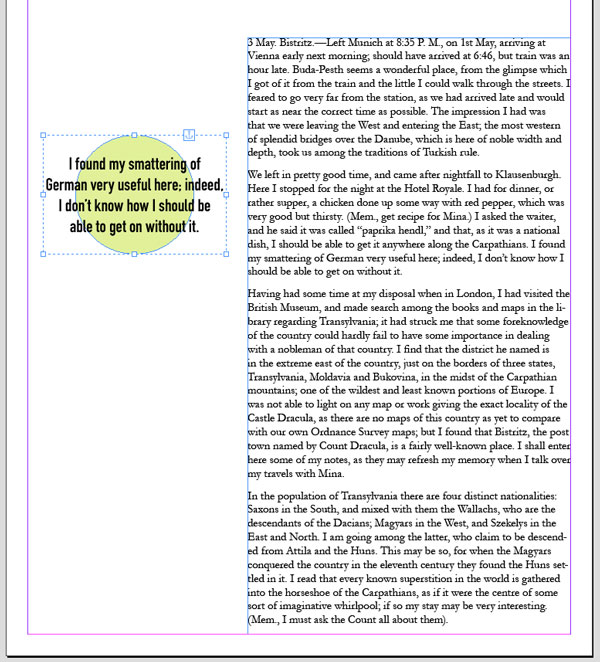
Figure 11. A group of objects—a text frame and a shape—anchored as one object
Option/Alt-click on the anchor icon and choose Anchored Object > Options, and you’ll see the position is set to Custom and values have been set based on the item’s current position (Figure 12).

Figure 12. The settings for the anchored object
Set where on the object the values are referenced from, as well as how the object relates to the relative X- and Y-axis items—turn Preview on, click the icons, and change the values with the arrows to position the item. Click OK. That quote will now follow along with the text it’s anchored to.
Always Leave Your Options Open
You can see that whether you’re creating leader dots or callout text, InDesign is always full of options. If you want to automate a process there is often a way, even if sometimes it takes a manual push to keep it moving.
Commenting is easier and faster when you're logged in!

Recommended for you

Understanding Liquid Layouts – Part Three
Editor’s Note: This article is part of a 4-part series on using Alternate Layout...

Two of My Favorite Microsoft Word Track Changes Tips
Speed up your editorial workflow in Word and InDesign with these tips.

InDesign 101: Saving Your Work
Sandee Cohen covers all the the basics of creating and saving InDesign documents...