

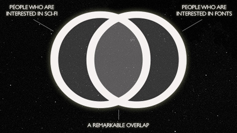
Typset in the Future is a new blog devoted to typography in sci-fi movies, and authored by Dave Addey, a Senior Writer at Apple. It’s a brillaint concept, because as Addey points out, plenty of font geeks are also sci-fi geeks.

source: typesetinthefuture.com
The first post is a fun frame-by-frame analysis of the fonts used in 2001: A Space Odyssey.
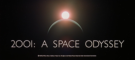
Or should I say, “2OO1” as one of the juicer revelations is that those are actually Gill Sans capital Os in between the 2 and the 1. And that’s just one of many cool finds. After reading the post, you may never look at Eurostile Bold Extended, Gill Sans, or Futura quite the same way again.
This article was last modified on February 4, 2014
This article was first published on February 4, 2014
Commenting is easier and faster when you're logged in!

Recommended for you
Creating Better Brand Images with Graham Clifford
Branding is the term used to describe the creation of an identity for a product,...

Prep for Winter Now: New "Snowflake" Font
Press Release Snowflake, designed by Jessica Hische, is a new display font that...

ProScale ID 7 For InDesign CS 2 Now Available
Software developer GLUON is delighted to announce the long-anticipated release o...