
Making Charts Accessible
Simple techniques to ensure your charts can be understood by readers with visual impairments.


This article appears in Issue 129 of InDesign Magazine.
Creating accessible files (what is often called “508-compliant” in the U.S.) is a challenge even with the simplest of documents consisting mostly of text—but when you start adding data and charts, the process gets complicated fast. The best advice I was ever given regarding 508 compliance is that ultimately it is a best faith effort. And especially when it comes to charts, logic and common sense play a much bigger role than any particular rules that determine whether something is or is not accessible.
The thing to always keep in mind is: how those with visual and cognitive impairments will be able to digest and understand your content. And so with charts specifically, we have to contend with how someone with limited vision (for example, color blindness) will understand a multi-colored chart, and how someone with no vision at all will understand a pie chart by using a screen reader that speaks a document’s content.
To narrow the scope of this article, we won’t go into all aspects of making charts easier to read by those with limited vision, but it should be noted that most general best practices for data visualization should be followed and even amplified: use high-contrast values, avoid relying on color to convey information, use direct labels on your data series rather than legends, include meaningful titles and notations, and so on.
But let’s focus on several techniques for making well-designed charts that are still accessible to blind audiences via screen readers, involving adding alt text and leveraging tables.
Adding Alt Text
Whether a chart is created manually in InDesign, brought in from Illustrator, or placed as a PDF or image, the primary solution for making it accessible is to apply an alt text description so that screen readers can deliver the general meaning of the chart. What makes a good alt text description? As Penn State advises, it is a description that you might use over the phone. With this in mind, alt text works best with simpler situations where a chart’s data require a limited amount of description. In InDesign, the way you apply alt text descriptions is to select a frame, choose Object > Object Export Options, and enter the description in the first tab of the dialog box (Figure 1).

Figure 1. Apply alt text to a chart via Object Export Options.
In the above example, all audiences receive essentially the same data and story. However, as a chart gets more complicated, it becomes less practical to include every data point in alt text, and a chart’s meaning may become too expansive to sum up in a sentence or two. But it should be noted that depending on the chart and your document, you may not want to include every data point, as in the example shown in Figure 2. This is one of those areas where accessibility becomes a judgment call, and only you can determine how much of a chart actually needs to be explained to a non-sighted audience to convey the overall meaning.

Figure 2. An alt text description need not include information for all data points in a chart.
But if you do need to include all data points, there are two good ways to do that.
Adding a Table
If you have applied a brief alt text description to a chart, but have not included all the data points, consider adding a data table below the chart. By including your data as both a chart and a table, you are providing different audiences with different levels of access to your content. A sighted person will likely focus on the line chart, while the non-sighted person will get more out of the table of numbers.
If you go this route, you can choose to keep an alt text description on the chart, or you can actually tag your chart as an “artifact” so that screen readers will completely ignore the chart. Again, think logically to determine what would benefit your audiences the most.
To tag a chart as an artifact in InDesign, go to the Tagged PDF tab of the Object Export Options dialog box, and choose Artifact from the Apply Tag menu (Figure 3).

Figure 3. Apply the Artifact tag in Object Export Options to instruct screen reader software to ignore a chart completely.
Artifact tags can be useful in any situation where you don’t want a screen reader to read an item of text. You might have a logo on the bottom of every page, but in a 100-page document, it would be tiresome for your non-sighted readers to hear “Company X logo” 100 times. If a graphic, chart, or part of a chart really is inconsequential to conveying the meaning of your document, consider tagging it as an artifact.
Using an Invisible Table
This last technique is my favorite, and I use it all the time in data-heavy reports. For this, we are going to use the above chart-plus-table strategy and merge the two items so that the result looks like a normal chart to a sighted person, but reads as a table to screen readers. It functions on two completely different levels depending on your audience.
I should note that we will be demonstrating this with a bar chart—the humble workhorse of good data reports. If you find ways to use this technique with other types of data visualizations, I would love to see them! My email address is listed at the end of this article.
To start, create a standard in-line table with two columns and as many rows as you need. In Figure 4, I have left grid lines on for clarity in this explanation.

Figure 4. Begin by creating a simple InDesign table with your data.
Note that while you may not always need a header row for purposes of accessibility, it is strongly recommended, so go ahead and include one that gives categories to each column. But make sure it is defined as a header row, as screen readers will need that information.
Next, we’ll add our bar chart.
You can add a bar chart via a placed image, like an AI file or PDF, but I much prefer building bar charts by hand in InDesign. This allows me to retain global control over color, transparency, bar height, and even placement on the page via object styles. (See Issue 126 to learn more about creating charts and graphs in InDesign.)
Creating bar charts manually is pretty simple, as all you need to do is set the bar length to a measure proportional to the data. If you are working in points and have a data value of 45.3%, create a rectangle that is 45.3 points wide. (The height is entirely up to your personal preference.) If you are working in inches or in centimeters, you could make the width 4.53″ or 4.53cm. Continue creating the rest of the bars with similar measurements, and then left align, distribute, and group everything.
If you find that the width of your newly created bar chart is too wide or too narrow for your layout, you can expand or contract the group by an appropriate percentage. When I do this, I try to keep things simple, like expanding the bars by 200%. Make a note on the pasteboard as to how you changed the sizing, in case you need to go back and edit your values. You might also consider including a no-fill “control” bar at 100% (100 points) to make resizing easier.
Now that we have our bar chart, we just need to position it on top of our table. Adjust rows and/or the bars vertically so that everything lines up (Figure 5).
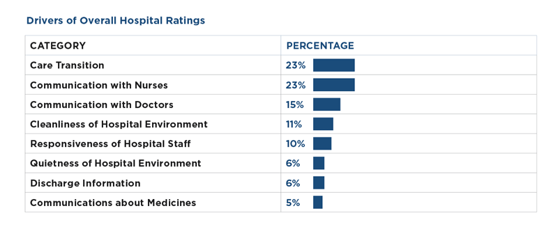
Figure 5. Position your bars on top of the table and align them to the table rows.
If you like, can you still apply an alt-text description to your bar chart, but usually I just tag it as an artifact.
And that is pretty much it. As long as you have removed grid lines, your sighted readers will see a traditional bar chart, and screen readers will read the underlying table. The information is now accessible to all audiences!
Taking Things Further
Now that you understand the basic concept of placing the text and numbers of a bar chart into a table, you can further design your bar chart by manipulating the table. If you want your data labels at the ends of your bars, increase the cell or paragraph indent of each cell by an appropriate value (Figure 6).

Figure 6. Increase the cell or paragraph left indent to position your data labels to the right of your bars.
If you would like your data labels inside the ends of the bar, layer your chart behind the text box that the table lives in. The only tricky part here is that you won’t be able to anchor your bar charts, as that will force the bars on top of any text, thus hiding your data labels (Figure 7).

Figure 7. Layer your bars behind the table and adjust cell or paragraph indents if you would like your data labels to sit inside the bars.
This technique is also good for a series of bar charts, often called “small multiples.” In this case, you can add columns to the table and then just add additional sets of bars (Figure 8).

Figure 8. For more bar charts, simply add more columns to your table (gridlines applied for clarity).
A Word About Reading Order
One of the most important tasks in creating accessible content is ensuring that reading order in a PDF is correct—meaning that all the different chunks of text and graphics are read by a screen reader in the intended logical order. Charts should be placed as anchored graphics at the desired point in your text flow. It also matters whether you use Inline or Custom positioning for your anchored charts since they are treated somewhat differently in an exported PDF.
The PDF/UA accessibility standards and most assistive technologies such as JAWS and NVDA make use of tags (visible in the Tags panel in Adobe Acrobat) for determining reading order. Tag order can be accurately controlled using InDesign’s Articles panel. When you export a PDF from InDesign and enable the Create Tagged PDF checkbox, both Inline and Custom anchored objects will be placed in the correct tags order. So in the resulting PDF, the Alt text describing an anchored chart will be read at the desired part of the text (e.g., “This is a chart showing…”).
But there’s more to the story. Acrobat also has a Reading Order panel that is used by some assistive technology for low-vision users. In this panel, reading order is determined by the stacking order of objects in the InDesign layout from bottom to top. Inline objects will appear at the point where they were placed in the text flow, but Custom anchored objects will not. For some reason (perhaps a bug) they fall to the end of the page.
So, if you are using custom-positioned anchored objects, in order for the document to be read correctly in all cases you have to use the Articles panel in InDesign to set the order of the tags, and then manually fix the order of content in the Reading Order panel in Acrobat.
Achieving Accessibility
While InDesign has been getting better in creating accessible PDFs upon export, you still need to stay nimble and creative in how you set up your content, especially when it comes to data visualization. But don’t get scared—as long as you’re putting yourself in your reader’s shoes and use the techniques in this article, you’ll do fine.
Commenting is easier and faster when you're logged in!

Recommended for you

InDesign Magazine Issue 110: Illustrator and InDesign
Issue 110 of InDesign Magazine include articles on Illustrator, designing with g...

Tip of the Week: Redefining Styles
Sign up for the InDesign tip of the week to get a new tip, roundups of new artic...
InDesign How-to Video: Working With Ruler Guides
In this week’s InDesignSecrets video, Anne-Marie Concepción shows us how to put...