
This article is courtesy ColourLovers.com.
![]()
In the U.S. 7% of the male population — or about 10.5 million men — and 0.4% of the female population either cannot distinguish red from green, or see red and green differently than the rest of the population. Color blindness affects a significant amount of the population, and it is even more prevalent in more isolated populations with a smaller gene pools. It is mostly a genetic condition, though it can be caused by eye, nerve, or brain damage, or be due to exposure to certain chemicals.
For those of us who see colors just fine, it is hard to imagine what those with color blindness are seeing. Luckily humans are smart and have created technology like the Color Blind Web Page Filter.
Popular Websites: As Seen by the Color Blind
The Color Blind Web Page Filter, which was used in this post to demonstrate the different types of colorblindness, allows you to view what a site looks like to people with each type of color blindness. Here are a few examples from some popular websites.


Iconic Art: As Seen by the Color Blind
Some would say we all see art in our own unique way… that would be especially true for the color blind. Here are a couple examples of some of the most iconic paintings as seen by the color blind.


Color Blindness Background
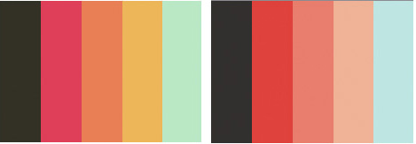
Using the Color Blind Web Page Filter,we’ll look at a popular palette, July, and how it is seen by those with different types of color blindness.

The NationMaster Encyclopedia states, “The normal human retina contains two kinds of light cells: the rod cells (active in low light) and the cone cells (active in normal daylight). Normally, there are three kinds of cones, each containing a different pigment. The cones are activated when the pigments absorb light. The absorption spectra of the cones differ; one is maximally sensitive to short wavelengths, one to medium wavelengths, and the third to long wavelengths (their peak sensitivities are in the blue, yellowish-green, and yellow regions of the spectrum, respectively). The absorption spectra of all three systems cover much of the visible spectrum, so it is not entirely accurate to refer to them as “blue”, “green” and “red” receptors, especially because the “red” receptor actually has its peak sensitivity in the yellow. The sensitivity of normal color vision actually depends on the overlap between the absorption spectra of the three systems: different colors are recognized when the different types of cone are stimulated to different extents. Red light, for example, stimulates the long wavelength cones much more than either of the others, and reducing wavelength causes the other two cone systems to be increasingly stimulated, causing a gradual change in hue. Many of the genes involved in color vision are on the X chromosome, making color blindness more common in males than in females.”
Types of Color Blindness
There are three types of inherited or congenital color vision deficiencies: monochromacy, dichromacy, and anomalous trichromacy.
Monochromacy

Monochromacy, also known as “total color blindness”, is the lack of ability to distinguish colors; caused by cone defect or absence. Monochromacy occurs when two or all three of the cone pigments are missing and color and lightness vision is reduced to one dimension.
Dichromacy
Dichromacy is a moderately severe color vision defect in which one of the three basic color mechanisms is absent or not functioning. It is hereditary and sex-linked, affecting predominantly males. Dichromacy occurs when one of the cone pigments is missing and color is reduced to two dimensions.

Protanopia is a severe type of color vision deficiency caused by the complete absence of red retinal photoreceptors. It is a form of dichromatism in which red appears dark. It is hereditary, sex-linked, and present in 1% of all males.

Deuteranopia is a color vision deficiency in which the green retinal photoreceptors are absent, moderately affecting red-green hue discrimination. It is a form of dichromatism in which there are only two cone pigments present. It is likewise hereditary, sex-linked, and present in 1% of all males.

Tritanopia is an exceedingly rare color vision disturbance in which there are only two cone pigments present and a total absence of blue retinal receptors.
Trichromacy
Anomalous trichromacy is a common type of inherited color vision deficiency, occurring when one of the three cone pigments is altered in its spectral sensitivity. This results in an impairment, rather than loss, of trichromacy (normal three-dimensional color vision)

Protanomaly is a mild color vision defect in which an altered spectral sensitivity of red retinal receptors (closer to green receptor response) results in poor red-green hue discrimination. It is hereditary, sex-linked, and present in 1% of all males. It is often passed from mother to child.

Deuteranomaly, caused by a similar shift in the green retinal receptors, is by far the most common type of color vision deficiency, mildly affecting red-green hue discrimination in 5% of all males. It is hereditary and sex-linked.
Tritanomaly is a rare, hereditary color vision deficiency affecting blue-yellow hue discrimination.
Resources
Interview with the Creator of Colblinder
Wikipedia: Color Blindness
Color Blind Image Filter
This article was last modified on July 11, 2023
This article was first published on December 10, 2008
Commenting is easier and faster when you're logged in!

Recommended for you

dot-font: Zapfest
dot-font was a collection of short articles written by editor and typographer Jo...

Send Those Crash Reports!
Recently, Zak Williamson of Adobe put out the call to InDesign users to please s...

Scanning Around with Gene: Happy Birthday, Peace Symbol!
It was fifty years ago this month that the peace symbol first appeared, a design...