


2:3. 3:5. 4:3. 16:9. If your designs have to accommodate the many aspect ratios and screen resolutions that proliferate in the mobile device market, these numbers are all too familiar. Certainly Punchcut (a company that designs user interfaces for a whole raft of devices) knows the pain you’re feeling. Punchcut’s designers have suffered through it themselves. Now they’re sharing the fruits of their experiences–and a handy set of tools.
The toolset includes the following:
* Photoshop marquee-tool presets for common screen resolutions.
* Templates of common devices intended for design presentation.
* A reference chart for resolutions and device landscape.
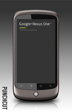
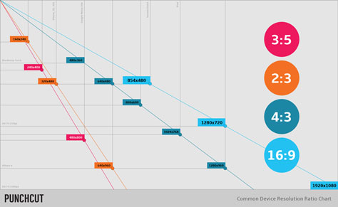
Get more information and the entire toolset here.
This article was last modified on December 14, 2022
This article was first published on April 6, 2011
Commenting is easier and faster when you're logged in!

Recommended for you
Closed Captioning in Premiere
Add captions to your Premiere video to ensure everyone benefits from its audio t...
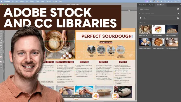
Find Adobe Stock Assets Without Leaving InDesign
Find Adobe Stock assets without ever leaving InDesign!
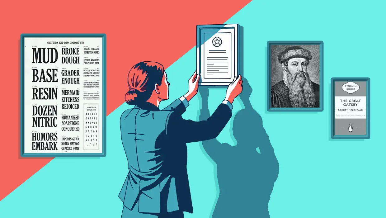
How to Be a Better Designer: The Rules
Throughout this series, several themes have recurred: study graphic design histo...