

dot-font was a collection of short articles written by editor and typographer John D. Barry (the former editor and publisher of the typographic journal U&lc) for CreativePro. If you’d like to read more from this series, click here.
Eventually, John gathered a selection of these articles into two books, dot-font: Talking About Design and dot-font: Talking About Fonts, which are available free to download here. You can find more from John at his website, https://johndberry.com.
Thirty-odd years ago, at the beginning off the 1970s, phototypesetting was at the top of its game. The flexibility, creativeness, and pure excess that sprang from the conjunction of new technology and freeform Zeitgeist created a world of graphic design that was flamboyant and unrestrained. The “big idea” approach to advertising, which had been popularized a decade earlier in a dramatic but severe visual style, was now decked out in bellbottoms and paisley and a cornucopia of revivals and references to older styles and fashions.
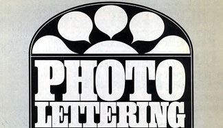
Photo-Lettering, the New York typesetting house that supplied headlines to much of the advertising and graphic-design business, both fed the appetite for new, ever-more-striking display typefaces and strove to keep ahead of the curve by stimulating the demand. Its library of typeface designs was huge, and growing daily. And, of course, one of the ways the company advertised its own business was through brochures, catalogs, and other publications that showed off their typefaces in action. One of these, a 24-page booklet called “Photo-Lettering No. 1” (also called, on the back, “Alphabet Directions Number Twenty”), came into my possession recently, and its pages are a reminder of what type could look like in those days.

Excessive Style, Careful Execution
Some of the typefaces used in the sample headlines shown in this booklet are so much of their time that it’s hard to imagine them ever being used again, except perhaps in a direct allusion to this cultural period.

This is a typeface that could only have come out of the late 1960s.
But many of the settings demonstrate a very careful arrangement of the letters and the words, taking into account not only their meaning but the particularities of their shapes as well. Even when the style of the typeface looks dated, these headlines are carefully composed and work on both verbal and visual levels—the essence of display typography.

The most effective way to arrange the words is not always the obvious one.
Simply interlocking the small details of the letters and avoiding mechanically centered or aligned arrangements can give a title force.

Playing with symmetry, asymmetry, and how the letter shapes fit together.
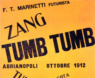
Tight But Not… Oh, Never Mind
This was the era of tightly spaced type, smashed together and sometimes overlapping for effect (see my earlier column “Type That’s Tight but Not Touching” for more). There are plenty of bad examples of this style, but this Photo-Lettering booklet shows quite a few examples of doing it right. For instance, this title setting for “The Story of Roy Bean,” with extremely heavy letters running into each other, works because of the very small size of the counters inside the letters (which mean that the space within the letters doesn’t look out of proportion to the lack of space between them) and because the bits that overlap are invariably the most exaggerated parts of the letterforms (so they don’t obscure the actual letterforms very much).

Tight space between letters, or even no space, sometimes works, when the letters are fat enough and the essential structure isn’t obscured.
Sometimes there’s a typeface that seems to have one and only one proper use. Could anyone find another use for the face shown in this headline (identified here as “8850n”)? In what other context could those flailing swashes be appropriate, except a headline about an octopus? (Well, perhaps one about earthworms.)

There’s a reason this typeface is known as “Octopus.” This may be its perfect use.
One of the typefaces that was popular at the time was Americana, a face that’s notoriously hard to space comfortably. The samples shown here use that face’s big, wide letterforms effectively, but they still suffer from the huge counters and the high contrast, which make any headline look like a jumble of curved sticks with odd holes in the middle of words.

Americana has striking letterforms but is very hard to space successfully, even in just a few words.
I certainly don’t recommend going and seeking out excessively dated display typefaces. Nor am I a fan of the 1970s “tight-but-not-touching” style of typesetting. But it’s instructive to look at examples from various eras and see what was in the eye and mind of the typographer. And it’s always useful to study examples of careful work, no matter what the style.
If I see a rash of faux-’70s headlines in the next few months, I’ll regret having written this column. But if I see a new attention to shape and the arrangement of type on the page, then this backward glance at a bygone era will have been worth the risk.
This article was last modified on February 18, 2022
This article was first published on October 25, 2004
Commenting is easier and faster when you're logged in!

Recommended for you

dot-font: Acrobatics—Putting the Story on the Screen
dot-font was a collection of short articles written by editor and typographer Jo...
dot-font: Avant-Garde Page Design
dot-font was a collection of short articles written by editor and typographer Jo...

dot-font: Typographic Souvenirs
dot-font was a collection of short articles written by editor and typographer Jo...