
The Darkroom Makes a Comeback
A few years ago, the computer age allowed photographers to escape the darkroom. Ironically, newly released, rigid viewing standards are pushing the photography, graphic arts, and publishing industries toward the need to lower the lights for entirely different reasons.
It’s not uncommon for desktop publishers in corporate environments to set up digital imaging computers in offices awash in fluorescent and window light. That approach, after all, saves money. But it does so at the expense of precise color image editing. Seasoned color editors agree that the most effective work space for critical computer editing of photography actually is a specially designed, darkened room — in which the overall illumination is lower than the brightness output of the computer monitor.
Attaining the ideal setting also necessitates considerations beyond lighting levels. To begin with, windows should be either heavily shaded from outdoor lighting or omitted outright to maintain a constant level of illumination throughout the work day. Next, to prevent ambient conditions from affecting human color perception, daylight-balanced D50 (or 5,000º Kelvin) fluorescent or filtered halogen lamps should be used for illumination. Ideally, walls and ceilings should be painted a neutral gray; and even flooring, countertops, and monitor faceplates should be color neutral. If the conditions for editing and viewing digital images are not rigidly controlled, the most subtle changes in color, brightness, and contrast displayed on a computer monitor may be impossible for the human eye to distinguish.

Standard Viewing Conditions
Following recommended standard viewing conditions is important to ensure not only accuracy in color imaging, but also consistency. Standardized color-imaging facilities allow different companies (or departments within an organization) to analyze, edit, and process files with consistency and eliminate as many variables as possible.
On September 1, 2000, standard viewing conditions for digital imaging production facilities were updated for the desktop imaging age. The revised international standard, called “Viewing Conditions — for Graphic Technology and Photography” (otherwise known as ISO 3664:2000), was created by the International Organization for Standardization (ISO). The ISO is set to release a second, related standard — ISO 12646 — by spring of 2002. Together, the revised standards have far-reaching implications.
The exhaustive, 20-page ISO 3664:2000 already available defines ideal viewing conditions when digital image files are displayed on a computer monitor in isolation, independent of any form of hard copy. In contrast, ISO 12646 (“Graphic Technology — Displays for Color Proofing — Characteristics and Viewing Conditions”) reasserts tighter (and long-used) color pre-press viewing conditions for monitor calibration and room lighting. In short, if you are setting up a contract-accurate imaging lab for comparing digital image files and printed output, then follow ISO 12646. If you are a Web developer or desktop publisher who seldom produces contract-accurate, printed proofs, you can use the less rigid IS0 3664:2000 as a guideline for setting up a color editing system.
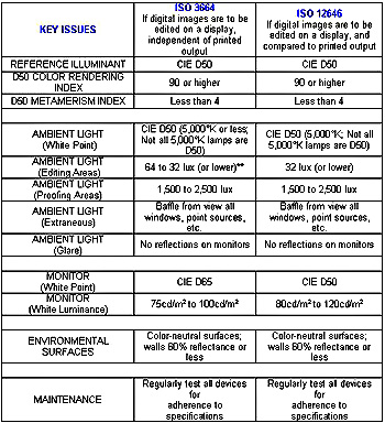
In addition to defining a minimum standard for computer viewing, ISO 3664:2000 defines the optimum conditions for viewing images reproduced on reflective media such as photo prints and press reproductions, and on transmissive media such as photographic transparencies. It also establishes illumination levels for viewing, exhibiting, and judging photographic prints (directly) and transparencies (directly or by projection).
ISO 3664:2000 also identifies a reference illuminant for room lighting known as CIE D50 (lamps with a relatively even spectral power distribution, similar to 5,000°K). D50 is based on yet another global standard set by the International Commission on Illumination (CIE). In addition, the ISO standard also defines desired ambient illumination levels and surround conditions (such as window light and neutral colors for walls, floors, and ceilings). And it recommends calibrated displays with specific white-point (D65) and white-luminance (75 to 100 candela per square meter) settings. ISO 3664:2000 even defines ideal surround conditions (such as transparency border and monitor faceplate color values) and warns against poor environmental conditions, such as colorful, distracting background areas in a monitor’s field of view.
Dimming the Lights
However, it is the ISO 3664:2000 standard for proper lighting in rooms where monitors are located that may shock desktop publishers and prove controversial in corporate settings, because it could be costly to implement. Imaging computers set up in brightly lit offices will be most affected: Under ISO 3664:2000, reduced ambient illumination in editing areas is the goal, and “shall” be less than 64 lux but “should” be less than 32 lux. ISO 3664:2000 standards are specified as either “shall” (a requirement that must be met) or “should” (a strong recommendation). Of course, the ISO isn’t going to send troopers to storm your office if it learns you aren’t meeting its requirements. But for organizations that build their reputations on ISO compliance or have such compliance written into their contracts, these requirements matter.
Some might classify 32 lux as working in darkness. Even a 100-watt, soft white, incandescent reading lamp in a room with no other illumination, off-white walls, and low ceilings measures about 350 lux at about two feet from a shaded source. Photographers accustomed to chemical darkrooms with far lower illumination levels will easily adapt to this way of working. However, typical office workers are accustomed to a relatively bright illumination level as high as 750 lux.
Corporate managers may cringe at the cost of reconfiguring office space to set up image-editing computers in rooms with lower levels of illumination. The reality, however, is that it is much easier to perceive color accurately and to make critical color adjustments when room lighting levels are lower. The ISO maintains that following lighting guidelines invariably results in fewer color output errors, which in turn reduces production costs.
Stricter Still
The ideal viewing conditions to be established in the upcoming ISO 12646 standard actually define a more rigid white-point (D50) and white-luminance (80 to 120 candela per square meter) monitor calibration standard, which can be met by most professional displays. It also specifies even lower room-illumination levels (32 lux or lower) that should be used when displayed digital image files will be compared to printed output. Ultimately, ISO endorsement of dueling monitor viewing standards reflect the reality that desktop
publishing and pre-press committee members were never going to agree on a single standard, because no one proposal met the diverse needs of all computer users. In other words, ideally, all of us who are concerned with color accuracy would be conforming to ISO 12646, but ISO 3664:2000 is a good compromise solution for businesses and individuals that don’t have a lot of money to throw at a solution.
The most important lesson graphics professionals can learn from studying these two complex new standards may be just how important proper lighting and other ambient room conditions can be in the production of accurate, consistent color. For others, including aging photographers like myself, that means a return to the darkroom. One can almost smell the chemicals.
In part 2 of this article, we’ll continue with practical tips for getting your office up to snuff for color-accurate work.
Read more by George Wedding.
This article was last modified on January 18, 2023
This article was first published on February 20, 2001
Commenting is easier and faster when you're logged in!

Recommended for you

Working With FDFs: Forms Data Files
If you are a designer, you’ll rarely come across an FDF file. In fact, you...

Using Picture Fonts and Icons
Who needs clip art? The best icons and symbols are already in your fonts.

InDesigner: Da Capo Press
Diane Burns shares the story of a publisher whose cookbooks promote good nutriti...