
Inside QuarkXPress: The Building Blocks Behind Effective Business Card Design

![]()

Application: QuarkXPress 4.x
Operating systems: Macintosh, Windows
There are two important aspects to desktop publishing: design and production. You can design until the cows come home, but if you don’t produce a printable document, what good is it? Similarly, you can follow print guidelines to the letter, but without a good design, who’ll care? That’s why it’s so important to balance both aspects carefully, never losing sight of either. In this article, that’s what we’ve set out to accomplish. By the end of the article, you’ll have created a business card, like the one shown in Figure A, which executes both form and function.

Figure A
Get creative with business card design.
Document Setup
The setup for a business card is fairly typical. In fact, you may want to save a copy of the formatted document as a template, for future use. To create a new document, activate QuarkXPress and press [c]N ([Ctrl]N in Windows). In the Page section, enter 3.5″ in the Width text box and 2″ in the Height text box–this is the standard size for a business card. In the Margin Guides section, enter 0.25″ for all four sides. This is a one-sided card, so you can deselect the Facing Pages check box, but make sure the Automatic Text box is selected. The last section is Column Guides. In our example, you don’t need columns, so leave both options at the default settings. Now, click OK.
Press [c]0 ([Ctrl]0 in Windows) to change the page to Fit In Window view. If the margin guides aren’t visible, press [F7]. Use these guides to indicate the live material area. The trim dimensions of this card are what you entered in the Document Setup. The live material area is your safety zone, where you can be sure pertinent information won’t be cut off.
Plan It Out
Now that you’ve created the basic template for a standard-sized business card, you can begin the planning stage. This process includes being able to answer these questions:
- How many colors will be printed?
- What paper stock will you use?
- Will the paper stock have color?
- How many cards will you print?
- How will you output the card?
- What’s the budget?
How you answer any of these questions affects how you might answer the others. Typically, the last question is the deciding factor. Can you afford a four-color business card or the fancy card stock? Would it be less expensive to choose a nice paper and forgo the color or vise versa? Don’t be afraid to ask the service bureau representative all these questions and any others you can think of.
If you’re outputting the cards to a desktop printer, you still have some things to keep in mind. You’ll probably choose to use color, but avoid small, serif type, where the ink might bleed. Also, make sure the printer can handle the weight of the paper. Typically, the heavier the stock the more likely it is to jam. One last point: A business card printed on a standard inkjet printer with perforated paper is obvious and (dare we say) rather unprofessional looking. Therefore, we don’t recommend it.
Prep Work
Once you’ve established a budget and material specifications, you can begin the design stage. This usually begins on paper, where you can sketch out several scenarios. If you’re designing the card for someone else, this is a good way of getting approval on a design before spending too much time on the computer. With an idea in mind, you can get to work. The design we came up with for our example developed progressively. We started with a hypothetical client that was in the architectural business. So we started looking through architectural books and magazines to get an idea of the kind of look that would suit this type of business–keeping an eye out for type styles and color trends as well.
Once you decide on a design, you can compile the necessary supporting files. For example, because the card was for an architectural firm, we decided to incorporate a building material into the design–hence the marble that’s woven into the border.
We found a piece of marble with the coloring we wanted to carry over into the rest of the card and digitized it in on a flatbed scanner. Then we made sure to format our image to that of four-color offset printing specifications, which is how we chose to output the card. For such a situation, the image needs to be scanned in at twice the printer’s line screen (typically 300 DPI), converted to CMYK, sized appropriately, and then saved as a TIFF file.
Along with making sure the imported image will separate to process colors, you want to make sure the colors in the document do as well. To do this, [c]-click ([Ctrl]-click in Windows) on Blue in the Colors palette (it has to be active) and then click the Edit button in the resulting dialog box. In the Edit Color dialog box, change the RGB model to CMYK and deselect the Spot Color check box. Click OK. Change Green in the same manner. Now select Red, but click the Delete button to remove it. Then, click Save to close out of the Colors dialog box. If you’re creating a card that’s going to be printed in something other than four-color, the basic process is the same. The easiest way to stick to the number of inks your budget allows is to remove all but those you’re using.
Design and Layout
Now that you have all the preliminaries done, it’s time to get busy. First things first: Make sure you’ve saved your document. If you have a bad habit of forgetting to save, take advantage of QuarkXPress’ preferences to do it for you. To turn on the Auto Save feature, choose Edit > Preferences > Application and click on the Save tab. Select the Auto Save check box and enter a time interval. Also, select the Auto Backup check box and specify a revision number and destination. Click OK. With that peace of mind guaranteed, we can move on.
Box It Up
Select the Rectangle Text Box tool and draw a rectangle that overhangs the card’s trim area (page size) by about 1/8 of an inch, which is a standard bleed allowance. With the Background Color icon highlighted in the Colors palette, choose Blue and change the tint to 20 percent.
Tip
- : Using snap-to guides for the basic building blocks of your card, such as the bleed dimensions, will help you to align the elements.
Now, drag a horizontal and vertical guide from the corresponding ruler to 1/8 of an inch from the trim. Then, select the Rectangle Picture Box tool and draw a box that’s 0.375 inches wide and 1.625 inches high. The easiest way to get these exact measurements is to draw the box and then enter the dimensions in the Width and Height area of the Measurements palette. Next, press [c]T ([Ctrl]T in Windows) and choose None from the Type pop-up menu to turn off the item’s runaround. Now, click OK. Next, place the rectangle to the left of the card, in alignment with the newly created guides, as shown in Figure B.
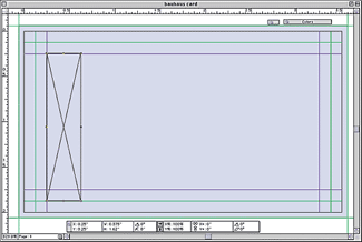
Figure B
Place the rectangle to the left of the card, in alignment with the margin guides.
While the rectangle is still selected, press [c][option]D ([Ctrl][Alt]D in Windows) to activate the Step And Repeat dialog box. Enter 3 in the Repeat Count text box, 0.75″ in the Horizontal Offset text box, and 0″ in the Vertical Offset. Click OK.
With the last rectangle you created still selected, press [c]D ([Ctrl]D in Windows) to duplicate the rectangle. Place the new rectangle in between the first two rectangles on the left, but align it with the top page guide, as shown in Figure C. Use Step And Repeat again, with the same settings as before, to create three more rectangles like this one.
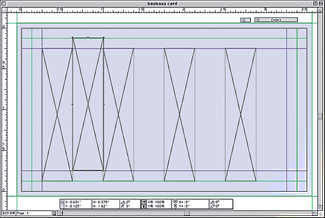
Figure C
Use Step And Repeat again, with the same settings as before, to create three more rectangles.
Choose the Rectangle Text Box tool again and draw another box that measures 3.6 inches wide by 0.25 inches high. Fill its background with a 70 percent tint of Blue and turn off its Runaround option, as we did for the other boxes. Then, align it just below the top page guide and in between the two bleed guides, as shown in Figure D.
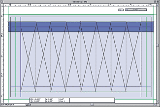
Figure D
Align the rectangular box just below the top guide and in between the two bleed guides.
Duplicate that box and place it just above the bottom page guide. Then, with the Content tool, [shift]-click on the two elongated rectangles and the background rectangle and send them to the back by pressing [shift][F5].
Now, press the [shift] key again and click on all six vertical rectangles, which are foremost on the page. Choose Item > Merge > Union to group them. Then, fill the newly created picture box with a 10 percent tint of Green.
With the Item tool and merged box still selected, [shift]-click on the other three boxes you’ve created (not the automatic text box) and send them to the back, so that the automatic text box is brought forward, as shown in Figure E.
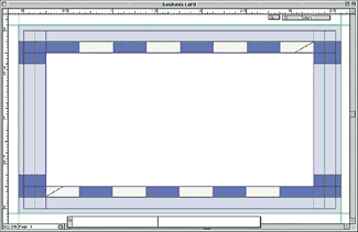
Figure E
With the Item tool still selected, click on the four boxes you created and send them to the back so that the automatic text box is brought forward.
Place the Picture
To add a bit of texture to the card, we used the TIFF image of the marble we previously scanned. We then placed the image into the irregular-sized box that was created with the merge function. To do this, select the light green box and press [c]E ([Ctrl]E in Windows). Now, select the image you wish to place and click Open to import it into your document. Then, press [c][option][shift]F ([Ctrl][Alt][Shift]F in Windows) to scale the picture in proportion to the box. (The image should already be within 25 percent of the correct size prior to placing it.)
Add the Info
With the overall graphic work completed, it’s now time to add the text. The automatic text box is just sitting there ready for you to fill it up with lovely type. At least you hope it will be lovely. It might not be if you end up with a font default. The first step to avoiding that is to choose PostScript fonts, rather than TrueType. If you’re having the card printed professionally, this is a must. Second, make sure to include the fonts you used with the document and image files you’re sending to the service bureau.
For the card in our example, we used Avant Garde and Avant Garde Demi. The company name is set at 14 points with a 70 percent tint of blue and a shadow type style applied to it. The line underneath the company name is set at 9 points and kerned -5 points. The address and bulleted items are set at 8 points. We used a tab stop at 2 inches for the bulleted items, and the bullets were created with Zapf Dingbats by pressing V. We sized the bullets down to 6 points. The last and most important part of the business card–the contact information–is set at 7 points and kerned -5 points.
The last, but not least, step to good-looking text is for it to be correctly spelled. Be sure to proof the text several times.
Finishing Touches
It’s the little things that count. Something as simple as a rule separating the company’s name from its description adds just that extra touch to tie the text in with the design. To create the rule, with the Line Text-Path tool selected, [shift]-click and drag a straight line the length of the company name and just below it. With the Item tool and line selected, double-click on the line to activate the Modify dialog box. From the Line tab, choose Dotted 2 from the Style pop-up menu. Now, change the Line Width to 1 point. From the Color section, choose Blue and a 70 percent shade. In the Gap section of the dialog box, choose Black from the Color pop-up menu. Click OK.
The last bit of graphic enhancement is to apply a frame that encompasses the text. To create it, draw another text box directly on top of the automatic text box and with the same dimensions. Now, double-click on the new box to activate the Modify dialog box. From the Box tab, select None for the Box Color. Then, click on the Runaround tab and select None from the Type pop-up menu. Finally, click on the Frame tab and enter 6 pt in the Width text box, and then select Deco Plain from the Style pop-up menu, as shown in Figure F. Leave the color as Black. Click OK.
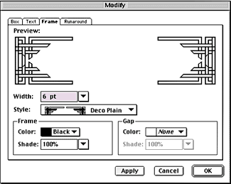
Figure F
Apply a frame to the box via the Modify dialog box.
Check It Out
The last step is always the same–make sure everything is in order and ready to send off. You always want to check all your digital files carefully and include hard-copy proofs too. If you’re saving everything to a disk for transport, a printed copy of what’s on it is always appreciated. To make sure your card is going to print properly, try it out right now. If the card contains more than black and white ink, print separations and check for any problems.
Here’s My Card
That completes the creation of a four-color business card. Hopefully, you’ve not only picked up a few tips on business card design, but also some new pre-press techniques to use.

Copyright © 2000, Element K Content LLC. All rights reserved. Reproduction in whole or in part in any form or medium without express written permission of Element K Content LLC is prohibited. Element K is a service mark of Element K LLC.
This article was last modified on March 12, 2022
This article was first published on February 14, 2001
Commenting is easier and faster when you're logged in!

Recommended for you

dot-font: Dot-Dot-Dot Dis
dot-font was a collection of short articles written by editor and typographer Jo...
Review: Affinity Publisher
In August 2018 Affinity took the unusual decision to launch its page layout prog...

The Secret to Naming InCopy Stories
It sounds like a simple thing doesn’t it? You name your InCopy stories usi...