

Editor’s Note: this post was excerpted from Keith’s handout from CreativePro Week.
Why listen to me?
What do I know? Who said I know the “right” way to do things? Years of using InDesign, teaching users how to use InDesign, and examining files built by a wide spectrum of InDesign users has shown me that while there are often many ways to accomplish the same task in InDesign, there is usually one way that is much faster, easier, and more efficient than the rest.
- You should learn the best way to do things to make your life easier. Nothing wrong with being lazy!
- Doing things the right way is usually the way that others will expect things to be done, making it easier for others to edit your files if the need arises.
- Doing thing the right way often makes InDesign able to compose text, render images, and layout pages the most efficiently, making InDesign faster and more responsive.
There are always exceptions!
As with any generalized “rules”, there are always exceptions. You will encounter situations where some of these tips won’t work, or will be slower or less efficient than certain other methods. But those are the exceptions, and should occur infrequently.
Ready? Here we go!
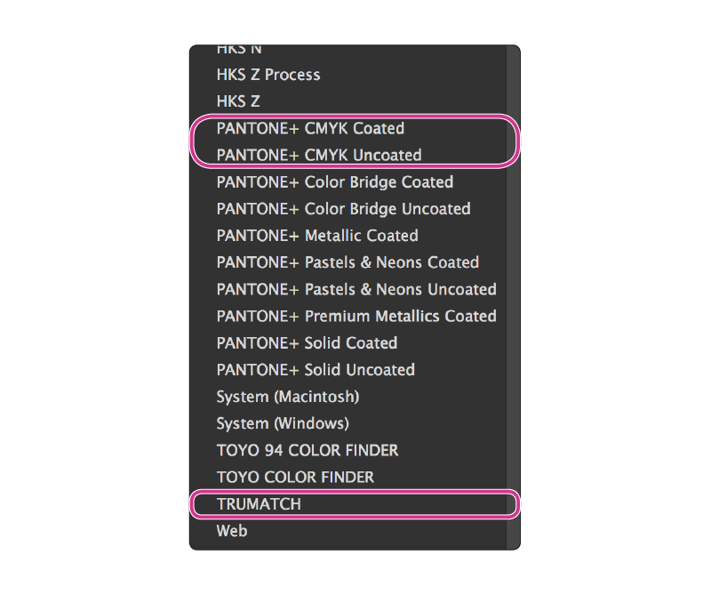
#1: Don’t specify spot colors when printing with CMYK
If your project is going to ultimately be printed on an offset press with CMYK inks, don’t specify PANTONE spot colors (colors from the PANTONE+ Solid Coated or PANTONE+ Solid Uncoated systems). Instead, obtain a Trumatch Colorfinder fanguide or a PANTONE CMYK Color Guide and locate the color you want in the guide. Then, in InDesign, choose the corresponding color from the matching library.
#2. Don’t blindly convert everything to CMYK
Your images probably came to you as RGB. Leave them that way as long as possible. For more information about RGB workflows, see this article.
- RGB is preferable for PDF output that will be distributed via the Web
- RGB is preferable for most desktop color printers and office color copiers
- RGB is can be easily converted to CMYK as the PDF is exported.

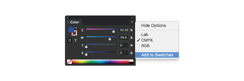
#3: Always create color swatches
There are many ways to create or choose a color in InDesign. But to make it easy, accurate, and efficient to assign the same color to multiple objects throughout your project, always make a Swatch out of any color that you create. Then, next time that you need the color, choose it from the Swatches panel.
#4: Don’t use ruler guides to align objects
Ruler guides are very helpful for helping establish a grid system or other boundary markers on Master Pages. But dragging in ruler guides onto document pages just to line some objects up is so 1988. Instead, use Smart Guides or the Align panel.
Smart Guides
- You can toggle Smart Guides on by choosing View > Grids & Guides > Smart Guides (command/ctrl+u). But I prefer to leave smart guides off all the time, and just activate them temporarily by holding down the ctrl key on the Mac while dragging an object. This is a Mac-only tip, unfortunately.
- Unfortunately, Smart Guides don’t work with objects on the pasteboard
- Smart Guides only activate for objects within the field of view on the screen. So on complex pages, it can be helpful to zoom in so that only the objects you are trying to align are visible before trying to drag an object with Smart Guides.
The Align panel
- The Align panel is located in Window > Object & Layout > Align (shift+F7). Some of the functionality of the Align panel also appears in the Control panel at the top of the screen, but the panel contains more alignment options, particularly if you choose Show Options from the Align panel menu.
- See this blog post: for more Align panel tips.

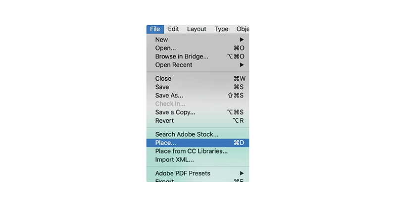
#5: Don’t paste bitmap images or large vector art into your layout
Yes, you can copy and paste from Photoshop into InDesign. But under normal circumstances you shouldn’t. Pasting images into InDesign has at least 3 disadvantages over using File > Place.
- The Info panel (Window > Info) doesn’t display resolution and color space information for pasted graphics.
- Pasted images can’t be color managed.
- Pasted images make the InDesign file much larger and theoretically more likely to become corrupted.
This article was last modified on April 13, 2023
This article was first published on May 17, 2019
Commenting is easier and faster when you're logged in!

Recommended for you

InDesign Tip: Fixing Multiple Hyperlinks at Once
Need to edit several hyperlinks that all point to the same destination? You don...
InDesign Magazine Issue 118: 20 Obscure Features
Issue 118 of InDesign Magazine with articles on obscure features, frame fitting...

Free Scripts to Convert Color Images to Grayscale
While creating a series of presentation templates for a client, I hammered toget...