

Press Release
Which one of these four new FontShop faces is your type?
FS Rufus
by Mitja Miklav?i? and Emanuela Conidi
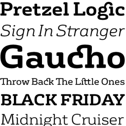
FS Rufus is an eccentric type. This cheeky, quirky, generous slab serif has wide forms and rounded corners. Combined with curious ink-traps, these create a unique personality. Equally at home in display and text sizes, this typeface is a collaborative design by Mitja Miklav?i? and Emanuela Conidi—both graduates from the University of Reading’s MA Typeface Design respectively in 2006 and 2008—and Jason Smith and Phil Garnham. The impressive ligature set in upper and lowercase turn this offbeat eco-warrior with a kooky nature into a very versatile family.
For more information, download the FS Rufus PDF.
FS Sally
by Phil Garnham and Jason Smith
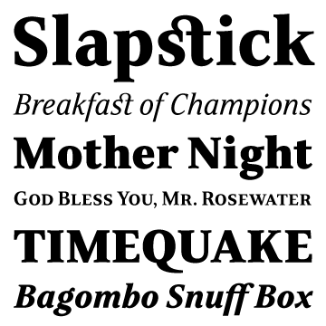
FS Sally is a graceful type. This refreshingly simple serif design by Phil Garnham and Jason Smith lends a crafted, elegant finish to display and text typographies. It is modern in its transitional style but with a hint of the classic. Sally enables its forms to sit with distinctive aplomb in both long and short texts. Used big, the slender character shapes add a touch of elegance to headlines. Sally’s extended ligature set, small caps, full complement of ordinal lower case characters and seven sets of numerals allow users to further refine the text setting.
For more information, download the FS Sally PDF.
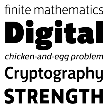
FS Dillon
by Jason Smith

FS Dillon is a rational type. Jason Smith took its inspiration from the Bauhaus movement’s philosophical emphasis on simple, practical forms. He added a thoroughly modern flavor, stark yet warm, imbued with the quirky individuality that has become a Fontsmith signature. The letter forms are simple and direct. Compact, with a large x-height, they are built for maximum clarity, economy of space, and impact.
For more information, download the FS Dillon PDF.
FS Jack
by Fernando Mello and Jason Smith
FS Jack is a confident type. This cool sans serif is good-looking and enthusiastic, its humanist letter forms honest, clear and to the point. Designed by Brazilian Fernando Mello—a graduate from the University of Reading’s MA Typeface Design program—and Jason Smith, FS Jack was selected for the Tipos Latinos 2010 exhibition, the biennial showcase of Latin-American typography and type design.
For more information, download the FS Jack PDF.
This article was last modified on January 18, 2023
This article was first published on April 21, 2011
Commenting is easier and faster when you're logged in!

Recommended for you

TypeTalk: Helvetica vs. Neue Helvetica
What is the difference between Helvetica and Neue Helvetica? First, a bit of his...
TypeTalk: Give These Fonts a Hand
Should you choose a handwriting font or real handwriting for your next project?

TypeTalk: Say What?
TypeTalk is a regular blog on typography. Post your questions and comments by cl...