

This InDesign tip on viewing color-blind previews of your pages was sent to Tip of the Week email subscribers on May 31, 2018.

Sign up now and every week you’ll get a new tip, keyboard shortcut, and roundups of new articles, plus exclusive deals sent right to your Inbox!
Just scroll down to the bottom of this page, enter your email address, and click Go! We’ll take care of the rest. Now, on with the tip!
Want to see what your layout might look like to someone with color blindness? InDesign itself doesn’t have a feature that will help you, but Illustrator does! Just export your file to PDF and open it in Illustrator.

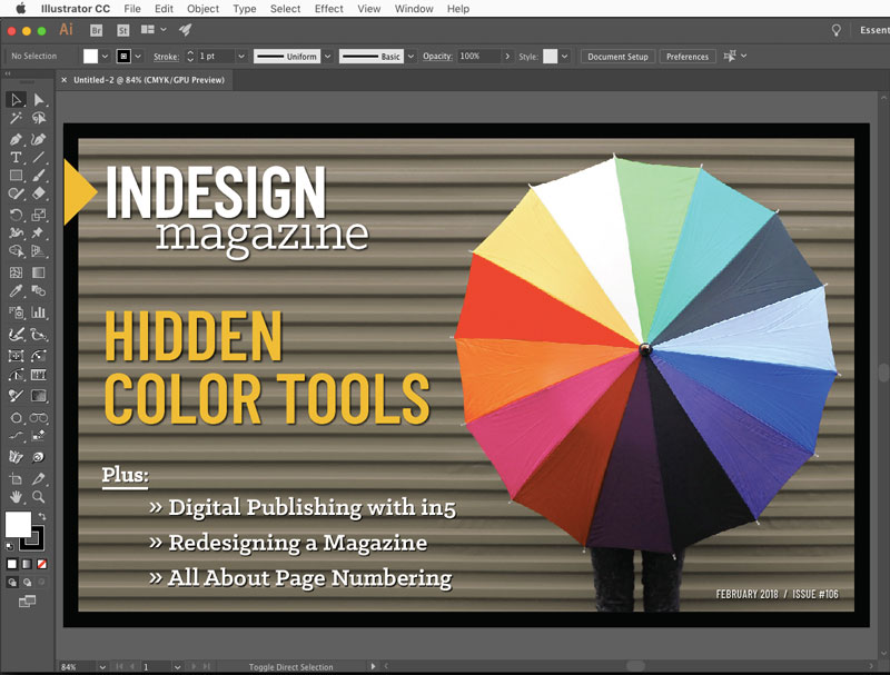
Then choose View > Proof Setup > Color blindness

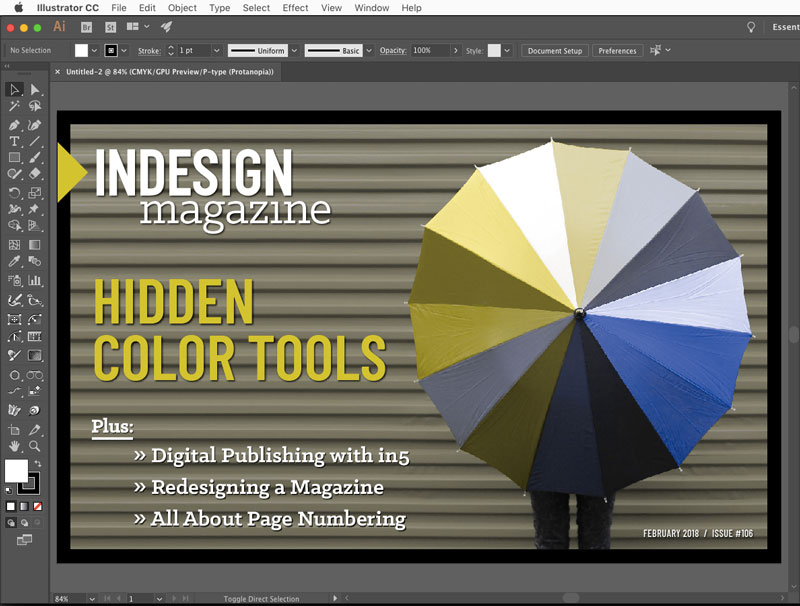
The two kinds of color blindness that Illustrator can simulate are Protanopia and Deuteranopia. Here’s an explanation of the difference from Colourblindawarness.org:
Protanopia
Protanopes are more likely to confuse:-
1. Black with many shades of red
2. Dark brown with dark green, dark orange and dark red
2. Some blues with some reds, purples and dark pinks
3. Mid-greens with some oranges
Deuteranopes
Deuteranopes are more likely to confuse:-
1. Mid-reds with mid-greens
2. Blue-greens with grey and mid-pinks
3. Bright greens with yellows
4. Pale pinks with light grey
5. Mid-reds with mid-brown
6. Light blues with lilac
This article was last modified on July 7, 2021
This article was first published on June 4, 2018
Commenting is easier and faster when you're logged in!

Recommended for you
Illustrator’s New and Updated Artboard Features
Discover the new features and updates to Illustrator's artboards with Kat Kremse...

How to Prevent Problems with PostScript Type 1 Fonts in EPS and PDF Files
Two techniques for heading off big problems when Adobe drops support for Type 1...

Tip of the Week: Viewing Document History
Sign up for the InDesign tip of the week to get a new tip, roundups of new artic...