

Slab serifs are one of the hottest typestyles in use today. These sturdy, full-bodied designs, with their thick, squared off, slab-like serifs, can be seen anywhere from magazines, newspapers and book covers to posters, logos, packaging and branding, web sites, and much more. They are most commonly used for headlines and display usage, but can occasionally be found used for text.
The good news is that more and more of these workhorse type designs are available from Typekit via Adobe’s Creative Cloud service. Typekit is a subscription font service that brings thousands of fonts from foundry partners into one library for quick browsing, easy use on the web or in applications, and endless typographic inspiration. Most Creative Cloud subscriptions include a Typekit Portfolio plan with access to their full library of fonts, while a few Creative Cloud options include a Typekit Free plan, with a subset of the fonts available.
We explored the Typekit Library and have selected five slabs worthy of consideration. They range from classic designs to contemporary interpretations, and were selected for their strength of concept, execution, as well as their practicality and usefulness.
Adelle

Adelle

Adelle Condensed
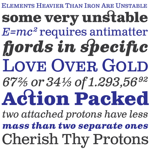
Adelle is an award-winning slab serif typeface family designed by Veronika Burian and José Scaglione of TypeTogether. Although originally conceived specifically for intensive editorial use in newspapers and magazines, its personality and flexibility make it a real multiple-purpose typeface. The unobtrusive appearance, excellent texture, and slightly dark color allow it to behave flawlessly in continuous text setting, even in the most demanding editorial applications. Its energetic character inherent to slab serif fonts makes it an excellent choice for subheadings and headlines. This superfamily also includes Adelle Condensed, making this an extremely practical typeface worth considering for any project calling for a wide range of versions.
Clarendon Text
Clarendon Text
Clarendon Text, designed by CanadaType, is a contemporary remake of this truly classic slab serif typeface. It is a widely usable text type suited equally well to advertising, books, publications, and corporate literature where large amounts of reading matter call for distinction and style without sacrificing readability.
Clarendon Text has been reworked to make it more contemporary and easily read. The shapes of certain letters including a, g, q, and t were revised for better readability when used for body copy. The original a, g, q and t are available as alternates for display uses, or those designers who like to make use of the traditional Clarendon. Clarendon Text was designed to be readable when used between 8 and 12 pt. The Bold weights are also clear and attractive at display sizes. Clarendon Text is the first version of this classic typeface to include small caps, fractions, and five different styles of figures.
See also: 5 Great Script Fonts From Adobe Typekit
Factoria
Factoria
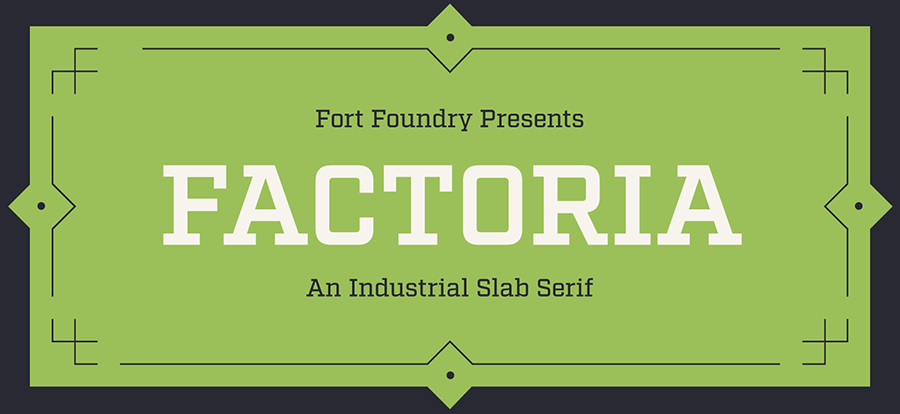
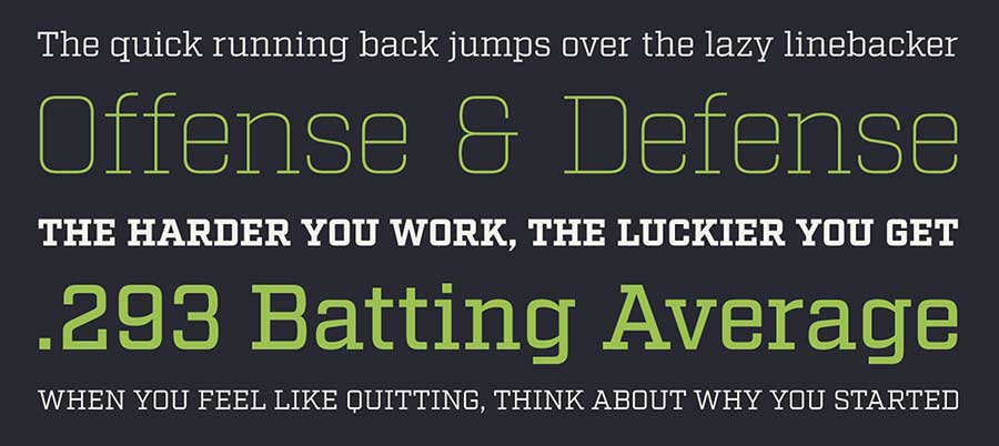
Born out of its sister sans serif typeface, Industry, Factoria is a striking geometric, square slab designed by Mattox Shuler of Fort Foundry. It was designed with a tall x-height for better legibility at mid-to-smaller sizes, but also presents a strong, powerful appearance at large sizes. This hard-working industrial slab can jump from the side of a building into a sports magazine with ease. The lighter weights exhibit a clean, no-nonsense vibe while the thicker weights exude strength and character. Factoria includes eight weights ranging from Thin to Ultra with corresponding italics.
Lexia
Lexia
Lexia is a slab serif font designed by Ron Carpenter for Dalton Maag, and contains a wide range of weights and styles. It has traditional proportions to give it the best functionality possible. This typeface family is perfect for conveying punchy messages on a massive scale, or simply communicating clearly at text sizes. For designers working with tough composition issues, one of Lexia’s great benefits is its extended range of weights and styles. The mid-weights provide excellent legibility for text, while the extreme weights are perfect for display and titling. Lexia even includes an Advertising weight that can be used to make impact on billboards and other large-scale applications.
Sutro Deluxe
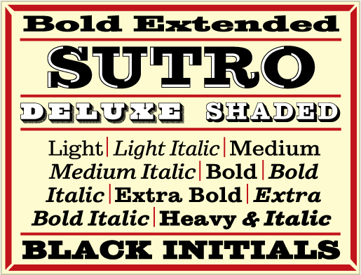
Sutro
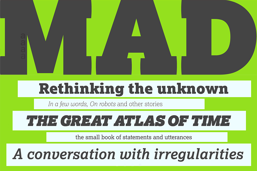
Sutro Deluxe is a square-serif Egyptian chromatic family designed by Jim Parkinson. Sutro Deluxe consists of the Primary, or main font, in addition to the four secondary fonts – Fill, Inline Fill, Inline, and Shaded Inline – which exist solely to support the Primary font. This chromatic font family (chromatic being another term for multi-layered) can be stacked or layered in different combinations and colors to achieve various effects. This bold slab serif with a double drop shadow was originally conceived as a simple black and white display alphabet. But, according to Parkinson, “it seemed unfinished, begging for something more. So I decided to add several layers of fill and detail to try and make it more interesting.” The result is this eye-catching, five-layer chromatic font family. The original unadorned, 10 weight Sutro adds to the extreme versatility of this contemporary superfamily.
* * * * *
While the slab serifs designs described above are a great place to start a font exploration when you’re considering this kind of design, they aren’t the only ones that Typekit has to offer. Check out their complete collection of slabs and find your own favorites!
This article was last modified on July 25, 2019
This article was first published on June 16, 2016
Commenting is easier and faster when you're logged in!

Recommended for you

Colorizing Grayscale Images (with transparency)
Georg wrote: I have a problem with placed grayscale images in InDesign. Normally...

Helpful Tips from the Denver InDesign Conference
The InDesign Conference in Denver just wrapped up this week. All of the attendee...
Quick find that graphic…
How do you quickly find an image that is linked in InDesign on your system or ne...