5 Cool Things You Can Do with GREP Styles
I love GREP Styles in CS4. Here are 10 (or more) tips for how you can use them to format text in your document quickly.

This article appears in Issue 59 of InDesign Magazine.
I love GREP Styles in InDesign. I’ve said it before: It’s probably my favorite new feature, and although it’s small, I think it makes the upgrade very worthwhile. But what are they, how do you make them, and what can you do with them?
A GREP Style is a way to apply a character style to some text inside a paragraph, based on a GREP pattern. GREP, as we’ve discussed, is a way to describe a text pattern using codes. For example, you can write “all the words that start with a and end with e” with the code \<a\S+?e\>
You can use GREP in the Find/Change dialog box, but only manually — that is, you have to actually do a search and replace each time you want to apply the formatting. GREP Styles don’t change text at all; they only apply formatting. But there are many things you can do with just that.
To apply a GREP Style to a pararaph, you probably want to edit your paragraph style definition. (You can apply a GREP Style to a single paragraph as local formatting by placing the cursor in the paragraph and choosing GREP Styles from the Control panel menu. But I find that in general it’s just more useful using GREP Styles inside a paragraph style.)
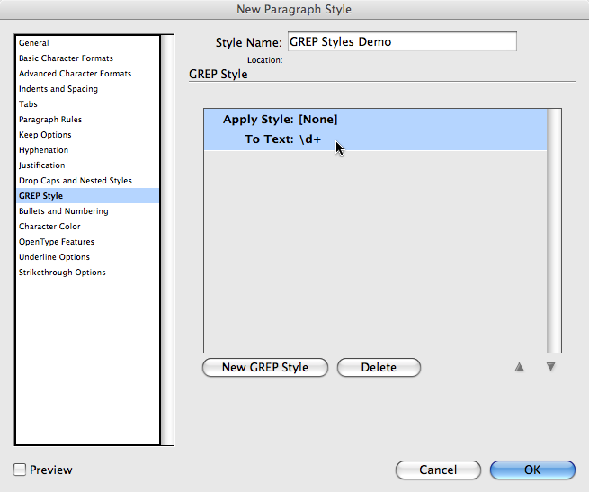
To make a new GREP style, click the New GREP Style button:

To apply a character style, click once on Apply Style and it turns into a character style. Then you can choose a style you’ve already made or choose New Character Style if you haven’t made one yet.
Type the GREP code in the To Text field. For example, the default GREP code \d+ means “one or more digits in a row.”
I encourage you to turn on the Preview checkbox to see how (or if) it works before clicking OK.
Five Cool Things You Can Do with GREP Styles
Okay, enough with the “how.” Now what about “what.” Bob Levine already posted about one way to use them here. Here are 5 more ways I like using GREP Styles. Please feel free to comment below with other ways you’re using this cool feature.
1. Oldstyle Numerals. Apply a character style that applies the OpenType Oldstyle Proportional figure style to all digits in a paragraph.

2. No Break words and phrases. I’m tired of setting individual words to “No Break” or changing dictionaries to instruct InDesign not to break words. If I don’t want to break “InDesign” on to two lines, I’ll just apply a no-break character style to the GREP code “InDesign” (that’s pretty simple grep, eh? Just type the word!)
3. Change Width of Em Dash. In some fonts, the em dash is just too wide for my tastes. No problem. Make a character style with a 75% (or whatever) horizontal scale. Then apply it to the em dash character. Don’t know how to type an em dash code? No problem. Just click the ![]() icon to the right of the To Text field. That shows you all kinds of cool codes for things.
icon to the right of the To Text field. That shows you all kinds of cool codes for things.
4. Make OpenType Fractions. Jamie McKeee reviewed and explained the excellent Proper Fraction script in InDesign Magazine Issue 27. I added a little sidebar to that review before it went “to press” that explained that if you are using OpenType fonts that include the Fraction style, you can apply them with a GREP Style. Apply a “Fractions” formatting character style to the code \d+/\d+ (which means one or more digits, followed by a slash, followed by one or more digits.) It won’t work if you have commas or decimals in the fractions, but it’s a good start! (Of course, you could make a GREP code to handle those situations, too?)
5. Make Characters Disappear. My colleague and co-author Olav Kvern just wrote me, saying, “You really don’t need to find/change typical typewriter text entry errors (double spaces after periods, etc.) anymore–just make a GREP style that does it and make it part of your base paragraph style(s).” Wow. Good point! But how to make a character disappear when you can only apply formatting? Make a character style that applies the fill color of None, a tiny point size, and a horizontal scale of 1%. Boom, it’s “gone.”
Dang, I can’t stop at five. Here’s one more you might find useful:
6. Replace text with icons. What if you want some text to convert into a special character? For example, everywhere you type some normal text, you want it to change into a special icon in a particular font. Here’s the before and after:

I found the ornament/symbol/glyph I wanted could be typed with the number “4” in Bodoni Ornaments. So then I made up a little easy-to-remember code that would never show up in normal text: “4z”. I then added two grep styles. The first one was 4(?=z) which means “look for the character 4 but only when it has the letter z immediately after it.” I applied my bodoni ornaments character style to that. The second grep style was (?<=4)z which is “find the letter z, but only when it has the number 4 before it.” To that, I applied my disappear character style.
What do you think? Can you think of other cool uses for this excellent feature?
This article was last modified on August 22, 2025
This article was first published on December 12, 2008
Commenting is easier and faster when you're logged in!
Recommended for you

Tip of the Week: Keyboard Shortcuts for Document Presets
This tip was sent to Tip of the Week email subscribers on August 13, 2015. Sign...

CreativePro Tip of the Week: Identifying Fonts in Photoshop
This CreativePro Tip of the Week on identifying fonts in Photoshop was sent to C...

InDesign Magazine Covers Your Version, Too
I’ve been the Editor in Chief of InDesign Magazine for 26 issues (that...


