


No matter how fabulous your design is, if it contains copy errors, those are what people will focus on. Below are some issues I’ve seen too many times over the years, and how you can prevent them from happening.
1) The backwards apostrophe.
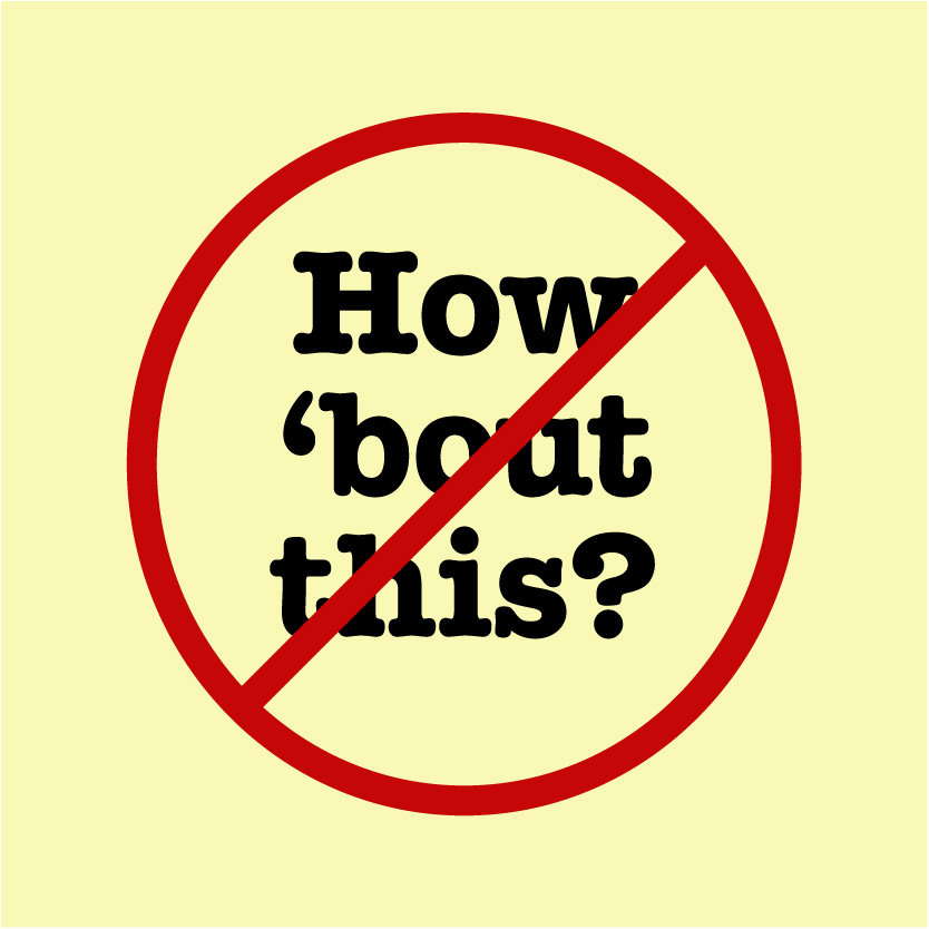
Computers love to do you the favor of wrapping quotation marks around the closest letter. Unfortunately, this can transmogrify an innocent apostrophe, trying to do its job of letter-replacement, into an opening single quotation mark. The poor apostrophe then suffers from a case of mistaken identity, and you end up with egg on your face. Your friends at InDesignSecrets can show you how to fix this issue, but you’ll want to stay vigilant to keep it from happening.

2) Lowercasing the wrong words in title case.

Title case does not mean simply lowercasing short words. It’s more complicated than that, I’m afraid. Generally, you lowercase prepositions (from, by, over, etc.), articles (the, an, a), and coordinating conjunctions (and, but, for, etc.)—unless they are the first or last word of the title. But it also depends on the style guide your company uses. The Chicago Manual of Style differs from AP style, and so on. But I have good news! The miraculous website capitalizemytitle.com will instantly put your text into title case, as dictated by six different authorities.
3) FPO copy going live.

Sure, your heart is in the right place when you insert placeholder text to see how it might feel in your layout. But I’ve seen this have regrettable consequences. I had a coworker who would blithely pull text from the internet to flow into her packaging layouts. (Yes, it did get printed in all its plagiaristic glory at least once.) There have also been many scenarios like the one pictured here from The Guardian. Moral of the story? If you’re going to use anything other than copy that was written, proofread, and blessed by a copywriter, slap a big, fat “FPO” on there. Otherwise, you might bring new meaning to the phrase “dummy text.”
4) Making “tiny” changes on the fly that end up being not so tiny.
The requests seem so innocent: “I just need you to take out this one letter,” your client tells you. “We only have one belly dancer on staff now. Just change ‘dancers’ to ‘dancer.’” It seems so simple, but you may not have sufficient time to notice that the new sentence reads, “All of our belly dancer are certified to perform your procedure.” (“All of” is bizarre now; and “are” should be changed to “is” for subject-verb agreement.)
5) Paying the price for trusting spell-check.
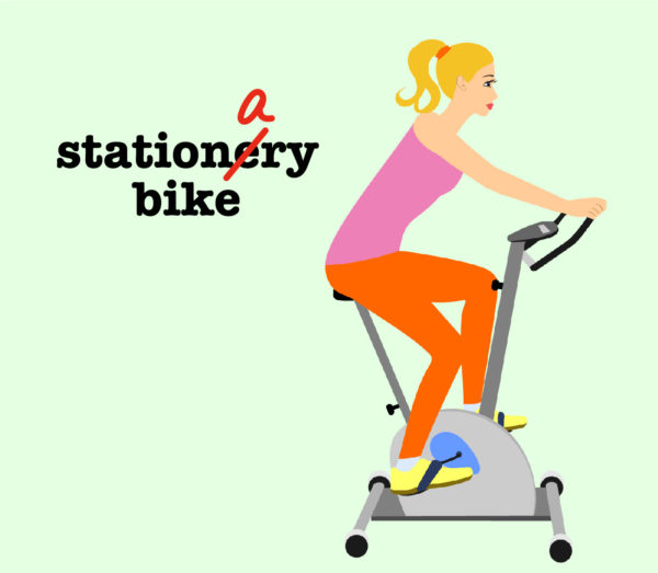
Here’s some unnerving news. “Complimentary” and “complementary” mean two completely different things. So do “discrete” and “discreet.” And when someone gets her “just deserts,” it’s spelled differently than desserts like chocolate cake and ice cream. By all means, use spell-check. It will show you that “refrigerator” does not have “fridge” in the middle, and that “minuscule” does not contain “mini.” But make sure a copywriter, editor, and/or proofreader gives everything a final look-over.
These are just a few of the mishaps that can happen in our line of work, of course. But I hope these tips will help error-proof your work, so your design can shine.
This article was last modified on June 1, 2019
This article was first published on June 1, 2019
Commenting is easier and faster when you're logged in!

Recommended for you

Special Quark/Apple Promotion
Quark announced that it has teamed with Ingram Micro Inc. to offer Quark custome...

Elevate Your Business Identity Using Class Crest Papers
Fresh, real-world samples in the current CLASSIC CREST® Papers identity pro...
P22 and The International House of Fonts Announce the Release of Two new Typefaces: Mantra and Bramble
Designed by Fontana Type Foundry co-founder Amondo Szegi (Hungary), “Mantr...