
5 Awesome Illustrator Techniques
Learn 5 ways to work faster and get better results in Illustrator

This article appears in Issue 1 of CreativePro Magazine.
One of my favorite things about working in Illustrator is how often I find new ways to use certain tools or discover settings within them that I never knew were there. In fact, I keep a notebook of tips and shortcuts I discover, including the “happy little accidents,” as Bob Ross would say. In this article, I’ll share five of these nifty techniques that you can incorporate into your own work and maybe use as a springboard to making your own discoveries.
Drag and Drop Appearances
The Appearance panel is one of the most powerful yet underused features in all of Illustrator. I’ve spoken to many designers at agencies who never open the panel; in some cases, they don’t even know what it’s for! That’s a shame because they’re really missing out. If you need a primer on why the Appearance panel is so awesome, check out this video by Von Glitschka at CreativePro Week.
This tip is quite useful when you have a single object that you want to format with the same appearance as another object (and creating a graphic style would be overkill). Most regular Illustrator users don’t know this technique, yet it’s hidden in plain sight!
Look at the piece of art in Figure 1. I created a basic star, and with the Appearance panel, gave it a fill color, two strokes, and a drop shadow. Now, what if I wanted to apply this same treatment to other objects in my artwork?

Figure 1. Two strokes, a fill, and a drop shadow—yup, that ought to do it.
All I have to do is go to the Appearance panel, click the small preview thumbnail in the top left of the panel, and drag the thumbnail on top of any other piece of artwork. The complete appearance will apply to that new shape (Figure 2). It even works with live type! You can then make adjustments if you like, but this is a really quick way of transferring fills, strokes, and effects to other pieces of art.

Figure 2. Top: Drag and drop the thumbnail from the Appearance panel onto the object you wish to format.
Bottom: The result
Bonus Tip: The Eyedropper tool offers another handy way to reuse strokes, color, effects, and so on in other parts of your art. Just select the piece of art you want to apply the formatting to, and use the Eyedropper to click the object that has the formatting you want to copy. Even better, double-clicking the Eyedropper tool opens the Eyedropper Options dialog box where you can determine which attributes the tool will pick up and which ones it will apply to your other art (Figure 3). Use this method instead of the Appearance panel thumbnail when you want to copy only some attributes to other objects.
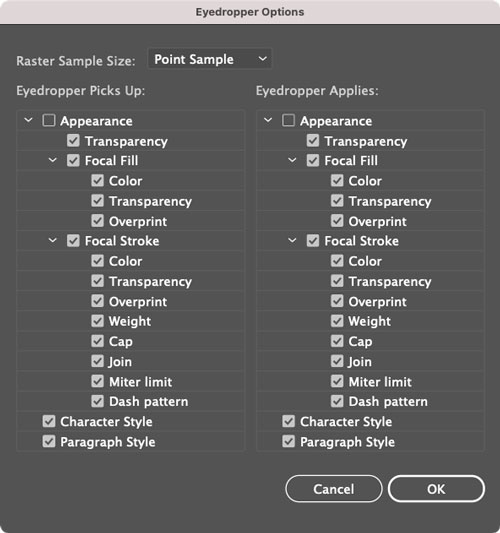
Figure 3. Eyedropper Options. Note that you have to turn on Appearance (which is off by default) in order to pick up and apply effects like drop shadows.
Transform Text with the Touch Type Tool
The Touch Type tool is another underused tool in Illustrator. Perhaps to some type aficionados that’s just fine, because it allows you to quickly distort the character shapes type designers worked so hard to create. But there’s no denying that it’s great fun to use if you are trying to achieve a quirky look with your type while keeping it live and fully editable.
Here’s how it works. Press Shift+T to access the Touch Type tool, or select it from the bottom of the toolbar’s stack of type tools (Figure 4), and click a character.
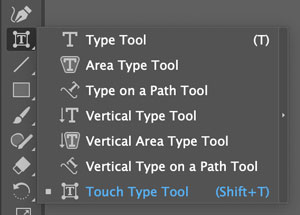
Figure 4. The Touch Type tool is grouped with the other text tools in the toolbar.
Illustrator will present you with a bounding box with small circles at the corners. One circle is a solid color, and the others are white (Figure 5).
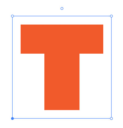
Figure 5. A bounding box with control handles appears when you click a character with the Touch Type tool.
Now you can:
- Drag the bottom-left control handle (the colored circle) to move a character up, down, left, and right. You can also just drag the character itself to move it. If you move the last letter in a word you can drag left to overlap the previous character, but you can’t go in the opposite direction (the gap between the letters will remain the same).
- Drag the top-left control handle up or down to scale a character vertically.
- Drag the bottom-right control handle to scale a character horizontally.
- Drag the top-right control handle to scale the character up or down proportionally.
- Click and drag the circle above the bounding box to rotate a character.
No matter what transformations you apply with the Touch Type tool, the text remains live. So you can change the font, apply different appearances, or edit the text without losing your creative touches (Figure 6).

Figure 6. Even though each letter has been rotated, moved, and scaled separately, it’s all still live text.
By the way, you can combine some of the techniques in this article. So, for example, you can use the Touch Type tool to distort some text and then use the Eyedropper to copy that distortion (with total precision) to other text. How cool is that?
Export Assets Like a Pro
For many designers, creating logos is a fun part of the job, but exporting those logos so they can be delivered to the client as usable assets is just plain work. The old way of doing this was to create multiple versions of the artwork in different file formats, color modes, and sizes. Nowadays you can use plug-ins like Logo Package Express to take some of the tedium out of the process. But don’t overlook another little tool built into Illustrator called Asset Export. To use it, first complete your designs (ideally with all appearances expanded), and then choose Window > Asset Export.
Once you have the panel open, you can just drag the elements you wish to export into it (Figure 7).

Figure 7. Drag the object you need to export into the Asset Export panel.
Then, choose their output size and format and select as many specific sizes as you require for each element (Figure 8). Or you can break the logo elements up into separate portions.

Figure 8. In the panel, you can see all the assets that will be exported along with the file formats, size, and file naming convention.
For example, you might want to deliver just a logo mark excluding the company name. You are also able to create groups of assets, which means you can create a single file incorporating all the elements for a job. It’s very versatile way to work and is a quicker option than the Export for Screens feature, which works for artboards as well as assets. You can also go into the Asset Export panel menu to open the Format Settings dialog box, where you can set the size and resolution for each export format.
Warp with Shape
When you want to get creative by warping text to fit a particular shape, this technique is simple to use, fun, and effective. For my example, I want to make a sticker design using the words LOVE and DESIGN and fit it into a shield shape that I have cut through the middle (Figure 9).
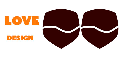
Figure 9. The ingredients for a cool sticker: two words of live text and two shapes to warp to
To start, all you need is your text (which can remain live) and your shapes. Unless you want to radically reshape the text, try to use a shape that’s roughly similar in size to the bounding box of the text. Otherwise, you might get a very strange outcome. Also, make a copy of the shape in case you want to use it as a background fill, as the default result will show the type only.
Make the shape the top object, and select it along with the first word you want to warp (you need to do this one word at a time). Choose Object > Envelope Distort > Make with Top Object, and the text molds to the shape. You can then choose Object > Envelope Distort > Envelope Options to fine-tune the result using the Fidelity option (Figure 10).

Figure 10. One word warped to the shape of an object
Repeat with the second word, and shape and fine-tune again. Remember, the type is still live so by double-clicking it, you can make edits that will automatically adapt to the distortion. Once you’re happy with the results, you can drop the copy of the shapes behind the text to make your design, add a solid shape with a stroke, and presto—a cool sticker design (Figure 11).

Figure 11. The finished sticker design
Swatches from Blends
I use this technique all the time to make my own swatches. It’s an unconventional use for the Blend tool, but it comes in very handy when you want to quickly create some new color swatches that create a bridge from one color to another. For example, let’s say I have two existing color swatches and want to create three new swatches that are a mix of the existing ones. What I would do is first create two shapes. I like to use circles, but it really doesn’t matter what shape you use (Figure 12).
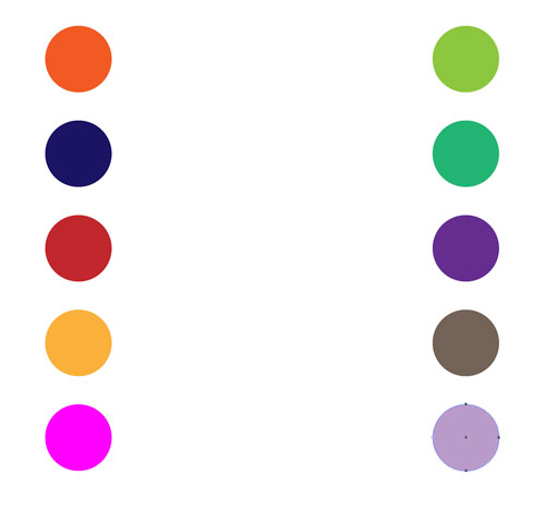
Figure 12. The starting point: a bunch of objects filled with colors you wish to blend
I then select both circles, and double-click the Blend tool in the toolbar to open the Blend Options dialog box. Change the Spacing to Specified Steps, and enter 3 for the number of steps (Figure 13).

Figure 13. Each blend step provides a separate color, along with the colors from the original two objects.
With the Blend tool, click the first circle and then the second to create the blend. Repeat this with as many pairs of objects as you like to create a bunch of new colors quickly (Figure 14).

Figure 14. This technique is too cool to use just once!
Next, expand the blend so it’s a set of regular filled objects (Object > Blend > Expand).
Then, with the expanded objects selected, go to the Swatches panel and click the New Color Group button. In the dialog box, name your color group and choose Create from Selected Artwork. I also usually select the options for Convert Process to Global and Include Swatches for Tints. Click OK, and you have a nice new set of custom swatches ready for use (Figure 15).

Figure 15. Colors from each set of blended objects become color groups in the Swatches panel.
The Fab Five
That’s just five of my favorite techniques in Illustrator. Give them a try! You might enjoy using them on a daily basis as much as I do.
Commenting is easier and faster when you're logged in!

Recommended for you

SOS San Francisco: A Case Study for Collective Visual Brainstorming
This article details the creative process used to develop the graphics for SOS S...
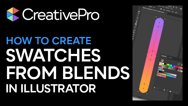
How to Create Swatch Groups from Color Blends in Illustrator
Learn how to create swatch groups from color blends in Illustrator and save them...

How to Smooth and Refine Paths in Illustrator
Learn how to easily smooth rough or bumpy paths in Illustrator using the Smooth...