
Working with Reversed Text in InDesign
A short but learned treatise on a creating a good-looking paragraph of light text on a dark background


This article appears in Issue 84 of InDesign Magazine.
If text is typeset well, nobody notices. But everyone knows poorly-typeset text when they see it. Reversed text is much easier to mess up than normal text; even seasoned typographers run into problems from time to time. So don’t feel discouraged: you’re not alone. As long as you have a good understanding of the factors involved, typesetting readable reversed text is quite straightforward. And it’s a transferable skill: you can set reversed text using any version of InDesign—or any other application, for that matter.
There are several techniques for creating reversed text; in this article we’ll tackle one that works at the paragraph level.
Why This is Important: The Unintended Optical Illusion
Consider this surprising behavior that explains why there’s a whole article on even just this one method of styling reversed text.
Create a small block of text, typeset in a standard font like Myriad. Make sure that the text is black and the text frame is white. Then make a copy of the whole text frame, and swap the colors around. The result will look like Figure 1.
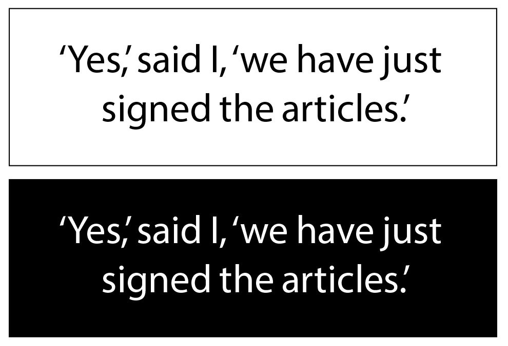
Figure 1: Two identical frames of text. Top: Normal text. Bottom: Reversed text. Notice how the two appear to have slightly different font weights, and than the reversed text appears to be more closely-spaced than the normal text. Typeface: Myriad (Robert Slimbach & Carol Twombly).
Now compare the two text frames. We know that the text frames are identical every aspect, except one is black-on-white (normal text) and the other is white-on-black (reversed text). But when viewed on-screen, the reversed text looks slightly heavier in weight than the normal text. And when we view a printed copy of the two text frames, the normal text looks slightly heavier than the reversed text.
If the two text frames are identical except for the swapped colors, why do the weights of the text look slightly different? The answer is complex. Part of it has to do with the way our brain interprets what our eyes see (an optical illusion); part of it has to do with the practical and technical limitations of different types of media. In a nutshell, printed layouts are vulnerable to an effect known as ink bleed, and screens suffer from an effect called light bleed. So it’s important that we understand how to avoid problems when designing layouts with reversed text, and for different publishing formats.
Finally—Paragraph Shading!
Paragraph shading is a convenient feature that users requested for years before it finally debuted in 2015. This new feature is easy to use, but offers sophisticated controls for those who need them.
The simplest form of paragraph shading is found in the Paragraph panel (Figure 2), in the form of a checkbox named Shading and a pop-up menu named Shading Color. To get a paragraph of reversed text, just insert your text cursor in a paragraph (we’re using Minion 10 point with 14-point leading), turn on the Shading checkbox, switch the Shading Color to [Black], and change the paragraph’s text fill color to [Paper] in the Swatches panel. The result will look like Figure 3, which is not a bad start. In fact, it’s a great start—we’ve got our reversed text!
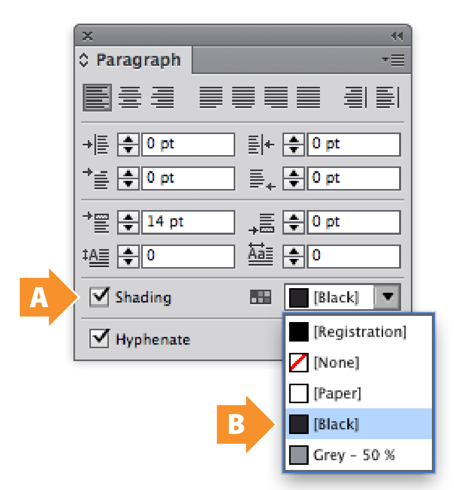
Figure 2: The InDesign CC 2015 Paragraph panel. This version adds support for Paragraph Shading. The Shading checkbox turns on shading for the entire paragraph (A). The Shading Color pop-up menu lists all colors and gradients from the Swatches panel (B).
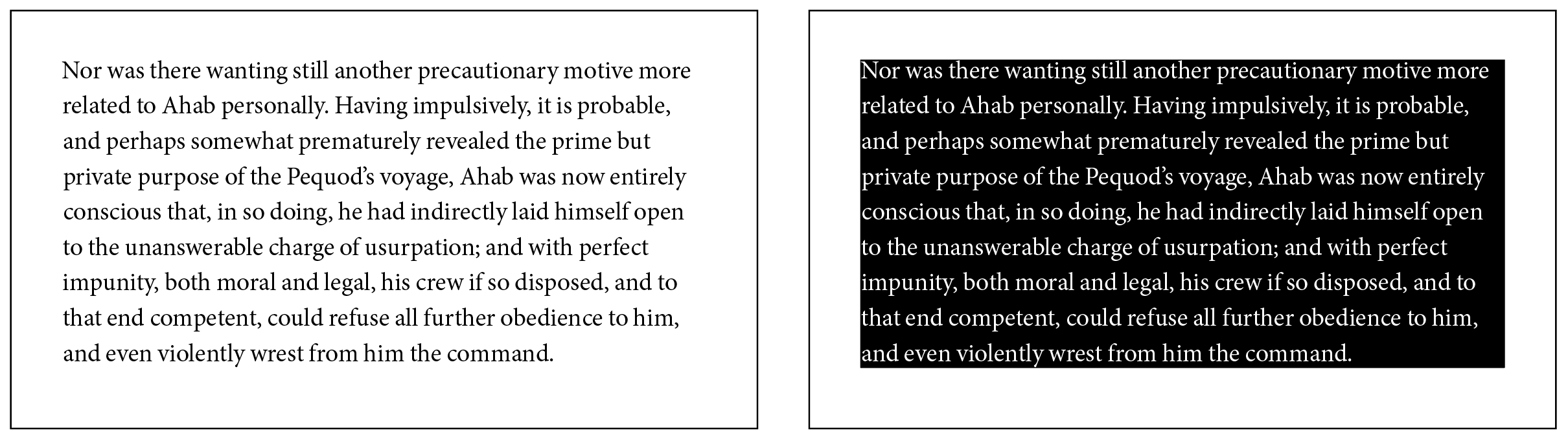
Figure 3: The effects of using paragraph shading. Left: A plain paragraph with no shading. Right: The same paragraph with the Paragraph panel’s Shading checkbox shading turned on. The default Shading Color is [Black]. Notice how closely the shading fits around the edges of the text; we’ll fix this problem next.
Visual Refinements
To make the text more readable, we should add some buffering to push the text away from the edge. We can do this by using the controls in the Paragraph Shading dialog box from the Paragraph panel menu (Figure 4).
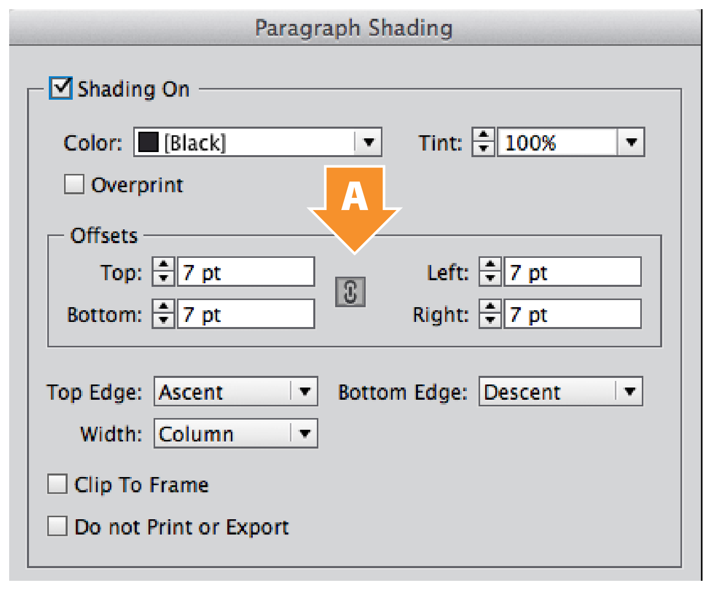
Figure 4: The Paragraph Shading dialog box, available from the Paragraph panel menu. These settings help control paragraph shading with great flexibility. The Offsets controls allow us to extend and contract the shading away from the edges of the text; unlock the chain switch (A) to adjust the four offset values separately.
These manual controls are convenient for applying paragraph shading on a case-by-case basis, but isn’t it a smarter idea to put them in a paragraph style? Let’s do that.
Part of paragraph formatting is considering how a paragraph interacts with the paragraphs above and below it, and this is visually even more important when working shaded paragraphs. In standard typesetting, there are two traditional ways to visually separate paragraphs: by adding a space between adjacent paragraphs, or by giving each paragraph a small first-line indent (Figure 5). The former is easier when working with shaded paragraphs; if you plan to use first-line indents instead, keep in mind that any paragraph with shading will need a bit of space before and after to allow for adjustments.
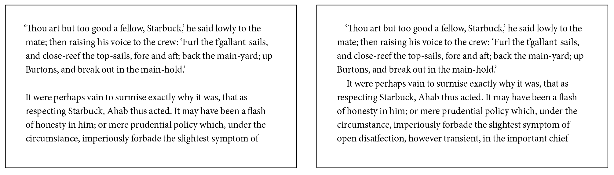
Figure 5: The two standard methods of separating paragraphs of body text. Left: Add extra spacing between paragraphs, normally the same as the Leading (line spacing) value. Right: Add a first-line indent at the beginning of each paragraph.
Creating the style
Begin by selecting a paragraph that will become your reversed text. Simply insert a blinking cursor in the paragraph, rather than selecting the entire paragraph; this will allow you to see changes without the text selection visually getting in your way. Then go to the Paragraph Styles panel, and click the Create New Style button at the bottom of the panel (Figure 6). A new style named Paragraph Style 1 is created. Double-click on the style to open the Paragraph Style Options dialog box. Give the style an appropriate name, and make sure that the Preview checkbox in the bottom left corner is turned on. In my example, I’ve set the Basic Character Formats to 10 pt Minion Pro Regular on 14 pt leading (Figure 7). I also set the Space Before value in the Indents & Spacing tab to 14 pt.
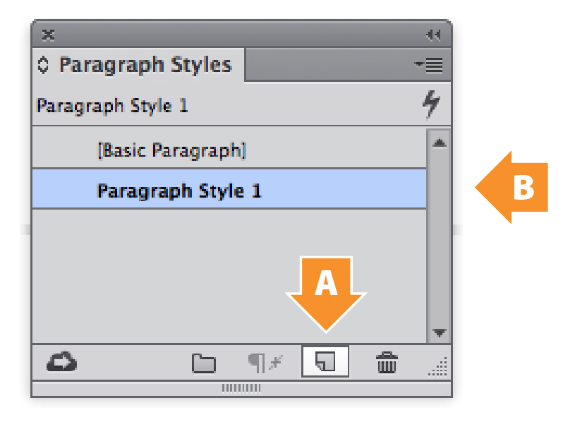
Figure 6: Creating a new paragraph style. First, select some text. Next, open the Paragraph Styles panel. Third, click the Create New Style button (A): a new style named Paragraph Style 1 appears. Finally, double-click Paragraph Style 1 (B) to change its settings.
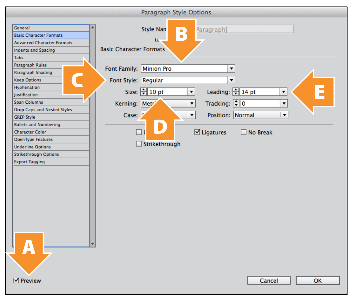
Figure 7: The Basic Character Formats tab of the Paragraph Style Options dialog box. Turn on the Preview checkbox (A) to see live updates to text in your page layout. Set the character formatting to 10 pt Minion Pro Regular on 14 pt leading (B–E).
The actual reversal
In the Character Color tab (Figure 8), we only have to change one setting—but it’s an important one! Change the Fill color swatch of the text—switch it from [Black] to [Paper]. At this point, the paragraph of text in the page layout will disappear. To make our text reappear, let’s go to the Paragraph Shading tab to set up our black background.
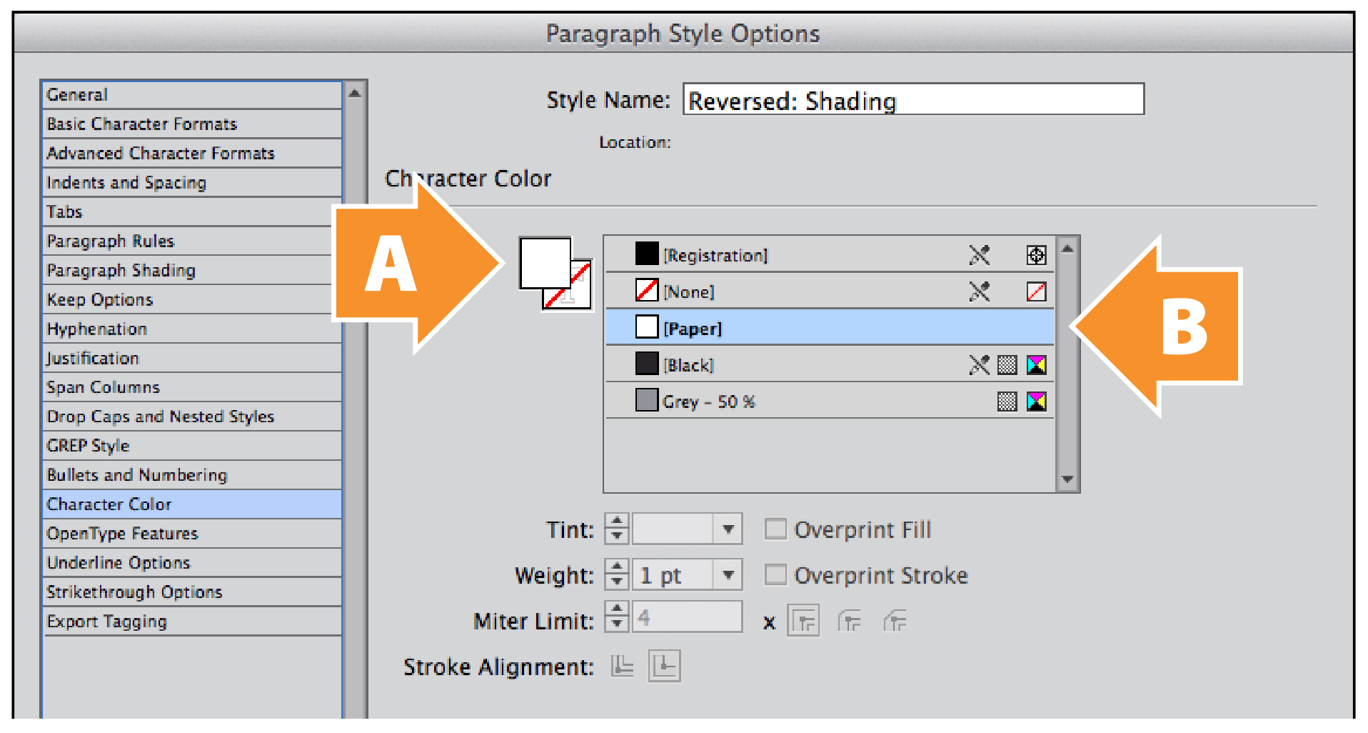
Figure 8: The Character Color tab of the Paragraph Style Options dialog box. Click on the Fill box in the top left (A) to make sure that it’s active. Select the [Paper] swatch (B) to change the color of the text to white.
Adjusting the background
The Paragraph Shading tab (Figure 9) is where we’ll make most of our adjustments. Before we can adjust any of them, we have to turn on the Shading On checkbox. Next, switch the Color to [Black]—and the reversed text reappears. But the text runs right up to the edges of the black background. This is not good for readability, so we’ll need to create a buffer to push the text away from the edges of the shading block.
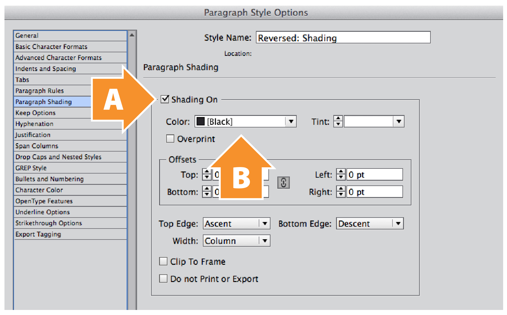
Figure 9: The Paragraph Shading tab of the Paragraph Style Options dialog box. Turn on the Shading On checkbox (A). Select [Black] from the Color pop-up menu (B).
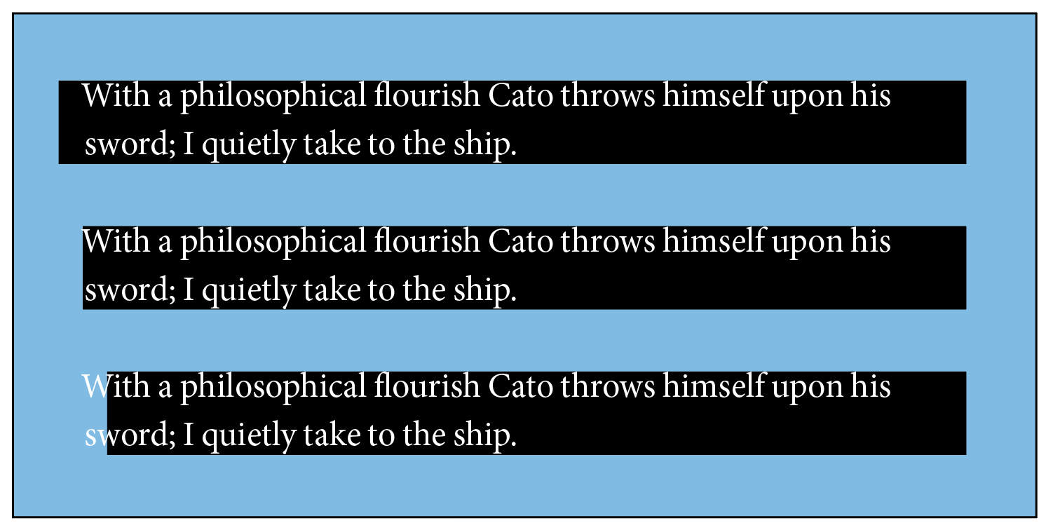
Figure 10: The effects of different Left Offset values on text with paragraph shading. Top: Left Offset set to 7 pt. Center: Left Offset set to 0 pt. Bottom: Left Offset set to –7 pt. Note: Background deliberately colored cyan to show white text.
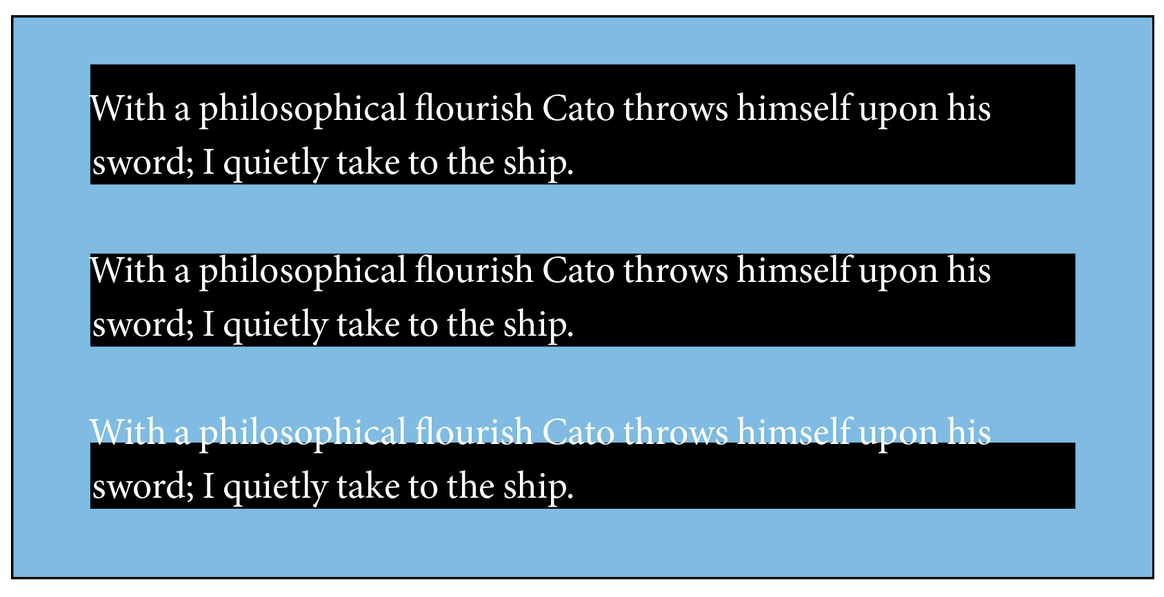
Figure 11: The effects of different Top Offset values on text with paragraph shading. Top: Top Offset set to 7 pt. Center: Top Offset set to 0 pt. Bottom: Top Offset set to –7 pt. Note: Background deliberately colored cyan to show white text.
If we want to buffer our text away from the edge of our paragraph shading, we need to do so in a way that best fits the rest of our layout. If we move only the shading edge, the shading will poke outside of the text column. What we ideally want is for the reversed text to line up with the rest of the text (Figure 12). We also need to make sure that the edges of the paragraph shading don’t overlap into the paragraphs above and below our reversed text (Figure 13). If you take the precaution to build a Space Before value into your paragraph style (Figure 14), the chance of the shading interfering with adjacent paragraphs is less likely.
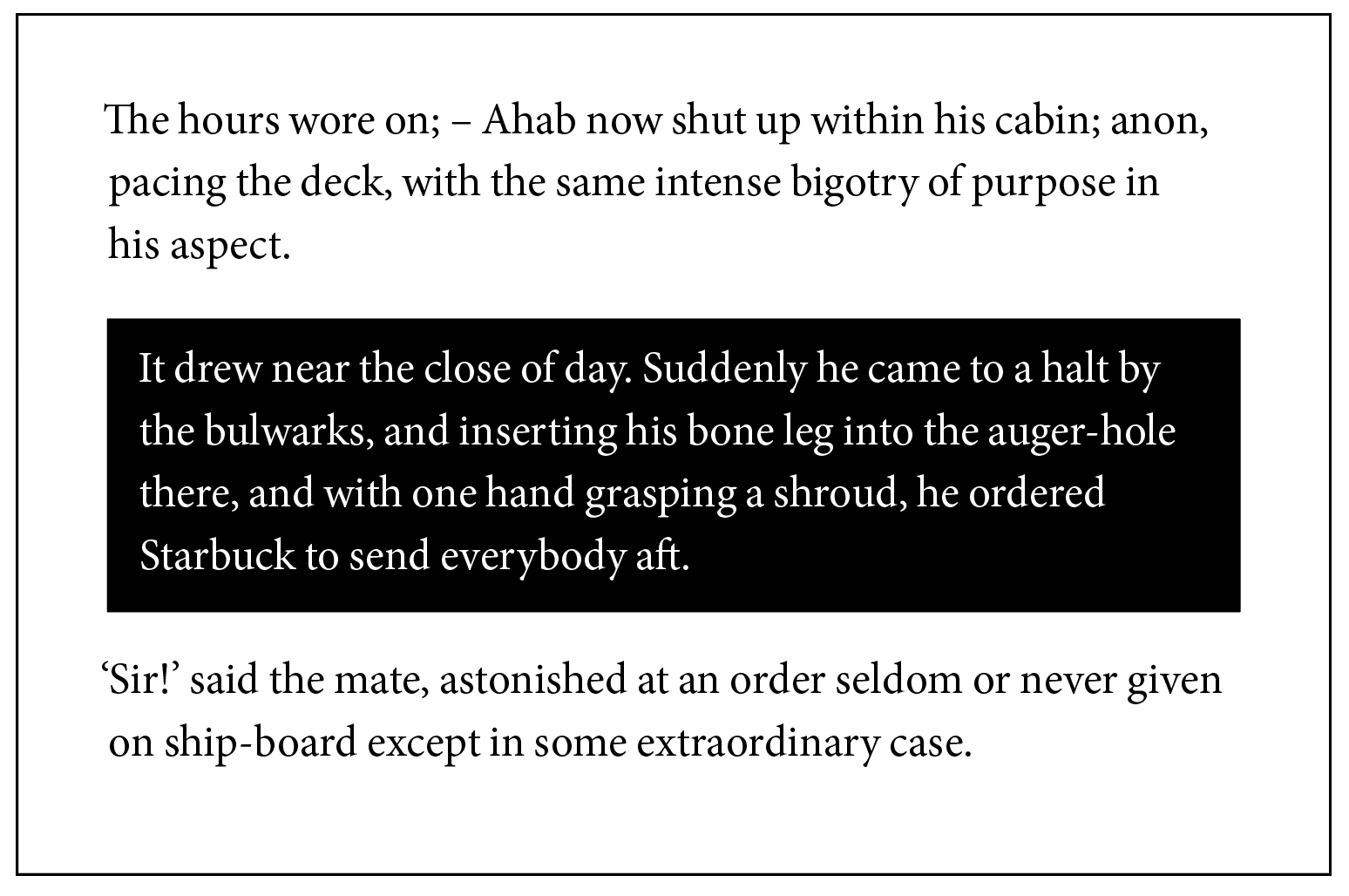
Figure 12: An example of paragraph shading that fits well into the rest of the text column. The left and right edges of the shading line up with the text column edges; the reversed text has padding that buffers it from the edges of the shading block.

Figure 13: When paragraph shading becomes problematic: shading that overlaps into adjoining paragraphs. This often happens when using first-line indents, rather than spacing between paragraphs; plan accordingly. Note: Background colored red to make black and white text more visible.
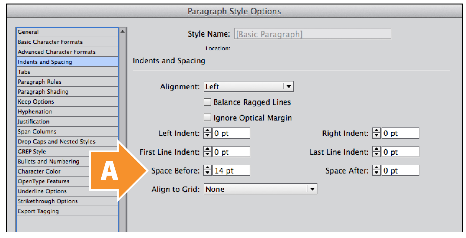
Figure 14: The Indents And Spacing tab of the Paragraph Style Options dialog box. Space Before is set at 14 pt (A); this helps avoid the overlapping problem seen in Figure 13.
When we originally set up our text, we used 10-point Minion on 14-point line spacing (leading), separating paragraphs from one another by an empty line. So if we need to add a buffer between our reversed text and its background shading, we need to decide by how much. Since our line spacing is 14 points, a buffer about half of that size (7 points) should be good.
Adding a 7-point buffer to our paragraph of reversed text takes two steps. First, we need to push the top and bottom edges of the paragraph shading out and away from the text. We can do this by changing both the Top Offset and Bottom Offset values in the Paragraph Shading tab to 7 pt, leaving the Left Offset and Right Offset values set at 0 pt (Figure 15).
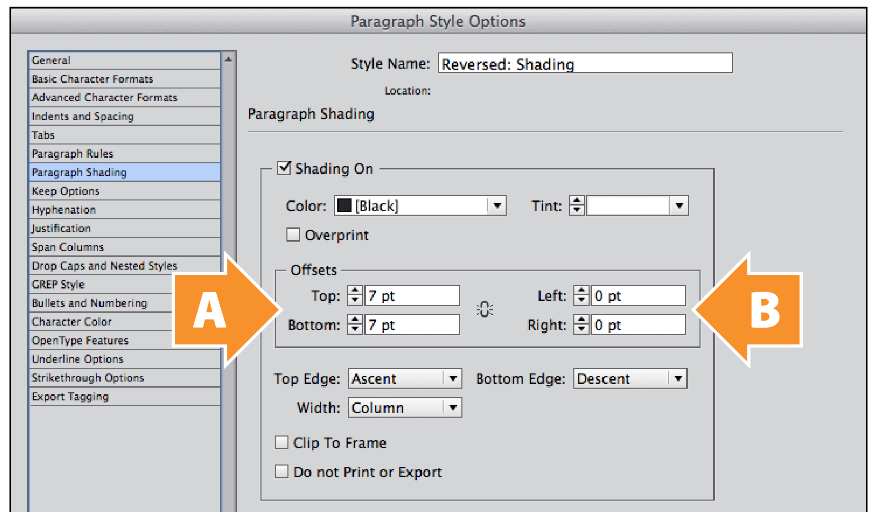
Figure 15: The Paragraph Shading tab of the Paragraph Style Options dialog box. Change the Top Offset and Bottom Offset to 7 pt (A). Leave the Left Offset and Right Offset set at 0 pt (B).
We already know that if we adjust the Left Offset and Right Offset values in the Paragraph Shading tab, the black background of our reversed text extends beyond the edge of the text column. This isn’t ideal, especially when building multi-column page layouts. If we want to keep the left and right edges of the paragraph shading aligned to the text column edges, the only way we can get our buffer is to push the text inwards from those edges. For that, we move to the Indents And Spacing tab of the Paragraph Style Options dialog box. When we change the values of both Left Indent and Right Indent to 7 pt, we get our left and right buffers (Figure 16).
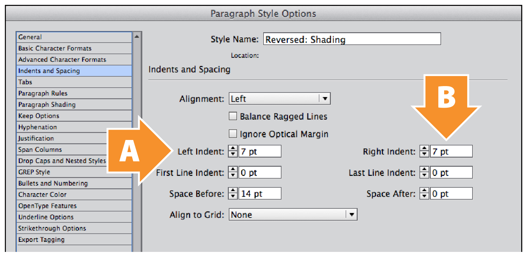
Figure 16: The Indents And Spacing tab of the Paragraph Style Options dialog box. Change the Left Indent to 7 pt. (A) Change the Right Indent to 7 pt (B).
Character weight and spacing
Our paragraph of reversed text is almost complete; all we need to do is optically adjust the weight and character spacing. Since we’re designing this layout for print, a slight increase in font weight will compensate for the effects of ink bleed. Changing Font Style from Regular to Medium in the Basic Character Formats tab (Figure 17) will take care of this.
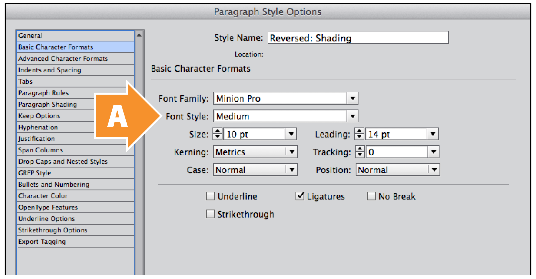
Figure 17: The Basic Character Formats tab of the Paragraph Style Options dialog box. Change the Font Style to Medium (A), in order to compensate for ink bleed.
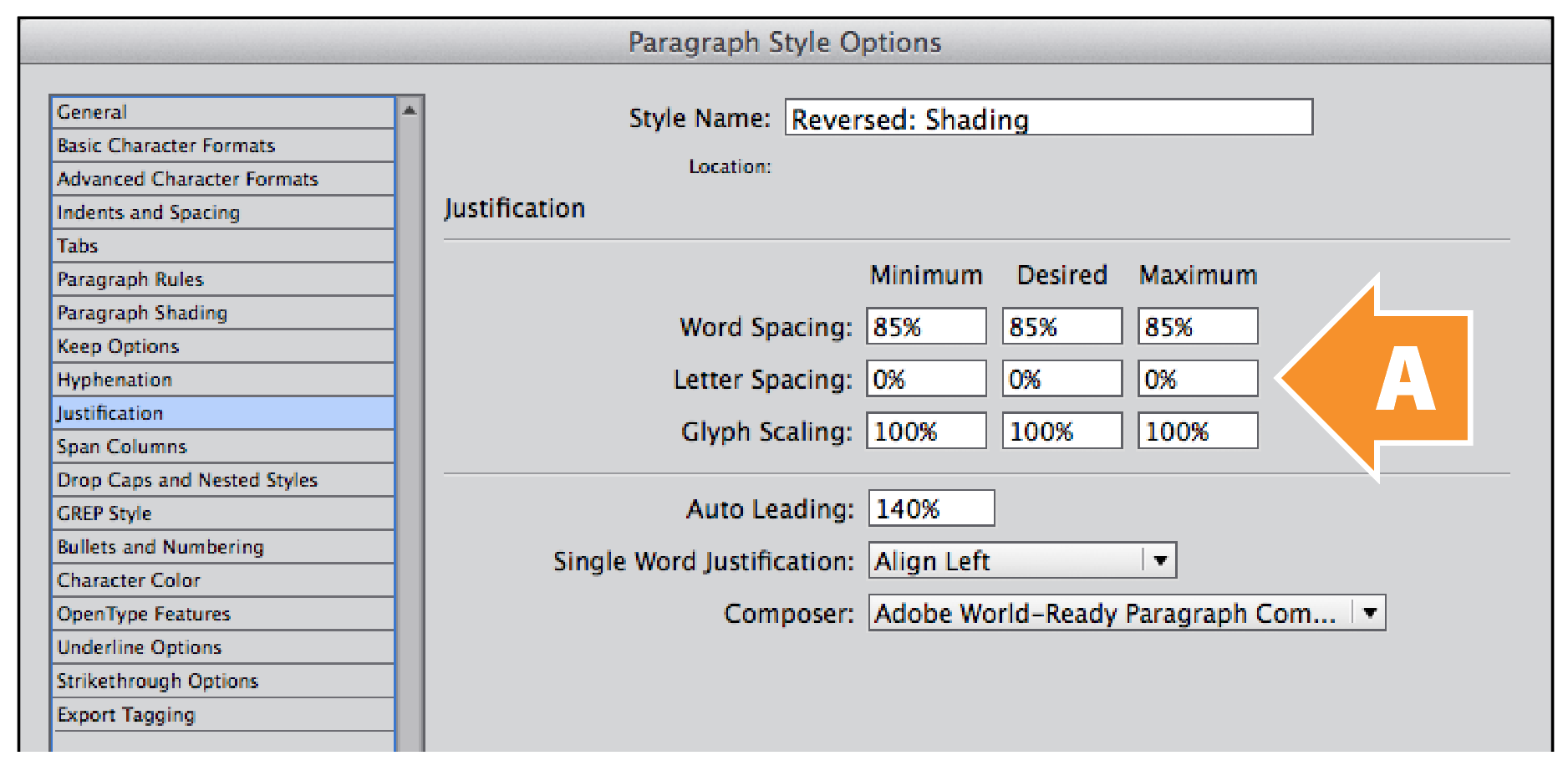
Figure 18: The Justification tab of the Paragraph Style Options dialog box. Note that the default values for all three values of Letter Spacing is 0% (A).
As for character spacing for our reversed text, we could use the Tracking value in the Basic Character Formats tab, but I prefer a more controlled approach, which we have in the Justification tab (Figure 18).
Justification controls the spacing between words (Word Spacing), between characters (Letter Spacing), within characters (Glyph Scaling), and between lines (Auto Leading). Letter Spacing works in percent values, based on the width of the standard word space character (Unicode: 0020) defined in the font itself (Figure 19). This means that a Tracking value of 10 thousandths of an em (or 1% of an em) doesn’t equal a Letter Spacing value of 1%.
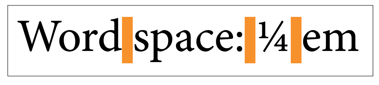
Figure 19: The standard word space character (Unicode: 0020) in most typefaces is about 250 thousandths of an em, or one quarter-em. InDesign uses this word space as the basis of the Word Spacing and Letter Spacing values in Justification. Minion Regular has a slightly narrower defined word space of 227 thousandths of an em.
Most people give up at this point, but we’re going to forge on. If the Letter Spacing value is based on the width of the standard word space in our font, then we need to know precisely what that value is. Most typeface designers define the width of a word space to be about 250 thousandths of an em, or one quarter-em. That means our letter spacing value needs to be about four times larger than our tracking value to compensate for the difference. So if we’re using a tracking value of 10 (1% of an em), our letter spacing value needs to be 4%, or a quarter-em (Figure 20).
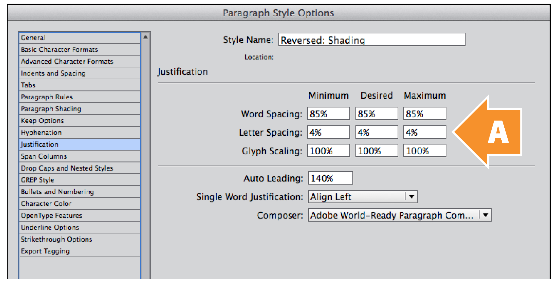
Figure 20: The Justification tab of the Paragraph Style Options dialog box. Change all three values for Letter Spacing to 4% (A).
Note: An easy way to roughly convert Tracking to Letter Spacing is to divide the Tracking value by 2.5. In our case, a Tracking value of 10 becomes a Letter Spacing value of 4%. There is an exact conversion formula for every font, but it’s beyond the scope of this essay.
Go Forth and Reverse!
And there you have it: a straightforward way to typeset an entire paragraph in reversed text in InDesign.
This article was last modified on October 11, 2024
This article was first published on October 11, 2024
Commenting is easier and faster when you're logged in!

Recommended for you

Before&After: How to Design a Logo of Letters
Logos with ligatures are handsome, simple, and compact.

Making a Custom Shape for Highlighting or Boxing Text
T.J. wrote: Just wondering if it’s possible to get a rounded corner frame...
Creating a “Fold Back” Effect for a Heading in InDesign
You’ve seen this effect, right? A rectangle that appears to bend or fold backwar...