
Working with Grids in InDesign
Greater confidence in your design, a more efficient workflow—really, why wouldn't you use grids? Nigel French shows you how.


This article appears in Issue 40 of InDesign Magazine.
Behind every well-designed document is a grid of some sort. Grids help you quickly and consistently arrange text and graphics, and even though a well-designed grid will be invisible to the average reader, it helps them make sense of the different elements in a document. The enhanced readability and increased structure that comes from using a grid gives your documents credibility. For you, the designer, the grid takes the guesswork out of where to place elements on the page. This means increased design confidence as well as a more efficient workflow. you know that the elements of your page are where they are for a reason. Columns of text, headlines, photos, illustrations, captions, pull quotes, and other page elements are more easily tied together—or unified—using a grid.
A grid can be simple or complex, but even a one-column grid has to be carefully considered, because it determines the type area of the page as well as where the folios go. Newspapers and magazines with multiple columns and a mixture of type sizes—as well as photographs and illustrations—require grids that are more complex. Often they‘ll use a flexible number of columns and divide the page horizontally as well as vertically. In addition, they use a baseline grid to keep the baselines of the type cross aligned over columns and equally spaced from other elements.
Elements of the Grid
Let‘s start by identifying the different types of grids:
- A Layout Grid is a matrix of grid fields that divide the page vertically (columns) and horizontally (rows). These grid fields, or cells, are separated by gutters.
- A Baseline Grid is an incremented ruling of guides superimposed onto the layout grid.
- A Document Grid divides the page (and pasteboard) into “graph paper“ with grid lines at specified
increments and a chosen number of subdivisions. While I sometimes find this useful when creating diagrams, for the most part I don‘t use Document Grids.

Figure 1: Experimenting with different numbers of columns.
Setting up a Layout Grid
Layout grids and baseline grids work in tandem. Before you set up the Baseline Grid, you create the Layout Grid. At its most basic this means choosing the page size and setting the margin values, number of columns,and the gutter width when you start a new document. If you‘re changing these values for a document in progress or creating a new Master Page, use Margins and Columns under the Layout menu. Another approach is to use Create Guides. While the Margins and Columns dialog box is the place to create or adjust major column divisions that affect text flow, Create Guides is a guide-making machine for making custom grids of rows and columns—and because it‘s instantaneous, you can experiment with different configurations. If you‘re working with a complex grid, you might consider superimposing an extra level of columns onto your main grid. For example, if you have a 12-column grid, you can break this down into 3- and 4-column configurations, each of which can be colored differently (Figure 2). To prevent the document from becoming cluttered put these guides on their own dedicated layer, which you can show, hide, or lock as needed.

FIgure 2: A twelve column grid, with 3- and 4-column permutations superimposed. The guides are colored and placed on separate layers for ease of use.
Setting up a Baseline Grid
Before we sign off on the Layout Grid, we need to set up the baseline grid since one informs the other. Firstly, choose View Options > Show Baseline Grid to show the Grid, then go to your Grid Preferences to determine its look, starting position, and increment (Figure 3). These are the options:

Figure 3: Setting up the baseline grid.
- Go to the Master Pages. The type area will almost certainly end with a partial grid increment. Zoom in to the bottom of the page and with the Rectangle Frame tool draw a rectangle in this partial increment to measure its height. Note the height of the rectangle (shown on the Control panel) or highlight the value and copy it to the Clipboard.
- Go to Layout > Margins and Columns. Insert your cursor after the value of the bottom margin and type + and then enter (or paste) the value of the partial increment to increase the size of the bot- tom margin by this amount.
Dividing the Page into Rows
If you want square grid fields choose a number of rows and columns that corresponds to the aspect ratio of your page (Figure 4).

Figure 4: A letter size page divided into 13 rows and 10 columns, yielding square grid fields.
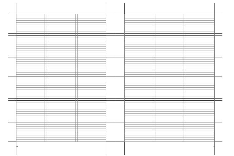
Figure 5: An A4 spread with a type area of 59 lines, divided
into six rows of 9 lines each.
Aligning to the Grid
Once you‘ve established a baseline grid, you can align text to it by clicking the Align to Grid icon on the Control panel, or by choosing All Lines in the Align to Grid choices found under Paragraph Style Options/Indents and Spacing (Figure 6).

Figure 6: Aligning text to the baseline grid through the Paragraph Style Options (left), or locally on the Control panel (above).
Aligning First Line Only
When working with captions and other supporting text that, because of size and leading values, cannot keep to the grid, choose Only Align First Line to Grid. This ensures that the first lines of such paragraphs align with the text in adjacent columns. Subsequent lines follow the specified leading increment. Try to set the leading values of the sidebars or supporting text so that they resolve with the baseline grid on every third or fourth line (Figure 7). For example, if the body text leading is 13.5 points and the sidebar leading is 9 points, the baselines will resolve on every second/third line (13.5 × 2 = 27, 9 × 3 = 27). 

Figure 7: For supporting text with smaller leading values (above), choose Only Align First Line to Grid (below).
- 12.75/8.5 every third line
- 12/9 every fourth line
- 11/8.25 every fourth line
- 11.5/8.625 every fourth line
Aligning Text and Images
When aligning text frames to the top of picture frames, the gap between the text cap height and the top of the text frame results in optical misalignment. To fix this, draw a ruler guide from the horizontal ruler aligned to the cap height (or the x-height) of the first line of type and align the top of the picture frame to this guide. If the layout requires cross alignment of multiple picture frames with the text cap height, then create a cap height grid by following these steps:
- Draw a ruler guide to the cap height of the first line of type.
- Cut the guide to the clipboard (Cmd/Ctrl+X), and go to the Master Pages.
- Create a new layer for the cap height grid—having the grid visible all the time will create visual clutter, so you‘ll want the option of only seeing it when necessary by turning on and off the layer visibility.
- Paste the guide (Cmd/Ctrl+V) from the Clipboard.
- With the guide selected, choose Edit > Step and Repeat (Cmd+Option+U/Ctrl+Alt+U) and enter the number of lines in your type area (minus 1) for the Count and the baseline grid increment for the Vertical Offset.
- Finally, change the color of the guides. Select the guides on the layer by clicking the square to the right of the layer name, then choose Layout > Ruler Guides.
See the results in Figure 8.

Figure 8: If the leading values of supporting text are carefully considered, the text will align on the grid with every third line, as indicated by the heavier rules.
Text Frames with Different Grids
In addition to a document-wide baseline grid, you can also use a separate baseline grid for each frame. This can be useful if you have sidebar material that flows in multiple columns and uses a different type size and leading value than the body text. Use a custom baseline grid when it‘s more important that the supporting text align with itself, than side-by-side with the main text. Theoretically, every text frame can have its own baseline grid, but too many different baseline grids in one document undermines the whole purpose of the grid: a document architecture based on consistent modular units (Figure 9).

Figure 9: The blue lines mark the cap height of the type incremented at the same interval as the baseline grid. The
tops of picture frames are aligned to the cap height. The
cap height guides can be put on a separate layer, its visibility turned on only when necessary.
Rhythm of the Grid
Good typography relies upon rhythm and it is the grid that sets the rhythm of your document. Grids impose order but they also impose constraints and consequently they take some getting used to. But once you are comfortable with them, grids enhance, rather than inhibit, your creativity. Instead of facing the uncertainty that comes with a blank page, a well-designed grid will suggests layout permutations, encourage experimentation, and make it more likely that all the elements on your page are in their right place, consistently spaced, and with everything relating, in some way, to something else (Figure 10).

Figure 10: The smaller text in the shaded box does not run side by-side with the body text, so is a good candidate for a custom baseline grid. The caption is on the main baseline, but aligned to the first line only.
Commenting is easier and faster when you're logged in!

Recommended for you

The quickest way to create a series of threaded text frames
Imagine you want four columns of text on a page, and want to do this with 4 thre...

Before&After: Use a Simple Grid With Endless Variety
Snap-together modules make this format for ads and promotions easy—but get the s...

Designing with Grids
Maya P. Lim shows how working with a grid opens up all kinds of creative design...