

 Nothing makes a designer happier than paper and type. So when Neenah Paper asked Willoughby Design to design a book to promote its signature paper line, it took them about a nanosecond to say “YES!” The theme “Fresh Takes on CLASSIC Type” showcases contemporary typography interpreted by Willoughby, and demonstrates the versatility of Neenah’s paper products. For this project, they selected various typefaces to represent the “new classics” of typographic design, and included Jessica Hische, Matthew Carter, Erik Spiekermann, Luke Lisi, Nicole and Petra Kapitza and Mika Mischler. They then created six spreads that capture how the digital and analog worlds are united in an unlimited possibility of expression.
Willoughby is recognized by industry peers as one of the leading global design ?rms. As a woman-owned and operated ?rm, they have honed their expertise around their favorite things: vibrant retail and brand experiences in the categories of food, fashion and well-being. Willoughby Design has received awards and been published in Communications Arts, Print Magazine, TheDieLine, How Magazine, AIGA and Graphis. Members of Willoughby Design have presented at conferences including TED, Marketing to Women Conference and Kauffman Foundation. They are also very involved with several boards and committees, including AIGA National, AIGA Kansas City, AIGA San Francisco, Win-Win and KC and SF Design Weeks.
We asked founder and Chief Creative Officer Ann Willoughby and Senior Designer Angela Snyder to tell us about this juicy project – from beginning to end:
When I received your Neenah promo on Fresh Takes on Classic Type in the mail, I was blown away! Not only because it goes deeply and lovingly into type (including the typographic wrap), but because the exquisite and engaging design concept is supported by beautiful typefaces and hand lettering, engaging text, luscious paper and fabulous printing.
How did you come up with the concept?

Ann Willoughby
Ann: Neenah initially asked us to identify ten classic typefaces that would pair with The Perfect Ten, the ten featured colors in the Neenah Classic palette. The audience is made up primarily of designers, so we wanted to find a fresh way to engage them. We collaborated with writer Alyson Kuhn to find an interesting twist on classic typography and classic colors. By focusing on contemporary typography designers, we were able to tell the story of how new digital typefaces evoke classic analog printing technologies while freeing designers from the limitations of traditional typesetting. Once the direction was approved, we discovered that most of The Perfect Ten could be featured with six stories.

This clever motion graphics video showcases many of the 3D aspects of this piece.
How long did it take to finalize the concept, which is pretty complicated, and did it change along the way?

Angela Snyder
Angela: It took us a few weeks to come up with our overall concept. We spent that time reading and researching an extensive range of designers, which was one of the most interesting parts of our process. There are just so many great possibilities out there and so many wonderful visuals we could imagine. We all shared a Google slideshow document and added pages with our favorite typefaces and ideas to collaborate more easily. It was fun to open it up and see which new things appeared. Narrowing it down to just a few stories was much more difficult.
Ann: We started with about 25 designers/typefaces that ranged from classic to contemporary. There were several designers that we wanted to include from day one: legendary type designers like Matthew Carter and Erik Spiekermann. We also sought some diversity and thus selected type by female designers Jessica Hische and Nicole and Petra Kapitza. And we wanted to include lesser-known designers like Luke Lisi who decided to share his typeface through the open source economy. Alyson Kuhn, our writer partner, suggested the typewriter spread as it perfectly demonstrated a return to our analog past through reimagined digital typewriter typefaces.
Angela: Once we knew which type designers, typefaces and ideas that we wanted to feature, it was then time to think through the visuals that would best bring these stories to life. We initially had several ideas for each spread. As a designer, it was the most perfect assignment because the sky really was the limit. We had these amazing typefaces to work with, we had so many great papers to use, and special print processes were enthusiastically welcomed by our clients.


Was it difficult to build the team? How did you go about selecting the best paper for each stage?
Angela: It wasn’t difficult at all to build the team. We collaborated with a very talented copy writer, Alyson Kuhn, who brought so many great ideas to the table. We also worked with Erik Spiekermann and his colleague Ferdinand Ulrich at p98a in Berlin on typesetting and photographing the wood type for that spread. We did the rest of the design for the book in-house.
Ann: Telling the story while featuring four brands, ten colors, and various weights took some creative finesse. It was a complex challenge to design a book where the paper choices on each spread felt natural and not forced. For example, the typewriter spread features five writing and text weights, five colors, and several finishes. The smaller pages appear to be coming out of the typewriter and each can be removed. Each page tells a delightful story about the history of the many typefaces designed for the typewriter. 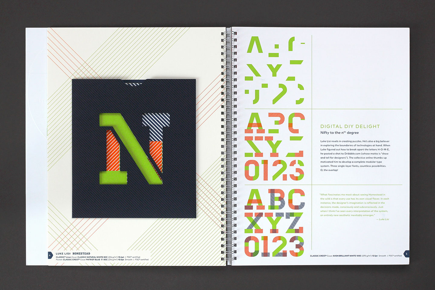

Tell us about the printing.
Angela: We worked with Independent Printing Company in Wisconsin to produce the books. They did such a wonderful job with this piece, especially considering all of the complicated processes and attachments it required. They would overnight us samples and press sheets as each spread began production. It was like Christmas around here at Willoughby, with special deliveries all the time! One thing we learned was that the production notes page that goes in the back of the book is the very last thing to be printed since there are so many small changes that happen once each spread goes on press. Colors get tweaked, paper weights get changed, processes get altered. It’s more of a fluid process than one would think. 


How long did the project take from beginning to end?
Ann: The Neenah project started in January 2016 with an April deadline, but the deadline was pushed forward by Neenah until July 2016. It was a 5-6 month process.
Any unexpected problems or crises?
Angela: We had such great partners and clients that helped make the process very smooth, even as we problem-solved various production issues. One particular production issue that comes to mind was on the wood type spread. The quote says “Good design is in all the things you notice. Great design is in all the things you don’t.” We originally planned for the “good design” portion to be printed and the “great design” portion to be a blind emboss. Once we saw printed samples of that page, we realized that the blind emboss was too subtle. We tested several options, such as adding color or a clear varnish to the emboss, and landed on adding a pearlescent spot thick UV. Even this involved painting different clear nail polishes to the paper to see if we could achieve the right look before going on press. 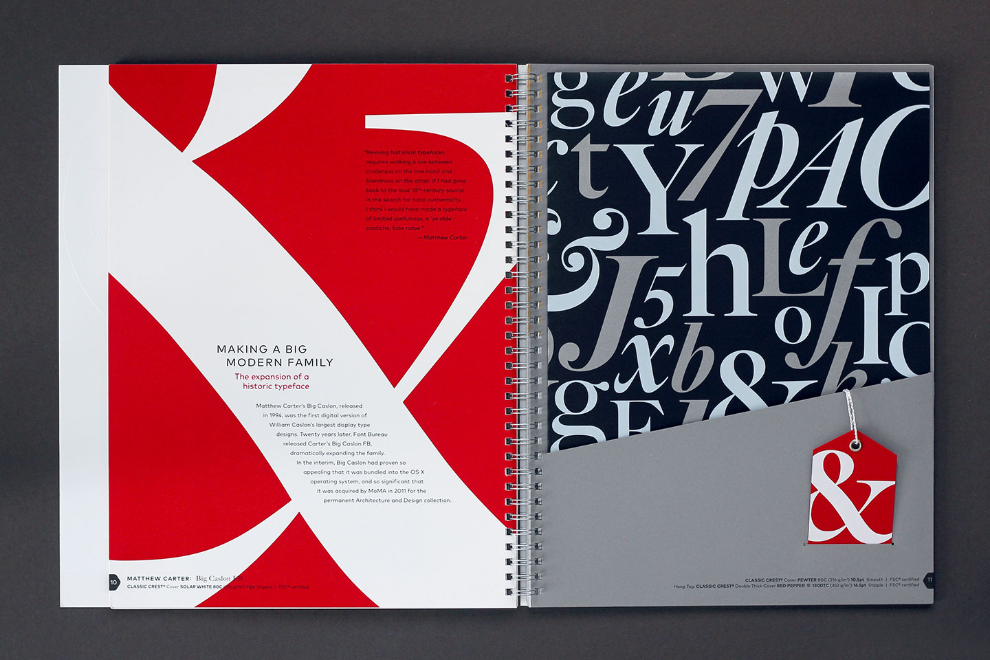
Where and when did you both develop your love of type?
Angela: I’m not sure if I could pinpoint a specific time or place where I developed a love of type. I think I’ve always loved and appreciated good design – it must be in my DNA! And typography is such an intrinsic part of design that I feel they just go hand-in-hand together. Good typography helps make good design. 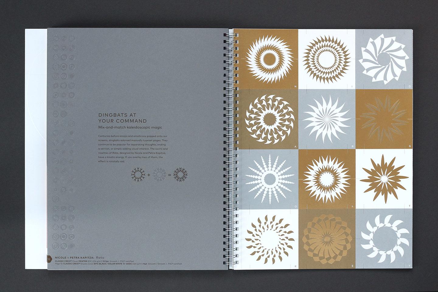
What other kinds of work does Willoughby Design?
Angela: One of my favorite types of work to do is brand development, and luckily that is one of the things Willoughby does so well. We also do a lot of great packaging and environmental design. I just love when I have the opportunity to think about things more dimensionally.
This article was last modified on November 16, 2016
This article was first published on November 16, 2016
Commenting is easier and faster when you're logged in!

Recommended for you

Typography Playing Cards
If you’re pondering what to get your favorite type nerd for the holidays,...

InDesign Magazine Issue 121: Big Design
We’re happy to announce that InDesign Magazine Issue #121 (May 2019) is now...
Certiport Holds Worldwide Design Competition for Students
Oh, look! Another design competition! Everyone can just relax, though, because t...