

Frank Romano, Professor Emeritus at the Rochester Institute of Technology, recently quipped, “There are now over 200,000 typefaces, most of them based on Garamond.” O.K., that’s an exercise of comic license, but it’s hard to understate the influence of the designs of 16th-century French punch cutter Claude Garamond (whose name is sometimes spelled Garamont). Looking at the host of faces now labeled “Garamond” offers a fascinating peek into how typeface designs evolve, what makes some endure, and just how subtle are the features that make for optimally legible, pleasurably readable type.
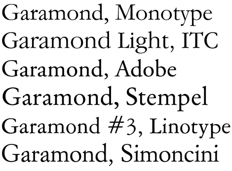
Figure 1 shows a gallery of just a handful of the currently available types that go by the name Garamond. (The other 100,000 or so go by different names.) As we’ll see, some are attempts at revivals of Garamond’s original faces, while others would be better filed under “Inspired By.”
Figure 1: Despite strong family resemblances, there are plenty of distinguishing characteristics among these six 20th-century Garamonds (compare the rs, for example). Common features include only a slight angle of stress, generous counters, and the fulsomeness of the round letters. The delicacy and lightness of Garamond’s originals was a stark contrast to the sturdy oldstyle faces that preceded them.
Who’s Influencing Whom?
Garamond’s designs didn’t appear out of thin air. Scholars agree that the late 15th-century types of printer Manutius Aldus (cut by Francesco Griffo) were a singular source of inspiration for Garamond. But to establish this definitively took some detective work. The trail was indistinct because Garamond’s types fell into disuse for a couple of centuries, only to be “rediscovered” in the archives of France’s Imprimerie Nationale in the mid-19th century. It was a welcome find, except that the faces weren’t really Garamond’s: they were the work of one of his admirers some 60 years later, Jean Jannon. Jannon only belatedly got proper credit for his work, in part because he had the bad luck to work for Protestant printers at the wrong time in French history, and his punches and molds were confiscated by the state. Ironically, their first major application was in setting the memoirs of Cardinal Richelieu.
When the typeface revival craze hit the burgeoning type industry at the dawn of the 20th century, one of the early smash hits was Garamond. Or rather Jannon, as it turns out, because the first generation of Garamond revivals were actually based of Jannon’s misidentified types. It took a lot of spade work in the 1920s for type historian Beatrice Warde to sort things out, and in so doing, give both Jannon and Garamond their due.
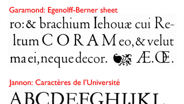
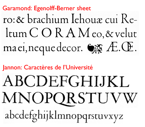
After Garamond’s death, his punches (used to create the molds from which metal type was cast) were sold off here and there, with the result that his original works became hard to distinguish from those of imitators and admirers. It was only with the discovery of a 1592 typeface sample page printed in Germany—the so-called Egenolff-Berner sheet—which clearly cited the use of Garamond’s own types, that a certified Garamond sample could be identified that clearly distinguished itself from the work of Jannon. Figure 2 contrasts the two faces.
Figure 2: On top is a sample from the Egenolff sheet, which bears the label “Canon de Garamond.” Below it is a sample from Caractères de l’Université, a typeface now known to have been created by Jean Jannon, not Garamond. Jannon’s lowercase feels much more like Garamond’s than its capitals do.
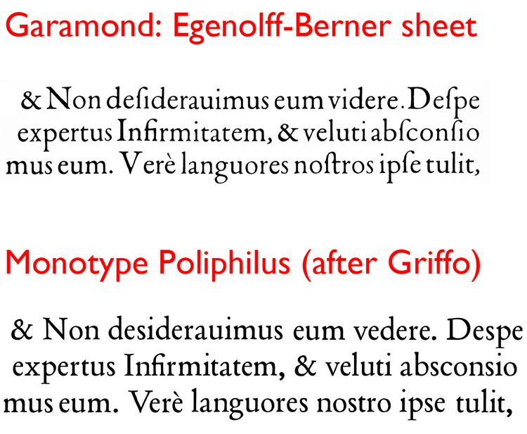
Having sorted out what an original Garamond face looked like, it became possible for type scholars—notably Beatrice Warde—to dissect the lineage between Griffo’s types and Garamond’s. Figure 3 shows a close-up of some of the characters from the Egenolff-Berner sheet compared with those set in Poliphilus, a 1923 Monotype face based on the one Griffo cut in 1499 for Aldus’s Hypnerotomachia Poliphili.
Figure 3: Garamond was no doubt influenced by the work of Francesco Griffo, whose work is best memorialized today by the revival typeface Bembo, named after the author of De Aetna, printed by Aldus Manutius using Griffo’s type. The sample on top here is another sample (set in Garamond’s smaller Petit Canon) from the Egenolff sheet. Below it is a similar text I set using Monotype Poliphilus, another Griffo revival.
Several of the Garamond faces’ signature features are also apparent in the type Griffo cut for the Hypnerotomachia Poliphili. Note the form of the a; the unbalanced widths of the shoulders of the m; the high cross-bar of the e; the cocked serifs on the T; and the open bowl of the P.
Click the image above for a higher-resolution version.
This article was last modified on July 31, 2021
This article was first published on July 31, 2012
Commenting is easier and faster when you're logged in!

Recommended for you

How-to: Add Multiple Strokes to Editable Text in Photoshop
Have you ever tried to add more than one stroke to text using Photoshop’s Layer...

Five Healthy Habits in InDesign
Everyone knows the healthy habits we should practice regularly, like flossing ou...
Open Source Fonts
In the recent past I’ve written about Free Fonts – the pros and cons, the ins an...