

Typefaces are such an amazing fusion of emotion and ergonomics that designing type is endlessly fascinating. A wonderfully balanced a, e, g or s helps elevate humanity through visual communication in beautiful little ways.
Designing fonts is fun. Like, designing thousands of interrelated logos all at once fun. It sets a high bar, but I revel in it. I’m learning from every design. And, discovering the next breathtaking font family can inspire typographic trends that can take hold across cultures and reverberate for a generation or more.
I started Treacyfaces creating TF fonts like my TFForever®, TFHabitat®, TFAvian™ and others as hybrids — the first typefaces to purposely span text and display typography with available Mac-based tech combined with longtime best practices that somehow, no one else was using. My goal was creating new designs that would literally set themselves just by typing, to the best typographic standards of design and natural fit.
In a world where there are ever more new stories to be told, every story deserves a typographic texture to embellish it. Based on how clients love using them, Treacyfaces fonts have risen to that challenge for blue chips the world over. And, some stories are so big, they require our custom corporate branding and packaging fonts.
What else have I learned? By voraciously collecting type specimens, I’ve noticed that traditional formats can actually impede selection, especially online when combined with vertical scrolling. Specimens should do a better job of displaying type as people actually use and read copy today.
When you consider that there are thousands of fonts from earlier decades purposely designed to be unassuming or are simply unusable design relics today, it’s a problem. Why? Type specifiers today have to wade through all that to just get to the magical solution they crave. Finding type isn’t the only thing studios do all day, and with impossibly tight deadlines, it would be great to reclaim time lost to searching. Think about your rate for three to five hours, and the value of that time comes into focus.
Further slowing it all down is a very real psychological phenomenon called the paradox of choice. It was elevated to the public mindset in the 2004 book by psychologist Barry Schwartz, Paradox of Choice, Why More is Less. Popularly cited examples include the vast array in the toothpaste aisle. But the same concept applies to font selection.
When faced with an overload of options, choice paralysis happens even to graphic designers and others who really, really, really love fonts. People can simply get overwhelmed when presented with too much choice, so they will gladly put off making a decision.
Yet, sticking with what they have might not be the right decision for a particular story and layout. In the long run, using the same fonts over and over won’t help to diversify your creative portfolio.
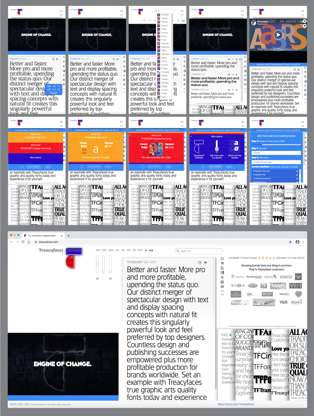
To do something about this problem, I created our homepage’s interactive Treacyfaces.com Typesampler™ with an adaptive mindset, asking myself: Can’t we speed up the selection process and create a more exciting and fulfilling discovery process? I’ve found that interactivity helps considerably in making font selection faster and easier.
From the beginning, I built in A.I. to help speed selection. Our Typesampler displays your own text in Treacyfaces fonts the way people ideally read in typical text sizes: in a column 40-45 characters wide. We’ve replaced endless scrolling with lots of sampling flexibility. We even automated the adding of users to licenses, so that’s rocket-fast, too.
Anticipating search on the Web turning predominantly mobile, I designed the Typesampler mobile-first, with audio DJ-like slider controls to make selection fun and much faster, and then amped it up further with well-produced video. One user recently said the experience of using it made her feel like a fonts DJ!
Now, folks can zoom through our Treacyfaces font collection in just a couple of minutes, rather than hours. And you’ll have a very clear, concise and editable overview to mix and match with, select and checkout effortlessly.
I believe the leaner simplicity, speed, and interactivity of the Treacyfaces Typesampler helps take a little stress out of a designer’s day. It’s been a great help to our customers. I hope you’ll try it out and tell me what you think.

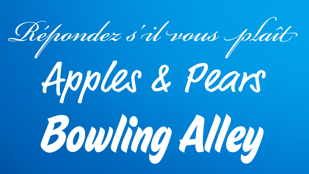
A perfectly balanced a, e, g and s can be a joy to behold. Examples from Treacy’s award-winning TFForever® and TFForeverTwo font series. Treacy says, “I love how letterforms can appear absolutely weightless, whether they’re super-light or ultra-bold.” Design and all artwork: Joe Treacy, for Treacyfaces.com
—————
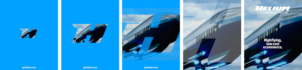
Rebranding the Helium Commerce Platform, a pioneering API-based “headless commerce” ecommerce shopping cart platform originally funded by GoogleVentures. Rebranding, design, copy: Treacyfaces.com. Includes TFAvian™ and TFForever®Two font families. 3D art by @itwasleo
—————

![]()
Financial services company rebranding for The Glenmede Trust Company by Treacyfaces TFX for Shaeffer & Associates. The rebranding included custom lettering of the logo, and a custom corporate headline typeface that created a textural experience for the reader unlike any other. Logo and custom headline font development, finished art, layout and illustrations by Joe Treacy.
—————
Designing fonts is fun. Like, designing thousands of interrelated logos all at once fun. This depicts some of Treacy’s work as director of typography, fleshing out the six Eastern European character sets of TFTrantinoCE for a Treacyfaces TFX custom branding fonts commission.

—————
The Treacyfaces.com Typesampler™ is our own font ecosystem where it’s fast and easy to compare and find excitingly complementary and contrasting Treacyfaces designs. Research into choice overload, UX design and implementation by Joe Treacy exclusively for Treacyfaces.
This article was last modified on July 2, 2021
This article was first published on April 2, 2021
Commenting is easier and faster when you're logged in!

Recommended for you
How to Choose and Use Script Typefaces
Nigel French offers a guide to some of the most beautiful and expressive typefac...
London’s Kerning: An Excerpt
Editor’s note: For over 500 years, the center of financial and judicial po...

Confusing Type Terms, Part 2
Within the world of typography, there are a variety of terms that are either con...