
Visual Storytelling With Photography
Finding Picture Perfect Images for Design Projects

This article appears in Issue 86 of InDesign Magazine.
Visual storytelling is a craft both photographers and designers share. Often these two creative careers overlap, particularly in the world of advertising and marketing, since they are the most practical means of communicating a message in a way that is creative, clear, and has the appropriate context. As someone who has loved both design and photography for more than half my lifetime, I’m fascinated by the parallels between the two, and by how often my knowledge of one can elevate my execution of the other. For graphic designers, choosing the right photography—and being able to use and manipulate it appropriately—can pose quite a challenge, especially if you have little or no experience behind the lens. But don’t worry! You can use familiar visual communication principles to your advantage; you just need to understand the combined context of design and photography instead of thinking of them as one or the other. When making photo selections for my graphic design work, I tend to concentrate on five key elements: perspective, composition, sharpness, focal point, and color. In this article, we’ll talk about each of these aspects.
A Little Perspective Can Change Everything
Photography takes advantage of perspective in a unique way. When shooting human subjects, the angle of the photographer in relation to the subject can make all the difference in how the subject is perceived, and therefore in the tone and message the photograph projects. For athletic shots, there is sometimes what is called a “hero shot.” Typically, the camera is angled up at the subject, who fills the frame and thus appears “larger than life” (Figure 1). This technique is also sometimes used for corporate photography to create an imposing figure or communicate a look of authority.
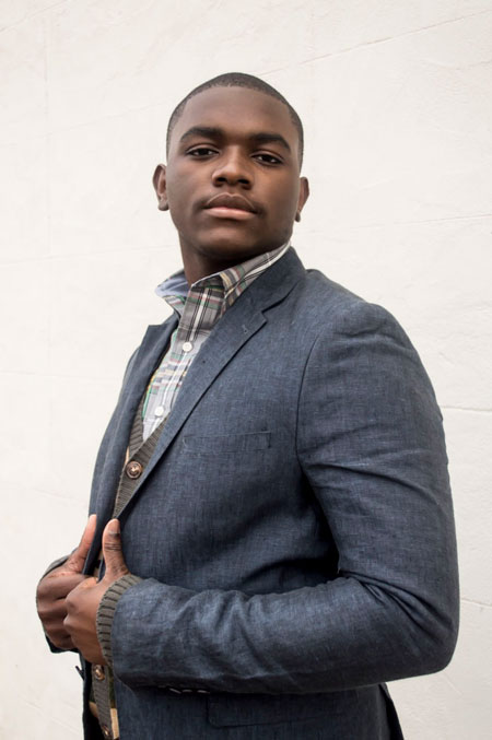
image, the subject is given an air of authority by his size (nearly filling the frame) and the angle, which forces us to look (slightly) up at him. His pose, clothing, and expression contribute as well.” width=”450″ height=”677″ /> Figure 1: In this image, the subject is given an air of authority by his size (nearly filling the frame) and the angle, which forces us to look (slightly) up at him. His pose, clothing, and expression contribute as well.
Composition and Cropping Make a Real Difference
If design and photography have anything in common, it is the importance of good composition. Composition (sometimes referred to in photography as “framing”) is one of the key aspects of what makes a good photo and tells a good story. In design, it is important to make use of the appropriate amount of white space. Photography has its version of white space, but it’s more dictated by intent than in design: photography shot for the intentions of printing and framing a photo will differ dramatically from photography shot with the intention of post-production for editorial or commercial work. For example, most professional photographers who shoot portraits prefer to shoot “cropped in,” framing the image exactly as they intend it to be produced and printed. While it could be cropped in post-production, most prefer to avoid this and “get it perfect in camera,” because cropping brings some minor distortion and image degradation (though not noticeable to the majority of people). However, many commercial photographers shoot “loose” (Figure 2), meaning they shoot wider than necessary, with the intention of cropping after the fact. This allows for more options and more room to work with when editing the images for commercial use, while also minimizing the number of shots they have to take. For example, one of the benefits of using a high-resolution professional camera is that you can sometimes crop a full body shot down to a usable head shot, if the client decides after the fact that’s what’s needed.
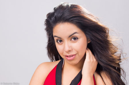
Figure 2: Notice the extra space to the left of the model in this image. This can give you some extra flexibility when incorporating this photo into a layout (and save you from having to fake more image area with Photoshop).
Sharpness and Clarity are Interpreted as Quality
Most photographers try to achieve tack-sharp images, because the sharpness of the primary subject and focal point (on human subjects, typically the eyes) is one of the ways that photographers judge the quality of the work (Figure 3). In design, we often interpret quality in similar ways: crisp readable text, proper kerning and leading, accurate color, and so on.
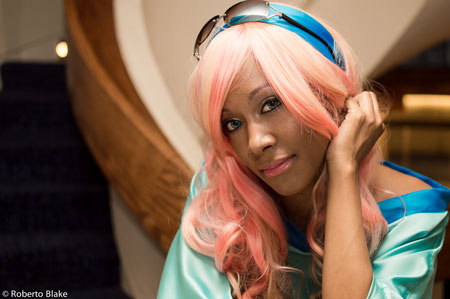
Figure 3: In this image, the tack-sharp details like the model’s eyes and hair contribute to the overall impression of professional quality.
Focusing the Message with Subject Isolation
As I’ve said before, graphic design and photography have many parallels. Visual balance and having a key focal point are important to both for helping you tell a clear story. In photography, subject isolation (in the form of depth of field) works similarly to white space in design. When your subject in the foreground is clearly in focus while the rest of the background softens, this is what is known as “shallow” depth of field (Figure 4). Images with shallow depth of field are ideal for your compositions as a graphic designer for several reasons.
Figure 4: With its background out of focus, this image keeps our eyes fixed on the subject.
Creating Impact with Color and Vibrancy
Designers know that color and tonality play important roles in conveying information. By using color theory, social cues, and psychology, designers can use color as a shortcut to framing the way images are perceived by an audience. It is no different when you think of the way color and temperature are used in photography and cinematography. Each light source has its own color or color temperature, varying from red to blue on the spectrum, with red being warm and blue being cool. Examples of warm light sources are sunlight, candles, and tungsten bulbs. Examples of cool light sources would be fluorescent bulbs, clear blue skies, and standard camera flashes. These tend to be measured in degrees Kelvin, with warm colors being lower on the numbers scale (1000K) and cool colors being higher on the scale (10,000K). In storytelling, warm colors tend to be more inviting, energetic, and can present optimism and positivity. By contrast, cool and muted colors can imply seriousness or even harshness. Removing color altogether and using flat or even high-contrast black and white images can completely change the tone of the image and what it conveys to an audience, even if you make no other changes to the photograph (Figure 5). 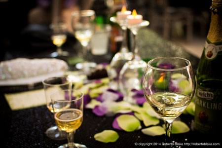
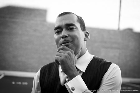
Figure 5: (Top) The mix of warm and cool colors give our eyes plenty to savor in this tabletop image. (Bottom) The lack of color in this portrait adds even more emotional depth to the man’s thoughtful expression.
Developing an Eye for Visual Storytelling
When choosing the photography for your design projects, be sure that above all the images are helping you fulfill your client’s wishes. Ideally, you shouldn’t be justifying your image selections on their aesthetic quality or how interesting they are. Instead, each image should clearly help tell the story, drive the call to action, or accomplish the overall goal of the design. By its nature, design is intentional, so having clear intentions behind your choice of images matters. Photography by Roberto Blake.
Commenting is easier and faster when you're logged in!

Recommended for you
New Typeface Family Well-Suited to Newspapers, Periodicals
Monotype Imaging Holdings Inc., a leading global provider of text imaging soluti...

20 Desert Island Typefaces
If you could use only twenty typefaces for the rest of your life, which ones wou...

Markzware Releases Microsoft Publisher To Adobe InDesign
After a very long and vigorous, yet successful beta testing program, Markzware i...