
Vintage Vectors: The Enduring Power of Blends in Illustrator
Take a deep dive into the amazing power of vector blends.

This article appears in Issue 12 of CreativePro Magazine.
Much of the time, people read CreativePro Magazine to learn how to use new features in their favorite programs. But in this article, I’m going to focus on one of the oldest features you’ll ever see: blends in Illustrator. For as long as I’ve been using vector drawing software, there have been blends. In fact, they’ve been around for 34 years and counting (Figure 1).
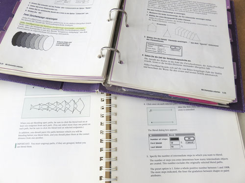
Figure 1. Blends in the Illustrator 88 and the FreeHand 2 manuals. Blends were first introduced in Illustrator 88.
I have to admit that back in those early days I made some pretty terrible blends (instead of using them to make photorealistic illustrations, like those people whose work I deeply admired). Nowadays we have gradient meshes and freeform gradients in Illustrator, so you might wonder: Why use those fiddly and old-fashioned blends at all?
It turns out that blends still have uniquely powerful aspects that are not evident at first glance. So, let’s take a look at some different use cases to demonstrate that blends are far from being an anachronism. Along the way, I’ll show you some tips and tricks to improve your workflow and results.
Finding the Exact Color You Want
Blends take two objects and interpolate their shapes, positions, and certain appearance attributes. To create a blend in Illustrator you can use either the Blend tool (Figure 2) or the Blend command.

Figure 2. The Blend tool is even included in Illustrator’s Basic toolbar.
One obscure use of the blend function is to explore colors. Imagine there are two colors you’re not quite satisfied with. Apply each of those colors to a rectangle or other shape, and use Object > Blend > Make to interpolate them and see if you’ll get a better option.
By default, Illustrator tries to smooth the interpolation as much as possible, but for this purpose you don’t need as many objects, so open the Blend Options dialog box by choosing Object > Blend > Blend Options or double-clicking the Blend tool in the Tools panel. Choose Specified Steps from the Spacing menu, and enter the number of steps you’d like to see (Figure 3).

Figure 3. In the Blend Options dialog box you can specify an exact number of steps for your blend.
To turn the result into editable objects and get their color values, you need to expand the blend. Choose either Object > Expand or Object > Blend > Expand. The result will be grouped. It’s always best to target it in the Layers panel and ungroup as needed.
Photorealistic Illustration and Infographics
Because a blend creates smooth interpolations between shapes and coloring, it’s the perfect method for creating all kinds of color transitions. Even in the age of freeform gradients, blends are still relevant because of their precision and the option to work with intricate shapes (Figure 4).

Figure 4. Blending just shapes and their fill colors to prepare a pattern brush
Blends Are a Knockout
To prevent unexpected visual effects, a blend is always a Knockout Group by default. As the name suggests, a Knockout Group is a special kind of group where all items knock each other out, instead of showing through even when they have reduced opacity values or blending modes other than Normal. Without this setting you’d have a problem if you made a blend between overlapping objects with reduced opacity. The transition wouldn’t look smooth because the objects would show through each other instead of just having the background show through (Figure 5). If for any reason you don’t want your blend to use the Knockout Group option, you can turn it off in the Transparency panel.

Figure 5. Knockout Group inactive (left) and active (center and right): Note how the blend is considerably darker and overlapping shapes look different when it’s not a Knockout Group.
Blends can be created between shapes as well as open paths. Besides the shape morphing, Illustrator creates in-between values for stroke and fill colors, opacity settings, and stroke width, including variable widths.
Sometimes when you make a blend the results might be underwhelming at first. Illustrator blends between just the positions of the paths by default, but you can change this. You may also get better results when both paths have the same number of anchors in corresponding positions, but it’s not necessary (Figure 6).
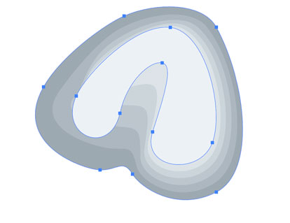
Figure 6. Your first attempt at blending may not look right. In this example, the two paths have the same number of anchor points, but those points aren’t all in corresponding positions. Fortunately, you can solve this without too much trouble.
To improve the blending result, select the same number of corresponding anchors on both shapes with the Direct Selection tool, and then with the Blend tool, click a point on one shape and then on the corresponding point on the other shape (Figure 7).
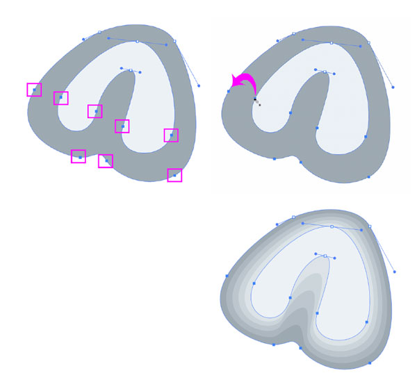
Figure 7. After selecting corresponding anchors on the shapes involved, use the Blend tool from the Tools panel and click a pair of those anchor points.
Keep in mind that while the blend is simple to work with in the original Illustrator file, it will be expanded when you save a PDF (or other non-native file format). So, there will be many objects in the exported file (Figure 8). Unless you want to rasterize your artwork for the output, you need to keep the number of blend steps as low as possible. Experiment with different values in the Blend Options dialog box to determine the number of steps you really need.

Figure 8. Live blend (left) compared to the expanded blend (center): What looks simple and efficient in Illustrator can become complex and bloated in output. In this case, the highlight on the drill handle is composed of so many vector objects the area looks black in Outline mode.
Creating brushes
Illustrator brushes cannot contain gradients, so if you want smooth color transitions in a brush, you need to use blends (Figure 9).

Figure 9. To create this rope brush in a realistic fashion, you can use blends. The top shows the Outline view of an expanded brush.
You can drag the live blend into the Brushes panel to create the brush, and it will be expanded automatically. That’s convenient, but a word of caution is in order. If you’re making a scatter or pattern brush as in the rope example, the number of vector objects will be multiplied when you apply the brush in the artwork. So, using a brush like that can easily grind Illustrator to a halt as it tries to calculate the appearance of thousands of paths. That’s why when using blends in brushes, you must make sure to use the lowest number of steps necessary for the intended reproduction size (Figure 10).

Figure 10. Reducing the number of steps in a blend for the rope brush: By default, Spacing is set as Smooth Color, which results in 178 steps—way too many. Depending on the size of your brush, you may be able to reduce this to a very small number. Admittedly, 6 might be too low for a smooth result, but it’s worth trying in a test print. You might be surprised how few steps you can get away with using.
To set up the number of steps, select the blend and double-click the Blend tool. In the Blend Options dialog box, select Specified Steps, which first displays the number of generated steps. Just enter your desired number.
How to Change Colors After Expanding a Blend
Generally speaking, if you think you might need to edit a blend you shouldn’t expand it. You retain the most flexibility by keeping the blend live. So, when you change a color, all the blended shapes will update immediately. But even if you have to recolor an expanded blend, the process isn’t too painful. First, change the fill of one or more shapes. Then select all the shapes that you want to update and choose Edit > Edit Colors > Blend Horizontally/Vertically/Front to Back (Figure 11).

Figure 11. Editing fill colors after expanding a blend
Which command you should choose depends on the positions of the paths in your artwork. Blend Front to Back uses the frontmost and backmost filled objects as the basis for the blend. Blend Horizontally uses blends between the leftmost and rightmost filled objects, and Blend Vertically blends between the topmost and bottommost.
Guilloché
In photorealistic illustrations you need a smooth transition, but visible steps can be desirable as well, as in guilloché patterns typically found on banknotes and stock certificates (Figure 12).

Figure 12. Guilloché artwork with blends between different dash settings (top) and different variable strokes (bottom)
Aligning Objects
Illustrator lacks a dedicated feature for aligning objects along paths. There are scatter brushes and scripts that do the trick, but the blend function with its ability to replace the blend spine is a very useful workaround as well. The blend spine is the line along which the blend is oriented. By default it’s a straight line connecting the centers of the blended objects, but you can replace it with any open path. Just select the path and the blend and choose Object > Blend > Replace Spine (Figure 13).

Figure 13. Before and after replacing the default straight blend spine with a curved path
After you replace a blend spine, you may want to align the blend objects in relation to the spine. You can do so by clicking the Align to Path button in the Blend Options dialog box.
One problem you may encounter after replacing a blend spine is that it’s very difficult to distribute the blend objects, because Illustrator distributes their centers instead of the space between them and doesn’t offer any alternative. This problem gets even more difficult to fix when you align the blend objects along the spine (Figure 14).
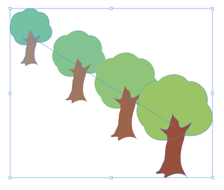
Figure 14. Initial distribution of objects in a blend
The handles of the anchors in the spine define the spacing between blend objects. When a handle is longer, objects get positioned wider apart (Figure 15). So, spacing is still somewhat easy to manipulate when there are just two anchors in the spine, but gets more difficult with each additional anchor.

Figure 15. Blends are great for creating many objects in perspective (such as the keys of this typewriter). This will need a lot of editing after expanding the blend, but as long as it is still live, you have to adjust the spacing of blend steps by creating handles (the blue dots) for the straight blend spine. Compare the default blend (top) and after adjusting the handles (bottom).
You can save a little time (and sometimes get better results) when creating the blend with a custom spine in one operation, skipping the step of creating a straight blend first. To do so, you have to assign a fill and stroke of None to your path, select the objects and the path, and then make the blend (Figure 16).

Figure 16. Objects set up for creating the blend with a custom spine (left) and the result (right)
Fixing the stacking order and direction
Objects in a blend are stacked according to the stacking order of the initial elements. If you want to change this after having created the blend, choose Object > Blend > Reverse Front to Back. If you want to change the direction of the blend, which is usually controlled by the path direction of your spine, choose Object > Blend > Reverse Spine (Figure 17).

Figure 17. The original blend (left), after choosing Reverse Spine (top right), and after choosing Reverse Front to Back (bottom right)
Special Effects
You can create so many interesting designs based on blends when you start to think about what else can be interpolated in addition to shapes, colors, and strokes.
Groups
You are not limited to blending individual shapes. You can blend groups in the same fashion, but the groups need to be consistently organized. Otherwise, you will get surprising results. Using this method, I drew a lot of typewriters back when they were still a thing (Figure 18).

Figure 18. Blended groups: There are the same number of paths in the same stacking order in each group, but their shape and positions change, which creates the illusion of perspective.
Effects
Effects are used to apply a set of attributes to an object. And if you apply multiple effects with different settings to the same object, you can then interpolate the settings using a blend. An interesting example is the Transform effect (Effect > Distort & Transform > Transform). For example, you can use it to rotate the blended objects around the spine (Figure 19).

Figure 19. In this example, all of the groups have Transform effects with different settings applied while being blended along a circular spine. Additionally, you can move the items in the groups independently. Tip: If you want to rotate more than 360°, apply more than one transform effect. Unfortunately, there is no simple fix for the spot where the spine’s start and end points meet. If you don’t like the look of that you will need to find a way to cover it up.
Gradients
By applying gradients to your objects you can create beautiful 3D effects. You can use only linear or radial gradients in blends, not freeform ones or gradient meshes. Blends are a good workaround when you run up against Illustrator’s inability to apply gradients that follow a shape or conical gradients (Figure 20).

Figure 20. Blends are perfect for creating realistic beveled buttons.
Animation
When Illustrator still exported SWF, you could use blends to directly export animations. It wasn’t a best practice because of the bloated (and dumb) timeline structure, but nevertheless it was possible—and useful in a pinch.
Nowadays, you can still prepare the elements of your animation in Illustrator, and then open it in Photoshop to export the animated file. To do so, after creating the animation with the blend, expand the blend using Object > Blend > Expand. Then ungroup once, so that all the steps are one object each (or a group) (Figure 21).

Figure 21. The expanded and ungrouped blend in the Layers panel
Next, click the layer in the Layers panel and choose Release to Layers (Sequence) from the panel menu. This creates sublayers which have to be moved out of their main layer in order to be main layers themselves. Then you can export the file as a PSD using File > Export > Export As and the default options (Figure 22).

Figure 22. After choosing Release to Layers (Sequence) and moving the sublayers out of their main layer
To finish the job, open the PSD in Photoshop. Open the Timeline panel (Window > Timeline). Click the button in the center of the panel to create a Frame Animation and its first frame. Then, from the Timeline panel menu, choose Make Frames From Layers. Press the spacebar to preview your animation. Use the controls in the Timeline panel to change options like speed and looping as desired. Then, choose File > Export > Save for Web (Legacy) and export to an animated GIF.
Outputting Blends
Due to their potential complexity, blends can cause trouble when you need to output them, either at your print service provider or when you’re exporting a PDF from an InDesign file that contains placed Illustrator files with blends. The best way to reduce the chances of running into trouble is to choose Specified Steps for the Spacing setting in the Blend Options dialog box and find the lowest number of steps that still preserves the look you want. In extreme cases, you may need to rasterize the blend (Object > Rasterize).
In some cases you can’t use blends, such as when designs need to be plotted, cut, or milled. Even expanding the blend and then uniting the objects will usually produce undesirable results (Figure 23).

Figure 23. Using blends for the creation of long shadows will leave you with stairsteps. Fortunately, there are better solutions for making long shadows, such as using the Astute Graphics plug-in Stylism, or some trickery with 3D and Transform effects I outlined in this article.
Building a Better Blend
As you have seen, blends offer a lot of creative possibilities. Still, there is room for improvement, mostly in the way Illustrator handles the distribution of the blend steps. The obscure use of blend spine handles for this feels like a remnant from the Stone Age. I wish that Adobe would borrow an idea from CorelDRAW, which offers superior control over the distribution of blend objects (Figure 24).

Figure 24. CorelDRAW offers the option to set the acceleration of a blend, giving you more control over the transitions of objects and colors.
You see that there is a huge amount of creative energy waiting in this ancient function. Try it out, get your hands dirty, and experiment with its capabilities for creating amazing artworks as well as for solving Illustrator’s shortcomings.
This article from CreativePro Magazine is for members only. To continue reading, please log in above, or sign up for a membership today! Thanks for supporting CreativePro!
Commenting is easier and faster when you're logged in!

Recommended for you

Adjusting the Position of Gradients
Blends are one of InDesign's least intuitive features, but they're not hard to c...
How to Create Swatch Groups from Color Blends in Illustrator
Learn how to create swatch groups from color blends in Illustrator and save them...
Designing with Gradients
Techniques for enhancing your page designs with attractive color blends.