
View Source: Make Web Site Elements Partially Transparent

If you’ve worked with Photoshop, you’ve probably adjusted a document’s layers opacity to create transparency effects that blend layers together. And if you’ve placed text over a photo in InDesign or QuarkXPress, you’ve probably added a transparent screen behind the text to dull the photo’s contrast and make the text legible.
But in Web design, the same types of effects haven’t been possible until very recently. Now, with the latest crop of Web browsers and their support for proposed CSS3 properties, you can add transparency effects to your Web pages relatively easily. You can see an example of the subtle effects possible with overlapping partially transparent page elements on the excellent 24ways.org site (Figure 1).
Figure 1. 24ways.org uses RGBA colors to create see-through effect on navigation buttons (“Home,” “Archives,” “Authors,” and “RSS”) as well as the “24 Ways” text at the top of the page, and the red callout box on the far right. Click this image to see a larger version.

CSS3 is the next version of CSS. While it isn’t finalized yet, most browsers have adopted a handful of its properties. Two fun new properties that let you adjust the transparency of Web page elements are opacity and rgba. They work in Firefox, Safari, Opera and Chrome, and although Internet Explorer (even IE 8) doesn’t support them, there are workarounds, which I’ll also explain. (Visit www.css3.info for information on the future of CSS3.)
Opacity
The opacity property lets you make any element on a page see-through. The property requires a value from 0 to 1. A 0 value makes the element totally invisible, while 1 is completely opaque. You’ll usually set this property somewhere in between.
For example, say you wanted to make an image 50% transparent. You could create a class style called .seethru, for instance, and add the class to the HTML for the image. The CSS would look like this:
.seethru {
opacity: .5;
}
And the HTML would look something like this:
<img src=”photo.jpg” class=”seethru”>
Although Internet Explorer doesn’t understand the opacity property, it does have its own way of achieving the same effect. Using the special Internet Explorer-only filter property, you can set the opacity of an element from 0 to 100. To make the above example working in IE as well, you simply modify the style like this:
.seethru {
opacity: .5;
filter: alpha(opacity=50);
}
A Hands-On Example
So you can really get a taste of this property, I’ll take you through a hands-on demonstration using Dreamweaver. If you don’t have Dreamweaver, you can use any text editor to follow along.
In the following tutorial, you’ll create a unique highlighting effect for images. Basically, the images on a page will be see-through (50% transparency), but when moused over, an image will appear 100% opaque for a rollover-like effect. For this tutorial, you’ll need to download the zipped folder “20090916_transparency_site” and then decompress it.
1. Launch Dreamweaver and choose Site> New Site. Click the Advanced tab in the Site Definition window and enter “CSS Transparency” for the site’s name. Click the folder icon to the right of the “Local Root Folder” field and select the “20090916_transparency_site” folder. Click OK to finish defining the new site.
2. In the Files panel, double-click the file opacity.html. This page has six images on it. Each image is wrapped in a link, and all of the links and images are contained within a <div> tag with the ID gallery applied to it. Because Dreamweaver doesn’t include the opacity property in its menu-driven CSS creation tools, you’ll have to — uggh! — type the CSS yourself.
3. Choose View > Code or click the Code button at the top of the document window. There’s already an empty internal style sheet in this page, so click between the opening and closing <style> tags near the top of the code and type the following:
#gallery img {
opacity: .5;
filter: alpha(opacity=50);
}
The #gallery img is a descendent selector, which tells a Web browser to apply the following style to every image (<img> tag) inside of another tag with the ID gallery. The actual formatting is contained in the next two lines. The first line sets the opacity property for Firefox, Safari, Opera, and Chrome, while the second line applies to Internet Explorer. Both lines set the opacity to 50% so you can see through the images on the page.
However, Dreamweaver’s Design view won’t show the effect of this style. You either have to preview the page in a Web browser or click the Live View button at the top of the document window (or choose View > Live View). Go ahead and do that now and you’ll see that the images look faded out.
Next, you’ll add a rollover effect.
4. Return to Dreamweaver’s Code view and add one more style after the #gallery img style you added a moment ago:
#gallery a:hover img {
opacity: 1;
filter: alpha(opacity=100);
}
This style applies to <img> tags, but only when they’re inside a link that’s currently being moused over (that’s the a:hover part). The style changes the opacity to 100%.
5. Preview the page in a Web browser or click the Live View button in Dreamweaver. Mouse over these images to see them pop into their fully vibrant selves (Figure 2) — a pretty cool effect using only two simple styles. There’s a finished version of this file, named opacity_finished.html, included with the tutorial files you downloaded.
Figure 2. With just two simple CSS styles, you can make faded images come alive when moused over.

RGBA Colors
The opacity property affects not only the element you apply it to but also any tags nested within that element. Say you have a <div> tag with a purple background color and white text inside it. You want to make the purple background color transparent so you can see a bit of the background image applied to the page. Unfortunately, the opacity applies to the text as well; you see not only through the div’s background color but also through the text (Figure 3).
Figure 3. The CSS opacity property also affects tags inside any element with an opacity setting. In this example, a 30% transparency applied to a <div> tag also makes a paragraph inside the div semi-transparent.

Fortunately, CSS3 offers a way to apply a transparent color to backgrounds, text, or any CSS property that takes a color value (such as border colors). So to solve the problem mentioned above, you could add a transparent background color to the div, leaving the text alone. To do that, you use the new rgba color value.
You’re probably familiar with hex color values when assigning colors to text. For example, to make all heading 1 tags bright red, you could create the following style:
h1 {
color: #FF0000;
}
Web browsers (including Internet Explorer) let you specify colors using rgb. RGB stands for red, green, blue and is a familiar way of specifying colors in Photoshop. Most Web designers don’t use this method, but you could re-write the above style replacing the hex color with an rgb color like this:
h1 {
color: rgb(255,0,0);
}
This color is exactly the same as the hex value #FF0000; it just uses a different notation — and it works in Internet Explorer 6, 7, and 8, as well as all other currently shipping browsers.
CSS3 adds an rgba color value to the mix. The a in rgba stands for alpha and it lets you assign an opacity value (just like the opacity property) from 0 to 1. Let’s say you want to make every h1 tag bright red but only 70% transparent, so that background images or colors show through the text in the headline. Using an rgba value, you could create a style like this:
h1 {
color: rgba(255,0,0,.7);
}
You can’t use hex values for this, only RGB. If you’re accustomed to hex values, you can convert a hex value to RGB using a program like Photoshop or Fireworks or a simple online conversion tool.
Unfortunately, no version of Internet Explorer supports RGBA color values. That browser simply ignores the color setting entirely and will either default to transparent (for background colors) or inherit a color (for example, text will probably appear black). However, there is a workaround for IE that lets you simulate RGBA colors. Read on for details.
RGBA In Action
To get a taste of RGBA color, you can follow along with this step-by-step tutorial. You’ll need to have downloaded the tutorial files linked to above and set up Dreamweaver as described in the first tutorial.
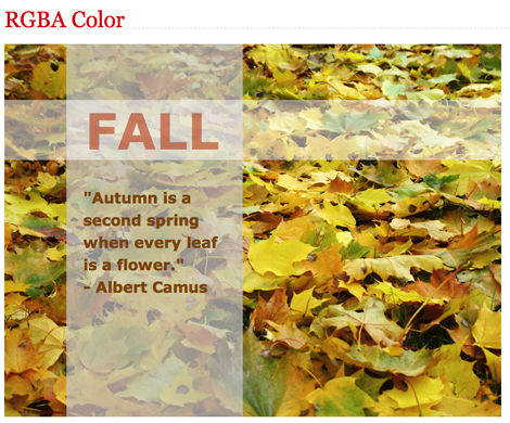
You’ll be working on the file “rgba.html”. If you preview that page in a Web browser, you’ll see a photo followed by the text FALL and a quote below that. The HTML is simple: a <div> tag containing a photo and two paragraphs. There’s already some basic CSS formatting applied: the text is styled and the paragraphs have set widths and heights.
RGBA (and opacity) are most fun when you layer transparent elements on top of each other. Using the CSS position property, you can layer page elements. So before you dip into RGBA colors, you’ll first position the two paragraphs so they sit on top of the photo.
1. Open the file rgba.html in Dreamweaver. There’s already a style sheet with a couple styles applied to it. Open Dreamweaver’s CSS Styles panel (Window > CSS Styles). There you’ll see a list of the styles for this page. The .caption class style is used to format the first paragraph, which has the class caption applied to it. Currently the paragraph isn’t positioned on top of the photo, so you’ll do that next.
2. Double-click .caption in the CSS styles panel to open the CSS Rule Definition window and edit the style. Click the positioning category in the left-hand list. Choose absolute from the position menu, and in the Placement boxes type 90 in the Top box and 0 in the Left box. Finally, type 100 in the Z-Index box (Figure 4). Click OK to complete the style.
Figure 4. The Z-Index controls the stacking order of absolutely positioned elements. The higher the number, the higher in the stack the element appears. Think of it like the order of Layers in Photoshop’s Layer’s panel. Click this image to see a larger version.

The Z-Index controls the layering of positioned elements. An element with a higher z-index appears above an element with a lower z-index. In this case, setting the z-index to 100 ensures that this paragraph will float above other positioned elements. The Top and Left values merely control where the paragraph is placed; in this case, 90 pixels from the top and 0 pixels from the left edge. But if you preview the page, you’ll see that this paragraph isn’t positioned in relation to the photo but in relation to the browser window. In other words, the paragraph is placed 90 pixels from the top of the browser window, when what you really want is to place it 90 pixels down from the top of the photo. Fortunately, there’s an easy way to do that.
3. In the CSS Styles panel, double-click the .photo style. This class style formats the div tag that contains the photo and paragraphs. In the CSS Rule Definition window, click the positioning category, and choose relative from the Position menu. Click OK to finish editing the style. The relative value forces any absolutely positioned elements inside the div to be positioned in relation to the div, not the browser window, so the paragraph you positioned in the last step will now appear 90 pixels from the top of the image. Preview the page in a Web browser to make sure. Next, you’ll position the second paragraph.
4. In the CSS Styles panel, double-click the .quote style. This style applies to the second paragraph. Select the positioning category in the CSS Rule Definition window and choose absolute from the position menu. Type 0 in the Top placement box and 100 in the Left placement box. Click OK to complete the style. This style positions the second paragraph above the photo, butted up against the top and indented 100 pixels from the photo’s left edge. Preview the page in a Web browser and it should look like Figure 5.
Figure 5. Using absolute positioning you can stack page elements on top of each other.

Now it’s time for some RGBA color.
5. Return to Dreamweaver and click the Code button at the top of the document window (or choose View > Code). Dreamweaver doesn’t understand RGBA colors, so you must add them by hand. Locate the .caption style and the background property. Currently it reads background: #FFFFFF; . Change that to read background: rgba(255,255,255,.5); . This sets the background to the same white color specified by the hex value but also makes it 50% transparent.
6. Repeat the previous step for the .quote style. Change background: #C8C8C8; to background: rgba(200,200,200,.7); . You aren’t limited to background colors, either. You can also use rgba colors for text.
7. Locate the .caption style and change color: #B53810; to color: rgba(181,56,16,.6); . This makes the word “FALL” in the first paragraph 50% transparent. Save the page and preview it in a browser. It should look like Figure 6 in all browsers except Internet Explorer. You’ll fix the page for that browser next.
Figure 6. RGBA color adds depth to Web pages.
RGBA for Internet Explorer
IE doesn’t support RGBA, but there is a basic workaround. An IE-only filter lets you create transparent colors (and even gradients if you want to get wild). The filter is a little scary looking — there’s a lot of code:
filter: progid:DXImageTransform.Microsoft.gradient(startColorstr=#B2C8C8C8,endColorstr=#B2C8C8C8);
Yikes! All of that code needs to be typed on a single line, and you include it just as you would any CSS property within a style. The two key parts are the startColorstr and endColorstr. The long hex value that follows those (#B2C8C8C8, for example) tells IE which color to use and what transparency it should be. The first two digits in the above example, B2, is a hex value indicating how transparent an element should be: B2 is roughly 70%. The last set of letters/numbers is the hex code for the color; in this example, C8C8C8, which is a light grey color.
Here’s a cheat sheet for choosing the correct hex value for common opacity values:
00 is 0% transparent
19 is 10%
33 is 20%
4C is 30%
66 is 40%
7F is 50%
99 is 60%
B2 is 70%
CC is 80%
E6 is 90%
FF is 100%
For instance, if you wanted the background color to be #EF6600 and 30% transparent, you would use #4CEF6600 for both the startColorStr value and the endColorstr value.
Time to see this in action.
1. In Dreamweaver’s code view, locate the following code:
<!–[if IE]>
<style type=”text/css”>
</style>
<![endif]–>
This code is a special IE-only method of including instructions that only apply to Internet Explorer. Other browsers see this as HTML comments and ignore it, but IE sees this as a special instruction to follow. It’s an internal style sheet only IE (that troublemaker) will read. You can put styles in here that only apply to IE and that can fix its lack of rgba support. There’s more information on this technique here.
2. Click between the opening and closing <style> tags and type the following:
.quote {
filter: progid:DXImageTransform.Microsoft.gradient(startColorstr=#B2C8C8C8,endColorstr=#B2C8C8C8;
zoom: 1;
}
Make sure that whole filter part from filter: to #B2C8C8C8; is typed onto a single line. This makes IE apply a transparent background for the quote paragraph. The B2 is 70%, while the C8C8C8 is a grey that matches the gray defined in the rgba value used for other browsers. Now it’s time to add one more for the caption paragraph.
3. Add one other style to this IE-only style sheet:
.caption {
filter: progid:DXImageTransform.Microsoft.gradient(startColorstr=#7FFFFFFF,endColorstr=#7FFFFFFF);
zoom: 1;
color: #B53810;
}
This style adds the transparent background color for the paragraph with the word “FALL” in it — 50% transparent (7F) and white (FFFFFF). In addition, since you used an rgba value earlier to make the text color transparent, you need to supply a color here (color: #B53810;) so that IE uses the proper color for the text. Unfortunately, you can’t use this filter property to create a transparent color for text. It only works for background colors. However, there is a way around this problem. You can use another filter to set the opacity of the text.
4. Add one last style to the IE-only style sheet:
.caption span {
filter: alpha(opacity=60);
zoom: 1;
}
This style uses the alpha filter discussed earlier in this article. To use this correctly, the text inside the paragraph has to be wrapped by a pair of <span> tags like this: <p> <span>FALL </span> </p>. This style only applies to <span> tags inside of the caption paragraph. Why do you have to do this? Because the alpha filter (like the opacity property) applies to the entire element. If you applied this to the paragraph, it would set the opacity for the entire paragraph (including the background color of the paragraph). By isolating just the <span> tag, you’re essentially only changing the opacity of the text itself and not the entire paragraph.
Save the file and you’re done! Displayed in Internet Explorer, the page should look like it does in other browsers (see Figure 6 above). You’ll find a completed version of this tutorial file — rgba_finished.html — in the files you downloaded earlier.
The opacity property and RGBA colors are really simple to use. But as with many things CSS-related, it requires a bit more effort to get them to work in the world’s most popular Web browser, Internet Explorer. However, with just a little extra effort you can explore new design techniques that can add depth and visual interest to your sites with these exciting CSS3 techniques.
This article was last modified on January 8, 2023
This article was first published on September 16, 2009
Commenting is easier and faster when you're logged in!

Recommended for you

dot-font: Making Art of Zeroes and Ones
dot-font was a collection of short articles written by editor and typographer Jo...

Spellcheck Bug Fixed in InDesign 16.0.1
Seeing odd spell check behavior in InDesign 2021? Download the latest update to...
25 Type Tricks for InDesign
Great tips to set stellar type and create beautiful typography in InDesign