
View Source: Make Pop-Up Tooltips with Dreamweaver

Now you’ll try out some of these settings on the tooltip you just created.
1. Scroll to the bottom of the page and click the blue Spry Tooltip tab to select the tooltip. The Property Inspector now displays the tooltip’s settings. (If you don’t see the Property Inspector, choose Window > Properties.)
2. Type -50 in the Horizontal offset box, 5 in the Vertical offset box, 200 in the Show delay box, and 100 in the Hide delay box. Select the Fade effect (Figure 2). Basically, you’ve just told the tooltip to appear 50 pixels to the left of the mouse and 5 pixels below it, and you’ve set the speed and way the tooltip will appear and disappear.
3. Now it’s time for some content. You can put any HTML you want inside a tooltip — it’s just a plain HTML <div> tag. Select the text “Tooltip content goes here” and press the delete button. This gets rid of the default text Dreamweaver inserts. Next, you’ll insert another <div> tag — this extra <div> will help us with a sneaky CSS trick in a moment.
4. Choose Insert > Layout Objects > Div Tag. The Insert Div Tag window appears. Click the OK button to insert the tag.
5. Type “What are these funny words? They don’t look like English to me!” and choose Paragraph from the Property Inspector’s Format menu. (If you don’t see the Format menu, make sure you have the HTML button selected on the Property Inspector.) You can put any HTML you want inside the tooltip, including headlines, graphics, and multiple paragraphs of text.
Styling the Tooltip
The default Spry tooltip doesn’t have much going for it in the looks department. Fortunately, you can control the appearance using CSS. For instance, you can make a tooltip look like the one in Figure 3 below. While you can use CSS to add a border and a background color, there’s no way to create the little ^ at the top of the tooltip without a graphic. One solution is to create a graphic that’s the exact size and shape you want the tooltip to be. However, this approach isn’t flexible: what if you want the tooltip to be wider, or you have several tooltips with varying content and varying heights? No one graphic would work for all of those cases.
A better approach is to use a little HTML and CSS trickery. While you do need a graphic, it will represent only the top part of the tooltip; CSS will create the rest of the tooltip (its background color and left, right, and bottom borders). To achieve this effect you need to use two divs. Figure 3 diagrams how this will work.
Figure 3. Sometimes creating the exact effect you’re after requires a little creative CSS and HTML. In this case, you’ll use two divs and a combination of graphics, borders and background color to create a single, unified box.

The first <div> (the one Dreamweaver inserted) has a class name of tooltipContent; there’s a style with that name in the SpryToolTip.css file Dreamweaver added to your site. You’ll edit this style to add a background image (the top part of the tooltip). You’ll also add padding to move the second div down a little (enough to clear the background image). Then you’ll create a new style for the second div (the one you added to the tooltip earlier), which will have a background color and bottom, left, and right borders. The left and right borders will overlap the background image, creating the visual effect of one continuous red outline. Here’s how to do that:
1. Click the All button at the top of the CSS Styles panel. (If you don’t see the styles panel, choose Window > CSS Styles). Double-click the .tooltipContent style listed under SpryTooltip.css. (If you don’t see any styles, click the arrow to the left of SpryTooltip.css in the styles panel.) The CSS Rule Definition window opens (Figure 4).
Figure 4. CSS provides precise controls for placing an image into the background of an HTML tag. Click on the image to see a larger version.

2. Click the Background category. Select and delete the yellow color value for the background color. Click the Browse button and select the file bg_tooltip.png in the images folder. Choose “no-repeat” from the Background-repeat menu. Choose “left” and “top” from the bottom position menus. This adds a background image to the top left of the tooltip div.
3. Click the Box category and type 200px in the Width box. Uncheck the “same for all” box under Padding and type 22px for the Top padding value. This defines the tooltip’s width on the page and pushes down any content inside the tooltip 22 pixels — the perfect amount to clear the background image. Click OK to complete the style.
4. In the bottom right of the CSS Styles panel, click the + (new style) button. The New CSS Rule window opens (Figure 5). Choose “Compound” from the top menu; type “.tooltipContent div” in the Select Name field, and choose “SpryTooltip.css” from the bottom menu. Click OK to create the style.
Figure 5. Creating a style in Dreamweaver requires choosing the type of style, naming it, and then telling Dreamweaver where to put the CSS code. Click on the image to see a larger version.

4. Click the Background category and set the background color to #F5F5D3. Click the Box category and type 10 for the Padding value (leave the Same for all box checked). This will put 10 pixels of white space around the edges of the tooltip box and keep the content inside the tooltip from touching the borders.
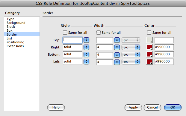
5. Finally, click the border category and uncheck all three “Same for all” boxes. Set the Right, Bottom, and Left borders to solid, 4px, and #990000, as pictured in Figure 6. Click OK to complete the style.
Figure 6. CSS lets you add borders around any or all sides of a HTML tag. Click on the image to see a larger version.
Congratulations! You have a stylish tooltip. Preview the page in a Web browser and mouse over the text dolore magna to see the tooltip.
Styling the Trigger
While the tooltip looks great, there’s no indication whatsoever that anything will happen when you mouse over dolore magna. For the tooltips to be really useful, you need to create a style to format the trigger elements.
1. Click the + (new style) button on the CSS Styles panel. Choose “Class” from the top menu of the New CSS Rule window. Name the new style .tooltipTrigger, make sure SpryTooltip.css is selected in the bottom menu, and click the OK button.
2. Select the Background category and set the background color to #FFC. Click the Browse button and select the file question.png in the images folder. Choose “no-repeat” from the Background-repeat menu and choose “right” and “bottom” from the position menus. This will add a small graphic to the right of the trigger text.
3. Click the Box category, uncheck the “Same for all” box under Padding, and type 21px in the Right padding box.
4. Finally, select the Extensions category and type “pointer” in the Cursor field. This will make the cursor change to a pointer when the mouse moves over the trigger. (It’s the same icon that appears when you mouse over a link.) Click OK to complete the style. Now all you need to do is add the style to the trigger element.
5. Click inside the text dolore magna below the red headline on the page. In the Property Inspector, choose “tooltipTrigger” from the Class menu. (Make sure the HTML button is selected in the Property Inspector.) The text should now have a yellow background, and there should be an empty space to the right of the text. (For some reason, Dreamweaver can’t display the background image correctly.)
6. Save the file and preview it in a Web browser. Mouse over the words dolore magna to see the final effect.
Going Further
Now that you’ve added one tooltip and all the time-consuming work of creating the CSS is out of the way, it’s easy to add more tooltips to the page. Just select another chunk of text, choose Insert > Spry > Spry Tooltip, and repeat steps 1-5 under the “Tooltip Properties” subhead above. Add whatever content you’d like to the tooltip, then add a class to the tooltip trigger as described in the previous section of this article.
As you can see, there’s a bit of a learning curve with the new Spry Tooltips, but once you’ve mastered the basic steps, it’s a piece of cake to add pop-up tooltips to your Web pages.
This article was last modified on January 8, 2023
This article was first published on February 25, 2009
Commenting is easier and faster when you're logged in!

Recommended for you

Veenix Software Adds New Features To Its Visual Font Database System
VEENIX SOFTWARE, the developer of “Veenix Font Tools” and “Vee...

89% of Sales Pros Want Customizable Design Templates
If you work with sales professionals, it’s no secret that they don’t alway...

Understanding the First Baseline Position of Text
A guide to understanding the factors that affect the position of the first basel...