

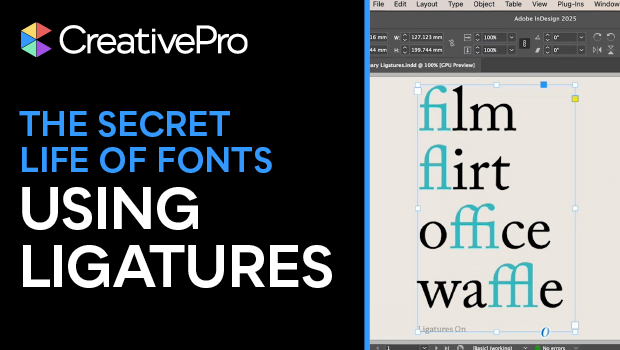
In this typographical how-to video, Nigel French talks about ligatures: when two characters are joined to create a single glyph. Ligatures make text look smoother and fix awkward spacing issues. InDesign turns on standard ligatures by default, but Nigel talks through how to use them or not use them more intentionally.
Subscribe to the CreativePro YouTube channel for more helpful design tips!
This article was last modified on October 3, 2025
This article was first published on October 3, 2025
Commenting is easier and faster when you're logged in!

Recommended for you

TypeTalk: The Ins and Outs of F-ligatures
F-ligatures are special characters found in just about every professional font....

Rounded Corner Tables and Brackets on Frames
E.R. wrote: After seeing your corner-only border segment, it reminded me of a pr...

This Week in InDesign Articles, Number 124
I was joking with a friend of mine, asking if he had decided to switch back to Q...