
This article will teach you how to use Illustrator’s Create Object Mosaic command to transform your digital designs into a geometric grid-based pattern, for output using any analog media. Anything that can be constructed using tiles or a grid-based structure, can be charted and planned out in Illustrator using this technique. I am a knitter, so I used this technique to create a charted-color knitting pattern (a knitting technique known as intarsia). Here is a simple color charted pattern I made using tables. While InDesign tables are a handy tool for creating charted-color patterns, as the table gets larger, it can grow unwieldy.
For years, I have been on the hunt for a simple solution to convert images into a grid-based pattern that I could knit. The challenge was finding a solution that met a few requirements:
- I needed a non-square rectangle for each stitch (knitting stitches have a ratio of approximately 4W x 3H). In other words, they are squatty little rectangles.
- My knitted designs only have a few colors, so I needed to be able to easily edit all the individual rectangles to reduce the number of colors to match the yarn colors I’m working with.
- I needed to be able to add vertical and horizontal lines to the design, delineating each row and column.
- I wanted the process to be somewhat automated, because I didn’t want to have to colorize each cell by hand. I want the computer the do most of the work for me.
The solution? Illustrator’s Object Mosaic. Now, let me me say that I had been using Illustrator for over a decade before I even knew that this feature existed. I discovered this feature in a book about using Illustrator for fashion design.
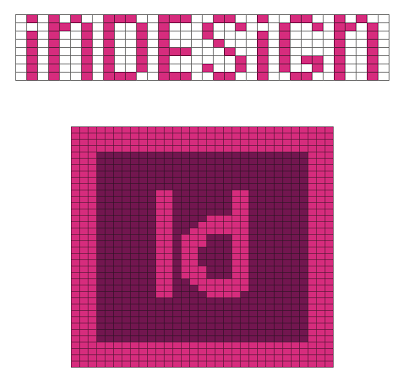
1. Start by choosing a simple piece of artwork that you want to turn into a grid pattern. Choose something that has just a few colors. I chose the logo for my beloved Raleigh InDesign User Group.

2. Simplify the colors. I removed all the gradients and converted it into a plain 3-color design.
![]()
3. Calculate the required proportion for rectangles. You’ll need to do a little math here. Knitting patterns generally use a term called “gauge,” which is usually done in a 4″ x 4″ swatch. My 4″ gauge switch was 20 stitches W and about 25 stitches H (which equates to 5 sts/inch wide x 6.25 rows/inch high).
4. Calculate how many rectangles you’ll need. I wanted my finished piece to be about 36″ wide x 36″ high.
Width: 5 sts/inch x 36 in = 180 sts
Height: 6.25 rows/inch x 36 in = 225 rows
5. Select your artwork and try to apply Create Object Mosaic. I say “try” because as you’ll notice in the screenshot below, the Object Mosaic command may be grayed out.

Maybe you figure, as I did, if you start with a vector object and you’ll be ending with a vector object, then you can work with vector objects all throughout the process. Not so! Apparently, Object Mosaic only works on raster objects.
6. Rasterize your artwork. Choose Object > Rasterize. My artwork was about 5.9 inches square and I rasterized it at 300 PPI.


7. Select your artwork and apply Create Object Mosaic. Choose Object > Create Object Mosaic. This is where you’ll plug in the numbers you calculated in Step 4.

8. Go get a cup of coffee. Seriously. If you have a complex design, this may take a while.

Now you’ll notice that the object mosaic looks like a really pixelated web image. Not to worry. We’ll fix that.

9. To keep your sanity while you’re fixing the colors, go to the Actions panel, scroll about halfway down and choose Delete Unused Panel Items. This will get rid of all the extraneous swatches (as well as some other stuff) and make it easier for you to recolor the artwork a few steps from now.

10. If they’re not already there, add your three swatches to your newly-cleaned Swatches Panel. These colors will correspond to the colors you’ll be using when constructing the physical piece. In my case, these are my yarn colors.

11. With no objects selected, select all three swatches and click the New Color Group Icon.


See how your swatches are sitting in a little folder now?

Next we’ll simplify the colors in the image back to just the ones you’re going to be working with in the final piece with the Recolor Artwork command.
12. Select your artwork and click the Recolor Artwork icon (located in the Control Panel and looks like a color wheel).

You’re then confronted with a dialog box that may look a little intimidating. In my case, there were about 284 different shades of pink. But have no fear. You can quickly reduce that down to just the desired shades.

13. Map the colors to your color group. On the right-hand side of the dialog box, click on the name of your color group. See how the colors are all grouped into a few rows now instead of a gigantic scrolling list?

14. Click on little downward-pointing triangle next to one of the pink rectangles in the New column. This is where you can specify the colorization method.

Set the colorization method to Exact.

Notice how we’ve lost a lot of the purple in the color conversion. (The spine of the book icon and the inside of the back cover should both be dark purple.)

This is the result of two things that Illustrator did which we need to correct:
- mapped the whites (which are located in the lower left corner of the design) to the dark purple swatch.
- mapped the dark purples to the mid-range magenta swatch
It turns out that every single one of the 284 Current Colors can be dragged up and down to be mapped to other colors. First drag the left edge of the top white row down so that white has its own row.

Now, the dark purple row is empty, so next click on each one of the purple slivers and drag them down to the row below. If you accidentally drag one of the mid-range magentas down to the purple row, just move it back up. Now the artwork is recolored and it looks like this. See how the spine has been restored to the correct purple color?

Now we’ve mapped all of our colors to swatches in our document. But the white row isn’t mapped to a swatch. See how the white row has a blank spot in the New column?

If you click on that spot, you’ll get a dialog box asking if you’d like to add a New Color to the current harmony. Click Yes. That spot will be filled with a white color.

Now we’re finished using the Recolor Artwork dialog box. Click OK. Illustrator will give you the option to add the newly-created white swatch to your color group.

The artwork may seem a bit rough at this point. In this case the entire Outer Banks (the barrier islands off the coast of North Carolina) got wiped out. So we’ll need to do a little manual cleanup work.

15. Add a thin white stroke to make each rectangle easier to see. I made my strokes .1 point.

16. Fix the details that got obliterated. Check the edges where the colors butt up against one another and fix the few rectangles that were colorized incorrectly.

17. You may want to add some extra black lines so it’s easier to keep track of your place in the pattern as you go. In my actual knitting, I put stitch markers every ten stitches, and these black lines correspond to those stitch markers.

18. Save your file as a PDF. The reason for this is so that you can track your progress in the pattern using PDF comments. I like to use semi-transparent rectangles, which I can resize, recolor, and move around the pattern as needed.
19. Knit the blanket. I cast on 180 stitches for the icon, plus 10 white stitches on each side. I knit the entire afghan in stockinette stitch. As I went, I decided that the it would have been too much work to knit that little series of Outer Banks islands, so I opted to fill in the water area with pink.

Because this is all stockinette stitch, the edges curl (similar to what happens with a torn/cut off T-shirt). So to fix the curling, I added about 10 ridges of garter stitch on all four sides. The garter stitch works like the cuff on a sweater. It adds a little bulk and strength to the edges, and helps the edges to lie flat.
One final note: While this technique describes how to create Object Mosaics for a knitting pattern, you can use Object Mosaics to create a chart for any other analog grid-based creative projects (such as tile mosaics). As graphic designers, it’s so easy to get stuck in a rut and never leave the digital world. But it’s so freeing to step away from the computer, and make something analog with your hands. No mouse required!
This article was last modified on September 1, 2023
This article was first published on July 29, 2013
Commenting is easier and faster when you're logged in!

Recommended for you

Flags For Our Fathers
Using a combination of line styles and creativity can be a lot of fun when you a...

Automatically Add Space Around Em Dashes and En Dashes
Learn how to use a GREP style in InDesign to automatically add space around em d...

TypeTalk: Typographic Hierarchy
One of the most important aspects of designing with type is the establishment of...