
Affinity Designer 2, just like Affinity Photo (and Adobe Photoshop), features a range of different blend modes that alter the look of any layer depending on the layers beneath. There are 32 different modes altogether, far too many to detail here; but we’ll look at some of the more significant ones to see how they differ.
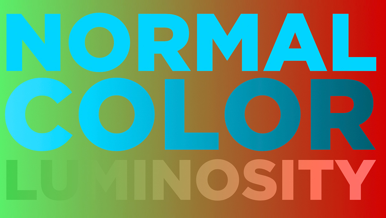
1. Normal, Color, and Luminosity
The first example below shows the word NORMAL set in pale blue on a green-red gradient background. This is the most basic blend mode. The Color mode changes the color of the artwork, without changing its brightness. So the word is still blue, but because the green end of the gradient is brighter than the red end, the word darkens towards the right. The Luminosity mode changes the brightness of artwork without changing its color. Even though the word is set here in the same blue as previously. So it has the effect of darkening the bright green, but brightening the dark red. 
2. Multiply and Darken
Both these blend modes make the layer content darker. Multiply adds the darkness of the current layer to the darkness of the one beneath, producing a result that’s darker than both. In contrast, Darken mode only shows up where the target layer is already darker than the underlying layer. That’s why it disappears on the right, as the darkness value of the green gradient matches that of the blue text. 
3. Screen and Lighten
These modes are the opposite of Multiply and Darken, above. Screen mode will make everything beneath brighter; but
Lighten mode is only visible where the target (top) layer is lighter than the underlying layer. 
4. Erase mode
Unique to Affinity Designer 2 (you won’t find this in Adobe Illustrator), Erase mode cuts out its content from the layers beneath. With just two layers, it just looks like white text.  When a new object is added beneath, the top Erase layer erases that layer as well. Still, it appears just like white text.
  But when the top two layers (the layer set to Erase mode, and the red rectangle) are grouped, then the Erase layer only affects the other layers within the group. The blue circle, beneath the group, isn’t affected. So you can see the Erase mode really does knock out the underlying layers in its group.
5. The Fade tool
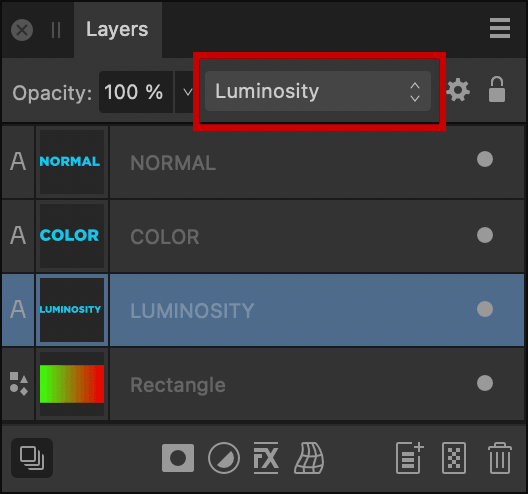
Also unique to Designer 2, the Fade tool does just what its name implies: it fades out any object, or any group, just by dragging the tool across it. You can set the fade to any angle, and you can drag the midpoint marker to skew the fade towards the beginning or the end. 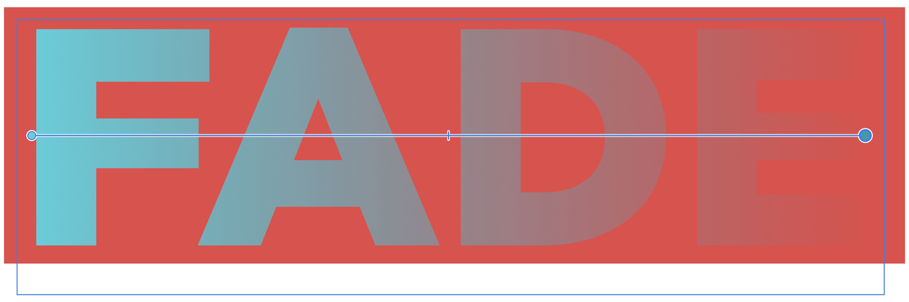 All these blend modes have been shown here on text layers for ease of reference, but of course they can be applied to any object or any group of objects. They can also be applied to masks and adjustment layers, and used when painting with pixel brushes or applying adjustment layers. By hovering your pointer over the pop-up menu at the top of the Layers panel you can scroll through each of the blend modes to see their effect, which makes it easy to select the right one for your task. You can also navigate the list using your Up and Down arrow keys.
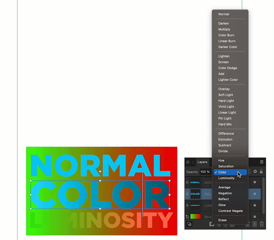
Commenting is easier and faster when you're logged in!

Recommended for you
Spice Up Your InDesign Layouts with Blend Modes
Khara Plicanic shows how you can use blend modes to add extra pizzazz to your In...

Cycle Through Blend Modes in InDesign with a Script
You can now cycle through all of InDesign's blend modes with the flick of a fing...

InDesign How-to Video: Create a Duotone Effect
In this week’s InDesignSecrets video, Mike Rankin shows off a great technique to...