
Adobe’s mobile applications are great tools for sketching out ideas while on the move. But can they be more than that? Is it possible to use them to create real artwork, rather than just roughs? The answer is both yes and no. It’s certainly possible to start artwork on a mobile device, and even to create and incorporate elements that will form part of the finished work. But to bring a serious piece of artwork to conclusion, you’ll most likely need to open it on a desktop application as well. Fortunately, as we’ll see, Adobe makes the process simple through its tight Creative Cloud integration between all its apps.
Here’s a sketch for a logo for a brand of chocolates named after the composer Franz Liszt, created in the free mobile app Adobe Draw. It shows the placement of the text and graphic elements, and it will serve as a good starting point.
The initial sketch

Converting to a template
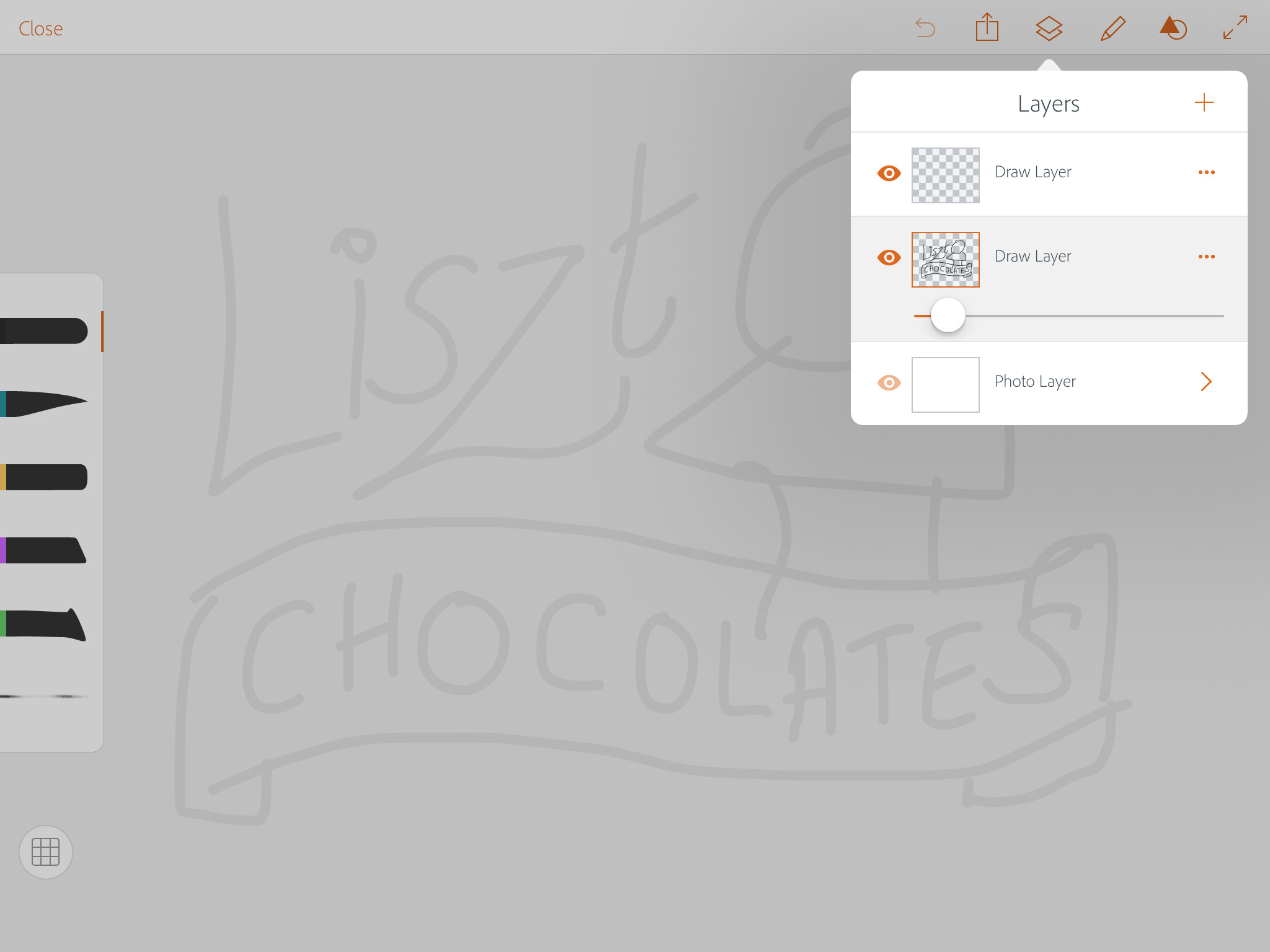
It’s easy to convert the sketch to a template: just open the Layers control, and reduce the opacity by dragging the slider. Don’t forget to make a new layer on which to draw the finished artwork.
Drawing the curves
The app comes with many built-in shapes, including squares, circles and architectural elements – but they also include French Curves, a replication of the analogue tools designers have been using for decades.

Sizing the curve
Unlike traditional French Curves, those in Adobe Draw can be resized at will. Drag on a red circle to move the shape, and drag both circles to rotate it. You can use pinch gestures to make the curve larger and smaller, but you can’t make it larger than the screen. You can, however, pinch on the drawing to make it smaller, which has the same end effect. Drag over any section of the curve and the pen will follow it, producing a perfectly smooth stroke.

Adding the figure
This logo requires a drawing of Liszt. Fortunately I have a bust of Liszt on my mantlepiece, so all I had to do was open the free app Adobe Capture and grab a photo. Drag the slider to increase the amount of dark in the resulting image – shown in the preview in green.

Refining the capture
Once you’ve captured your image, you’ll probably find extraneous objects selected as well. Drag over them to remove them (they’ll change from black to gray), then click the Next button to have Adobe Create turn the image into a smooth, vector shape. Save it to one of your CC libraries.

Placing the capture
Back in Adobe Draw, you can open the image from the library and it will appear in your artwork. Use the same technique as with the French Curves to size and move it, then tap on it to place it in the artwork.

The placed image
Once you place an image, its color changes from translucent red to black. It’s worth creating a new layer first, so you can erase the parts you don’t want – such as the elements that stick into the banner – without affecting the other artwork.

The lettering
I wanted a hand lettering style for the word Liszt, so I used a paintbrush with a variable stroke to sketch out the letters. If you make a mistake you can erase elements or simply Undo and redo them. The basic shapes here are OK, but they’ll need some tidying up later.

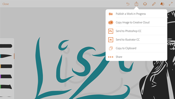
Exporting the artwork
There’s no point attempting the small lettering in Draw, since it can’t place text on curves. But moving the artwork from here to Illustrator, as long as you have a Creative Cloud account, is straightforward: just tap the Export button and choose Send to Illustrator CC. In a moment, the artwork will open on your desktop.

Opening in Illustrator
When the artwork opens in Illustrator you’ll find all the layers intact – so you can hide the template layer straight away. Shapes such as the banner will all have been drawn as separate outlined objects, so you’ll need to use the Pathfinder panel to unite them and then the Pencil tool to reshape the awkward overlapping corners.

Coloring the artwork
The bust of Liszt is easily recolored to a chocolate brown. To make the fill for the banner, first duplicate the banner and then use the Direct Selection tool to select and delete the outer stroke. This will leave the inner stroke forming the interior, which can be recolored as you like.

The hand-lettered artwork
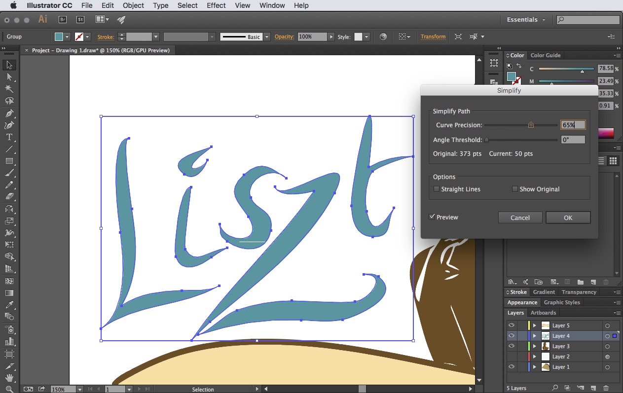
Drawing strokes with Adobe Draw’s brush tools work fine – but when you import them into Illustrator, you can see that they contain far too many anchor points. This would be a nightmare to try to edit.

Simplify the curves
You can use Object > Path > Simplify to reduce the number of anchor points. Of course this will reshape the outlines to some extent, but in most cases that’s no bad thing.
Refining the outlines
Now that the path has been reduced to a manageable number of points, it’s easy to redraw them with the Pencil or the Pen tools to get exactly the curves you want. Here, I’ve replaced all the sharp terminal points to blobs for a friendlier feel.

Creating the lower lettering
We could make the word ‘Chocolate’ simply by setting the text on a path – but this would look ugly. Instead, duplicate the banner fill object, and use Object > Path > Offset Path to make it smaller. Then create your text, and move it behind the new banner so that the banner is the topmost object.

Fitting the text
Use Type > Create Outlines to convert the text to a regular Illustrator object, so it’s no longer live text. Then select both this and the smaller version of the banner, and choose Object > Envelope Distort > Make with Top Object.
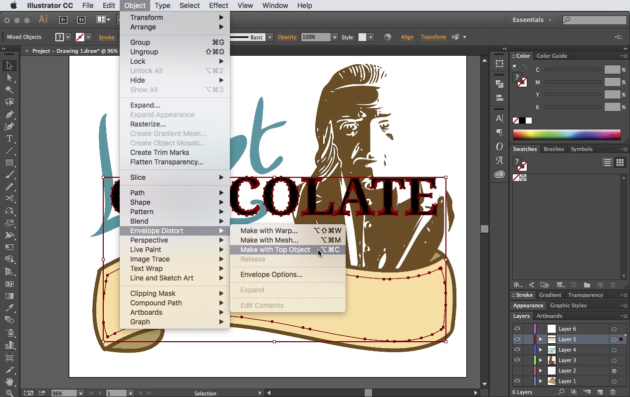
Perfectly fitting text
The text will now reshape itself to match the shape of the reduced banner. If we hadn’t reduced the banner size first, the text would have gone right to the edges and it would have looked awkward.

Finishing touches
As a final step, I duplicated the word ‘Chocolate’ twice, offsetting each one. I made the back copy red, then the middle copy the same color as the banner to make the retro shadow effect.

Creating artwork in Adobe’s mobile apps isn’t just a novel way of working, it also enables you to try out new ideas while you’re on the move. The apps may not be entirely capable of creating perfect finished artwork, but they do get you a long way towards your goal – and they’re a lot of fun to use. So why not give Draw a try and let us know what you think in the comments.
This article was last modified on December 23, 2015
This article was first published on December 23, 2015
Commenting is easier and faster when you're logged in!

Recommended for you
How to Use the New AI Features in Illustrator
Learn how to use Illustrator’s new AI features to use a prompt to create vector...

All About Indents and Other Paragraph Separators
Learn how to choose the right method of paragraph separations to add both readab...

How to Create a Neon Glow Effect in Illustrator
Learn how to create a neon glow effect in Illustrator and save it as a graphic s...