Understanding the First Baseline Position of Text
A guide to understanding the factors that affect the position of the first baseline of text in InDesign.

Ever mystified about why a particular piece of text begins so low (or so high) in its text frame? There are several settings that can affect the vertical placement of text. You can find them in the Text Frame Options dialog box, which you can open by selecting a text frame, and pressing Command+B (Mac) or Ctrl+B (Windows).
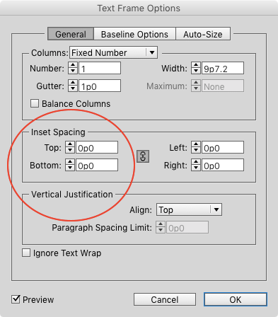
There are three tabs in the dialog box. In General options, both Inset Spacing and Vertical Justification can affect the first baseline placement.
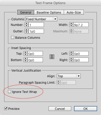
So can the option to Ignore Text Wrap, if you were expecting text to be pushed lower in the frame by text wrap from another object on the page.
In the Baseline options, you’ll find the First Baseline settings, which include five Offset choices, plus a Minimum value.

Four of the Offset choices use the text formatting (font, point size) to determine the first baseline:
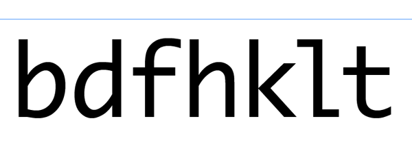
Ascent. This one ensures that the top of a lowercase d fits inside the frame. Exactly how far below the top of the frame varies, depending on the font you’re using.
Some will be dead on.
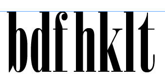
Others, not so much.

Cap Height. This one sets the flat tops of uppercase letters at the top inset of the frame. Characters that are rounded or pointed at the top will often poke out of the frame.


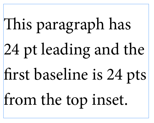
Leading. The leading value of the first line of text is the space between the top inset and the first baseline.
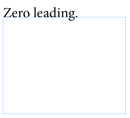
If you set the leading to zero, the first baseline sits at the top inset of the frame.
x-height. The top of a lowercase x fits inside the frame. Though once in a while you may encounter a font where the x pokes out a little bit.

There’s also a Fixed option that allows you to set a specific offset that will not be affected by the formatting of the text. When you leave the Minimum set to zero, Fixed offset will give you text that sits exactly on top of the text frame.

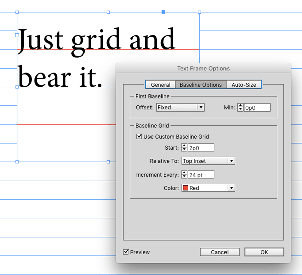
And last but not least, text baselines can align to baseline grids as part of the paragraph formatting, and they can align to either a document-wide baseline grid,

or a custom grid specific to the text frame.
This article was last modified on July 25, 2019
This article was first published on January 27, 2016
Commenting is easier and faster when you're logged in!
Recommended for you
A Tale of Two Enter Keys
If you use an extended keyboard, you might think that the keys on the numeric ke...

18 handy table shortcuts
Learn these 18 table techniques and shortcuts, and take your table skills to the...
Designing with Rules, Borders, and Shading
Creative ways to highlight text content in InDesign


