
Q. Are there any rules for setting register and trademark symbols? What sizes, positions, and fonts are best?
A. These symbols, while annoying to the designer, are legal designations that are required to appear in certain places. While there are no hard and fast rules to how to use them, there are guidelines to using them tastefully (if that is possible!).
The size and design of register and trademark symbols vary widely from font to font. For this reason, you’re not married to those in the font in use and are free to adjust the typeface as well as the size and position. (Unless it conflicts with your client’s guidelines, of course.)
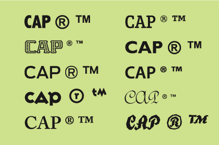
Register and trademark symbols can take many shapes and sizes. I set the examples below in Abadi Condensed, ITC Abaton, Antenna, Variex, Adobe Caslon Pro, Enclave, Gill Sans Pro, Myriad Pro, ITC Redonda, and ITC True Grit.
Although many designers prefer to use serif symbols with serif fonts and sans with sans, it’s acceptable (and sometimes preferable) to substitute a clean sans symbol (such as those from Arial or ITC Franklin Gothic), as they tend to be more readable and print cleanly at small sizes.
When you’re setting text, make register and trademark symbols a little smaller than half the x-height of the adjacent word. At display sizes, the symbols should be proportionately smaller, especially in headlines. In general, the symbols should look clean and legible yet unobtrusive.
Next, adjust the vertical position to your liking using baseline shift. You can align the vertical position with the cap height, x-height, or even the baseline — wherever it looks best.
Finally, use kerning to position the symbol horizontally. You’ll probably want to enlarge the image on your screen so you can see the spatial relationships more accurately, but be sure to print it as well to see the relationships in scale.
The register symbol in Jimbo Std is well-proportioned for this particular setting (upper). On the other hand, the register symbol in Interstate Black (lower) is quite large and heavy. The setting is much improved when I replace the register symbol with the Regular weight of Interstate, and then reduce its size and adjust position using baseline shift and kerning.
This article was last modified on October 23, 2023
This article was first published on January 21, 2009
Commenting is easier and faster when you're logged in!

Recommended for you

10 Essential Tips for InDesign
These tips originally appeared in InDesign Magazine. To have new InDesign tips d...

TypeTalk: Document-Wide Kerning
TypeTalk is a regular blog on typography. Post your questions and comments by cl...

Before&After: How to Use that Typeface
That font you just learned about won’t work just anywhere; it has a style that n...