

TypeTalk is a monthly question-and-answer column on typography. Send your question to ty******@*********ro.com. If we publish it, you’ll receive one Official Creativepro.com T-Shirt!
A Dash of Confusion
Q. A friendly battle has ensued between my boss and myself regarding the use of em dashes. I use them when they are appropriate grammatically, but he says no one uses them anymore, that people only use en dashes. According to him, em dashes are going the way of the Dodo.
A. Look around at type in printed matter and you’ll notice that em dashes are still used in most instances, though en dashes do replace them some of the time. The truth is probably somewhere in-between both of your views.
First, it’s important to know the difference between the dash types. An em dash is the longer of the two and is used singly to indicate a break in thought, or to separate a thought within a thought, which requires an em dash at the beginning and the end of the phrase.
The en dash, which is shorter than an em dash and longer than a hyphen, is used to indicate a break in time. Can you replace it with the words “to” and “from”; for example, 9 a.m. to 5 p.m. or Monday to Friday (Figure 1)? If so, an en dash is the correct punctuation.
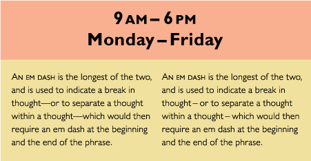
Figure 1. The top two lines of text show the en dash indicating a break in time. On the lower left, an em dash is correctly used to indicate a thought within a thought. However, this em dash might look too long and too tightly set for some people’s taste. An alternative treatment is on the lower right: Replace the em with en dashes and add a bit more space on both sides. All examples set in Gill Sans Pro.
Sometimes, for purely aesthetic reasons, a designer uses the en dash in place of em dashes throughout a document, or adds a small amount of space before and after either dash. These stylistic preferences are perfectly acceptable in good typography, and you can use them to improve the color and texture of your type when the size and spacing of the em dash is not to your liking; for example, many are too long and too tight for my taste. Consider it a form of artistic license!
How to Break Long URLs
Q. We often have to print very long URLs that don’t fit on a line. Is it OK to hyphenate URLs, and if so, what’s the best way to do it?
A. One solution is to put the URL on its own line, redistributing and re-breaking the text above it to avoid a big hole in the rag. If you can’t do this or it isn’t practical, or the URL is too long to fit on one line, break it after a forward slash, but don’t include a hyphen, which might be mistaken for part of the URL. Consider setting a split URL in italic to reinforce it as a unit (Figure 2).
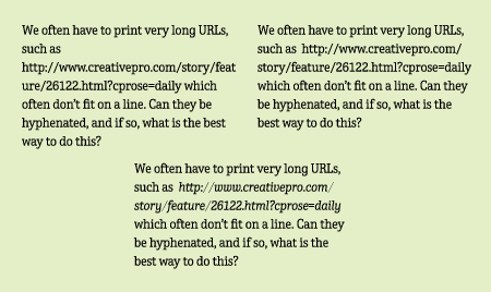
Figure 2. When a long URL doesn’t fit on a line, or creates a gaping hole in the rag (upper left), break it after a backward slash, but don’t include a hyphen (upper right). Italicizing the URL helps to visually keep the parts together (lower). Set in TerminalDesign Enclave.
Faking it with Fractions
Q. I love the fractions in some OpenType fonts, but much of my font library consists of Type1 fonts that don’t contain fractions. Setting fractions using full-sized figures (e.g., 4 2/3) looks so horsey. Is there an alternative?
A. Yes, you can build better-looking fractions manually. It’s a bit time-consuming, but the result, although not perfect, is an improvement over the oversized version you describe.
Here’s a method that works well for many fonts (shown step-by-step in Figure 3):
A. Begin by typing in the numbers without the spaces, using the fraction bar (option/shift/1 on a Mac, Unicode number 2044 for Windows) for the slash.
B. Reduce the numerator and denominator figures to about 60 percent.
C. Raise the numerator using baseline shift until it is the height of the caps.
D. Adjust the space between all three characters as needed with the kern feature.
E. If the resulting numbers look too light, using the next weight up of the font (if there is one) for the numerals only sometimes produces a better result.
F. The result is a fraction that looks very close to the true-drawn version. Customize it as you wish to get the best results.
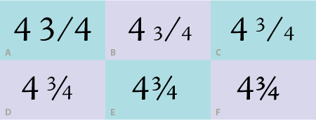
Figure 3. You can create good-looking diagonal fractions manually, as shown here set in Adobe Jensen Pro.
Indentation Information
Q. Should the first line of a first paragraph be indented?
A. The purpose of an indent in general is to create a visual separation between paragraphs. For that reason, an indent isn’t necessary in the first line of the very first paragraph, since there’s no need to separate the beginning of the copy from anything else. It appears as much as it does because this style was and often still is taught in typing classes. But in fine typography, first paragraphs usually aren’t indented; in fact, they look odd once you get out of the habit of doing it.

Figure 4. The text on the left shows an unnecessary indent in the first line of a first paragraph; the text to its right shows the typographically preferred first line treatment with no indent. Text from Black Beauty by Anna Sewell; set in ITC Conduit Std.
Love type? Want to know more? Ilene Strizver conducts her acclaimed Gourmet Typography workshops internationally. For more information on attending one or bringing it to your company, organization, or school, go to her site, call The Type Studio at 203-227-5929, or email Ilene at in**@***********io.com. Sign up for her e-newsletter at www.thetypestudio.com.
This article was last modified on January 9, 2022
This article was first published on December 21, 2007
Commenting is easier and faster when you're logged in!

Recommended for you

InDesign CC 9.2.1 Update Fixes Crashes
Some updates add new features, others just fix problems. A small update, InDesig...
Creating Double Outlines Around Text in InDesign
The Outer Glow effect can help you create the effect of double strokes around te...

New Norpath Elements Designer Now Shipping
Norpath Inc., today announced the immediate availability of Norpath Elements Des...