


TypeTalk is a monthly question-and-answer column on typography. You ask, and noted type authority Ilene Strizver answers. Send your questions to ty******@*********ro.com.
If we publish your question, we’ll send you one Official Creativepro.com T-Shirt!
What’s New on the Font Scene?
Q. How can I keep up with all the newest fonts?
A. In the past, almost every type foundry had a budget for printed brochures, catalogs, and posters, which they then freely distributed (literally and figuratively) to promote their font offerings. These days, there are far fewer print materials, and those that do exist are usually catalogs that are for sale and only as current as the last printing. (There are some exceptions, such as Veer and House Industries, which still produce free printed materials.)
Today, one of the best ways to stay current is to sign up for the free e-mail newsletters offered by many type foundries and resellers. Not only do the newsletters show and tell you about new releases, but they also offer free fonts, special discounts, interviews with designers, and other informative and entertaining articles.
Some foundries with newsletters are listed below. If I’ve missed any, alert my editor at te***@*********ro.com and she’ll update the list:
Fonts.com
FontShop
ITC
Linotype
MyFonts
Phil’s Fonts
P22
T26
Veer (Figure 1)
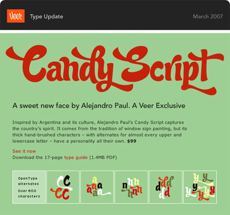
Figure 1. A past email newsletter from Veer.
Note that if your email isn’t set to support HTML, you won’t be able to see any images in the newsletters. You can either turn on HTML viewing, or look for a link within the email to a Web-based version of the information.
If your favorite foundry doesn’t have an e-newsletter, check its home page regularly, as it will probably post new designs there.
Auto-activation Enigma
Q. When I open a document and a font used to create it isn’t installed on my system, why isn’t Adobe InDesign smart enough to look for the font and activate it?
A. InDesign can’t auto-activate fonts on its own, but many font managers can. Most current font managers include greatly improved auto-activation features that automatically activate fonts used in documents as you open the files, so be sure to check that this feature is turned on in its preferences. However, Quark and Adobe apps do require special plug-ins. This means that every time you upgrade your design software, you also have to install an updated font-manager plug-in, a task many people forget.
For more on font managers and auto-activation, see the article “Troubleshoot Font Problems.”
Column Alignment
Q. When setting type in a brochure or anything that has multiple columns, should you strive to have the baselines of all the columns align? What if the text contains subheads of a different size/leading than the rest of the text, or if the space between the paragraphs is less than a full line space? Is there any hard and fast rule?
A. As you know, when subheads, paragraphs, or bulleted lists have leading (also called line-spacing) that is more or less than a full line space, the columns probably won’t base-align unless the total of all the leading miraculously totals a multiple of the overall leading.
This type treatment is neither right nor wrong, but more a question of taste and circumstances. Base-aligned columns look cleaner and more formal than a bottom rag, but they sometimes require sacrificing more pleasing line spacing within the columns, especially before subheads when a full line space often looks too large.
My advice is this: If you choose to use paragraph, subhead, or bulleted item leading that is not a full line space, do it in a way that results in a noticeably non-aligning bottom rag. Column bottoms that vary in tiny increments look more like mistakes than intentional design decisions (Figure 2).
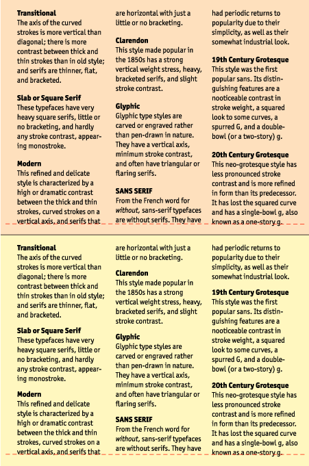
Figure 2. Both images use irregular leading (less than a full line-space) above the subheads with different results: The top image shows columns whose baselines misalign so slightly that they look like a mistake. The bottom image is much better, with the leading adjusted to create a more intentional, pleasing bottom rag.
Style Sheets & OpenType
Q. Can QuarkXPress 7.x select OpenType features in style sheets?
A. Yes, it can. Here’s a quick primer for those not in the know: Style sheets let you assign and change characteristics and attributes of text and paragraphs. They help maintain consistency and let you make quick changes throughout a document. They’re a real time-saver, especially when you create multiple-page documents.
InDesign also supports OpenType features in both character and paragraph style sheets. The visual interface and some of the details do vary between QuarkXPress and InDesign (Figure 3). For instance, in InDesign, you select standard ligatures via the basic Characters Format menu and figure styles via a pull-down menu. The one major difference between QuarkXPress and InDesign style sheets is that QuarkXPress does not support Stylistic Sets.

Figure 3. The above screen shots show how QuarkXPress (top) and InDesign (bottom) handle OpenType features in paragraph style sheets. Their character style sheets are almost identical.
Text to Outline
Q. Is there a way to convert text in multiple pages to outlines in InDesign CS3 in a single shot?
A. According to Scott Citron, designer and Adobe Certified Instructor, because you can select objects in InDesign per single spread only, it can convert text to outlines one spread at a time only. “Short of writing a script to automate type to outlines,” Scott says, “there’s no quick way to do this.”
But you should consider why you want to covert multiple pages of text to outlines in the first place. “Is it because you don’t want to send the font with the file,” Scott asks, “or because you’re worried that the text will get changed by accident? If so, you should use PDF as your final delivery format instead of converting text to outlines.”
In QuarkXPress, there’s no shortcut either. The only way to convert text into outline in Quark is to highlight the word or text, and go to Style> Text to Box. This creates an outline version underneath the original, which you then have to delete. (For more on Text to Box, see “Explore a Little-Known QuarkXPress Gem” and “Fill Type with Artwork in QuarkXPress“.)
Love type? Want to know more? Ilene Strizver conducts her acclaimed Gourmet Typography workshops internationally. For more information on attending one or bringing it to your company, organization, or school, go to her site, call The Type Studio at 203-227-5929, or email Ilene at in**@***********io.com. Sign up for her e-newsletter at www.thetypestudio.com.
This article was last modified on May 15, 2023
This article was first published on July 25, 2007
Commenting is easier and faster when you're logged in!

Recommended for you

Resize Page from Upper Left Corner
Artiom wrote: In QuarkXPress we change the page size from the top left corner of...

Label Placed Images in InDesign
Here’s how to label placed images with their resolution, color space, and other...

Turn a Photo into a Planet Using Photoshop
We’re all familiar with panorama photography, and you may have used Photos...