
TypeTalk is a regular blog on typography. Post your questions and comments by clicking on the Comments icon above.
Q. What exactly is glyph substitution?
A. I’ll explain with an example: When the ligatures feature is turned on in applications such as Adobe InDesign and QuarkXPress, those apps search a document’s text for the fi character combination and automatically substitute the “fi” ligature that is in most fonts. This application-based feature is glyph substitution in its most basic form, and it’s all that’s available in TrueType and PostScript typefaces. However, the OpenType font format takes glyph substitution to the next level.
Glyph substitution in an OpenType font is a really cool feature. This intelligence that’s programmed into some OpenType fonts with expanded character sets enables the font to select the most appropriate character — whether it be a standard or discretionary ligature, swash, or other special character — for a particular usage or typographic context.
For instance, some swash characters are intended for either the beginning or end of a word to avoid crashing into other letters and/or creating too much space between two characters. When this feature (Swash or Contextual Alternates) is turned on in a supporting application, such as InDesign or QuarkXPress, the software automatically inserts the correct swash. If the text changes, the application automatically changes the swash character back to the standard one as necessary.
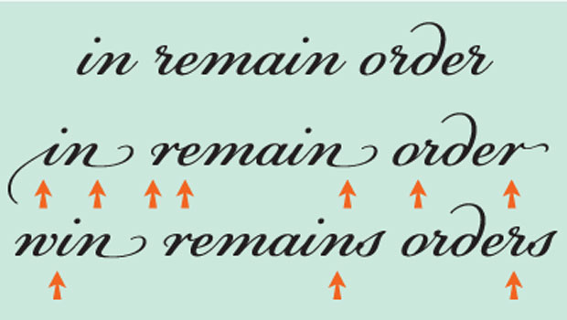
Figure 1. Glyph substitution is beautifully illustrated in this setting of Champion, an OpenType font with over 4000 glyphs. The upper setting uses standard characters only. In the middle setting, Contextual Alternates is turned on from the OpenType palette of InDesign, resulting in several glyphs being replaced by alternate versions, including initial and terminal swashes. When the text changes, as shown on the lower setting, initial and terminal swashes are automatically replaced with standard characters so a decorative swash isn’t preceded or followed by another character, compromising the spacing.
Glyph substitution has also been built into some fonts containing several alternate glyphs for one character or character combination, so that the font automatically selects characters based on totally aesthetic considerations.
Figure 2. House Industries has been at the forefront of contextual Glyph Substitution, as illustrated in this example of Ed Interlock. The top line is set without the use of Ligatures. When Ligatures is turned on beginning with the line below it, you can see how the most visually appropriate ligature is automatically selected with each respective added character…
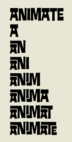
Figure 3. … even though some letter combinations in this font have several options, such as the HE combo, shown below.

A word to the wise: Some fonts contain a lot of alternates. Make sure that the glyphs that are automatically inserted are the ones you want. You can always override the automatic selection by manually inserting the alternate you prefer from the glyph palette.
Love type? Want to know more? Ilene Strizver conducts her acclaimed Gourmet Typography workshops internationally. For more information on attending one or bringing it to your company, organization, or school, go to her site, call The Type Studio at 203-227-5929, or email Ilene at in**@***********io.com. Sign up for her e-newsletter at www.thetypestudio.com.
This article was last modified on August 12, 2021
This article was first published on July 14, 2010
Commenting is easier and faster when you're logged in!

Recommended for you

One Good Kern Deserves Another
The old saw that “it’s the little things that count” was surel...

Letterforms: Typeface Design from Past to Future
If you love type and want to know more about letterforms and the history of type...

Confusing Type Terms, Part 1
The ability to talk about type and design, and say what you mean with clarity an...