

TypeTalk is a regular blog on typography. Post your questions and comments by clicking on the Comments icon above. If Ilene answers your question in the blog, you’ll receive one Official Creativepro.com T-Shirt!
Q. What is the difference between GIF files and JPG files? Which is better for type?
A. While both of these digital file formats are used for graphics on the Web, they differ greatly. The challenge is to determine which format will result in the highest image quality and smallest file size for the image at hand.
The GIF file format (Graphics Interchange Format) is best for graphics composed of solid colors, including type and lettering, line drawings, icons, borders, and other simple decorative elements. GIF files can have a maximum of 256 colors. They also support transparency and multiple frames, which are used for animation on the Web.
The JPG or JPEG file format is best for continuous tone images, such as photographs, as well as images with blended color, such as gradients. That’s because JPG files support 16 million colors, which allow for a smooth transition between blended colors. This can make for a very large file, but the JPG format will compress a file by discarding a certain amount of information. Depending on what compression setting you use, the lower quality may or may not be visible to the eye. The better the quality, the larger the file, so the trick is to find the smallest file size with the most acceptable image quality. While there are instances when a high-quality JPG containing type will look as good as a GIF, the file may be larger and thus download more slowly.
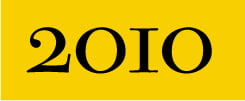
The image below is composed of two solid colors, lending itself to a GIF file, which is a mere 4KB in size.

When I convert the image to a low-quality JPG (10% compression), the file is the same small 4KB as the GIF, but the color is blotchy, especially around the type.

When converted to a high-quality JPG (100% compression) the image is about as sharp as the GIF file, but at 20KB, the file is five times as large.
The image below combines type and photo. Even as the highest quality GIF using all 256 colors, the color of the 24KB image isn’t as smooth as it could be. That’s especially noticeable in the lower right corner, which appears a bit dappled.

When converted to a low quality JPG (10% compression), the file is only 8KB, but the photo quality is very poor, which is most noticeable in the sky:

As the image below demonstrates, conversion to a high-quality JPG (100% compression) results in the best quality and maintains the integrity of the photo. However, the file is 36KB, a size that may be undesirably large for some sites.

When determining the best conversion format for Web graphics, start with the guideline above, then let your eye (and the file size) be your guide.
Love type? Want to know more? Ilene Strizver conducts her acclaimed Gourmet Typography workshops internationally. For more information on attending one or bringing it to your company, organization, or school, go to her site, call The Type Studio at 203-227-5929, or email Ilene at info@thetypestudio.com. Sign up for her e-newsletter at www.thetypestudio.com.
This article was last modified on May 15, 2023
This article was first published on December 30, 2009
Commenting is easier and faster when you're logged in!

Recommended for you

Selecting Horizontal and Vertical Spaces with GREP
by Erica Gamet If you use GREP in InDesign, you either know the name P...

How to Refine Illustrator 3D Artwork in Adobe Dimension
Learn how to bring 3D artwork created from Illustrator into a true 3D environmen...
Illustrator Preferences You Should Change
Use these recommendations from Illustrator pros to make your work more enjoyable...